Optimizing Caching: Twemproxy and Memcached at Flickr

Introduction

Flickr places a high priority on our users’ experience, and a critical part of that experience is the speed of the interface.  Regardless of the client you use to access Flickr, caching the proper data and the speed at which our servers can access cached data is critical to delivering on that quality user experience.  The more effective our caching strategy is, the better the Flickr experience will be for our users.  This is true for all the layers of caching we deploy at Flickr from the photo caches to the process data caches buried deep in the system.  In a previous post, we looked at how regional photo caching improved photo serving time in other countries, in this post we’re going to dive down into the innards of Flickr’s software stack and take a look at how we improved Memcached performance for our backend systems.

Back in the olden days (pre-2014), we accessed our Memcached systems through a mix of direct reads from our web servers and writes through a Flickr-developed proxy.  Our proprietary proxy system, Cerberus, handled a whole host of responsibilities. In addition to Memcached set operations, Cerberus managed database updates, the bulk of our Redis accesses, cache consistencyCerberus Based Memcached Architecture 
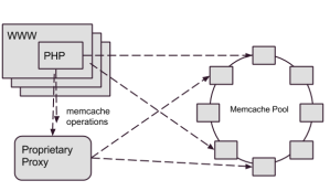
(which is why we directed our writes through Cerberus), and a few other miscellaneous transactions.   As Flickr’s traffic and functionality had grown, Memcached set operation performance wasn’t keeping up, so we needed to consider how to address the gap.

Since the development of Cerberus, the software landscape had drastically changed.  When we developed Cerberus, there was no comparable software available, but now several open source projects exist that provide similar proxy services.  On top of the availability of open source tools, Flickr’s traffic and usage patterns have changed over the course of a decade, changing the requirements we had for a proxy system.  Needless to say we had a lot of questions to ask ourselves before we dived into revising the caching architecture.

After years of operation, we had a good picture into the strengths and weaknesses of our current architecture, so when we started thinking about revising it, a few lessons from the past years really stood out.  One thing that we learned over the years was that Cerberus’ lack of a single purpose made it difficult to troubleshoot operational issues with Memcached.  Due to the lack of isolation, a downstream issue with a user database, could impact Memcached access time.  Whatever came next had to isolate cache requests from other data accesses.

Experience had shown us that Memcached get operation latency was a key performance metric, and we learned through trial and error that placing our current Cerberus proxy between the web servers and the Memcached hosts added more network latency than we were willing to tolerate.  Unfortunately, our options for connection pooling and more efficient use of connections were limited in PHP, so we had little recourse than to suffer with a high connection load and fluctuating connections against our Memcached servers.  The next generation system would have to carefully monitor get operation timings and ensure we didn’t introduce more latency into the process.

So as 2014 rolled around, we started to look into an alternative to Cerberus for accessing the Memcached systems.  Should we build a Cerberus 2.0?  Should we look at an open source alternative?  As we weighed our options, one alternative that stood out because it was quite successful in other parts of Yahoo and throughout the industry was Twitter’s Twemproxy.

Introducing Twemproxy

Twemproxy is a lightweight daemon that proxies requests to a pool of Memcached instances.  It provides the following features that we believed would improve our caching infrastructure:

  • Consistent hashing:  Figuring out what hosts in the ring on which to store and retrieve cache data.  While we had implemented consistent hashing before Twemproxy, it was previously left to the client libraries to sort out.
  • Connection pooling:  Reuse of network connections to the Memcached instances, cutting down significantly on the connection load to the Memcached daemons.
  • Command Pipelining:  Accumulating requests destined for the same host and sending as a combined payload.  This feature further reduces connection load and network overhead to the cache processes.

Resulting Architecture

We implemented a solution where each web server host had two local Twemproxies, forwarding to the Memcached rings.

Twemproxy Based Memcached Architecture

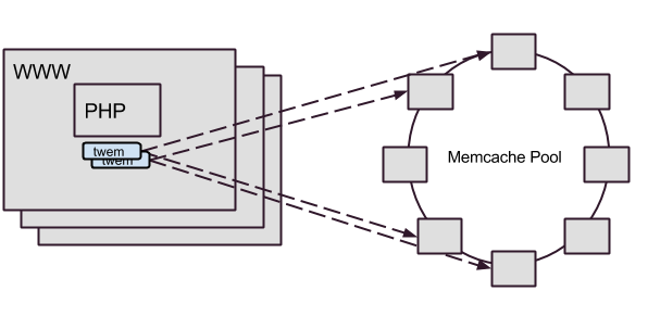
In the resulting architecture, all Memcached operations go through twemproxy.  The change accomplished many goals, including:

  • Providing a dedicated system for Memcached requests that was isolated from other systems
  • Reducing the connection load on our Memcached servers through Twemproxy’s connection pooling.  We experienced a 75% overall reduction of TCP connections to Memcached nodes
  • Improved overall caching latency.  This was a benefit that we didn’t necessarily expect.  With Twemproxy, we found that get operations had a 5% reduction in mean processing time and set operations had a 40% in mean processing time

The Road to Twemproxy

As nice as it would be to say we dropped in Twemproxy, declared victory and went for ice cream, we still had to solve a few interesting challenges along the way: maintaining availability, dealing with disparate consistent hashing schemes, and re-implementing cache coherency.

If One is Good, Two is Even Better

From the start, we recognized that the simple daemon model of Twemproxy would need to be managed carefully.  Each deploy through our continuous deployment system could result in changes to the Memcached hosts configuration.  And unfortunately, configuration changes for Twemproxy require the process to be restarted to take effect.  We measured the time to restart Twemproxy in the 1-2 second range, but even for these necessary restarts, it was too much of an interruption for the clients.

Our solution was to run two instances of the daemon on every host that needed the service and manage a careful synchronization between the restarts.  This restart “dance” was wired into the process that deploys the configuration changes to all the Memcached clients.  A couple of patches have been proposed to allow configuring Twemproxy without restarting it, but none of them have yet made the master branch.

When is Ketama not Ketama?

Ketama is a popular consistent hashing algorithm used by many systems to determine where to place a particular key in a multi-node caching system.  Out of the box, Twemproxy uses an implementation of the Ketama algorithm that is compatible with libketama, the C library which is the most commonly used implementation of the Ketama algorithm.

Our initial implementation of consistent hashing was done using Ketama, but with the Spymemcached Java library.  It turns out that Spymemcached has a slight variation in the implementation that makes it incompatible with Twemproxy.

Our transition from our current system to Twemproxy had to happen live, and a sudden change in the cache algorithm would have a painful (and unacceptable) impact on our database systems.  How could we get across this bridge?  Ultimately, we had to patch Twemproxy’s implementation of Ketama to match Spymemcached to maintain a consistent implementation of the Ketama algorithm.

Redis latency in propagating cache clears

Until we figure out how to change the speed of light, the only way we are going to make Flickr fast across the world, is through multiple data centers conveniently located near our users.  While this is way easier than changing the speed of light, it’s not without its complications.

What do they compute at Night ?

Caches between the data centers have to be kept consistent.  Some caches, like photo caches, deal with immutable data and are easy to keep in synch, others like Memcached systems have read-write data which is harder.  Our approach to handling cache consistency in our Memcached systems was to invalidate stale keys in other colo facilities whenever a process updated a value.  As we mentioned previously, Memcache write operations were directly through our Cerberus proxy specifically so Cerberus could dispatch a cache invalidation event to other colo facilities.  The migration to Twemproxy would not be complete, until we implemented a new solution for cache invalidation.

In our Twemproxy-based architecture, we decided to take the responsibility for cache invalidation our of the hands of the data proxy and push it into the client libraries we used to access Memcached.  Whenever a client updates a Memcache key, it enqueues a corresponding cache invalidation event into a distributed Redis queue.  We then deployed simple, single-purpose Java daemons to process the cache invalidation events from the Redis queue and delete the corresponding keys in their local Memcached systems.  A diagram of the system, appears below: Cache Clear - Blog Post

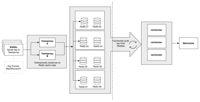
The wrinkle with this approach was that the enqueuing of clear keys would occasionally take 20 times longer than the normal mean time, pushing cache sets up to 40ms. After much digging, we found that the spikes were happening when the clearing daemons dequeued a batch of keys.  The dequeuing daemons were performing operations across a WAN. Due to the single-threaded nature of Redis, it would periodically block the queue for adding keys for 10s of milliseconds.  Once we figured that out, the fix was a matter of keeping separate in- and out-queues, and moving the keys from in to out with a local daemon, which significantly reduced the blocked time for writing keys.

Conclusion

Caching is crucial to a high-traffic site like Flickr, and we have taken a big stride in making our Memcached utilization more effective.  Using Twemproxy, we were able to clean up an internal system, reduce the connection load on our caching daemons, and even make modest improvements to caching latency for all clients.  Although we faced some technical challenges in implementing twemproxy for Memcached, particularly in propagating cache clear events, it was ultimately well worth the engineering investment.  After several months, our implementation of Twemproxy has proven to make a positive contribution to caching speed and ultimately the experience of a responsive site for our users.

If you dream in low latency and love to rip that extra 10 microseconds of overhead out of an operation, we’d love to have you! Stop by our Jobs page and tell us how awesome you are.

Exploring Life Without Compass

Compass is a great thing. At Flickr, we’re actually quite smitten with it. But being conscious of your friends’ friends is important (you never know who they’ll invite to your barbecue), and we’re not so sure about this “Ruby” that Compass is always hanging out with. Then there’s Ruby’s friend Bundler who, every year at the Christmas Party, tells the same stupid story about the time the police confused him with a jewelry thief. Enough is enough! We’ve got history, Compass, but we just feel it might be time to try seeing other people.

Solving for Sprites

In order to find a suitable replacement (and for a bit of closure), we had to find out what kept us relying on Compass for so long. We knew the big one coming in to this great experiment: sprites. Flickr is a huge site with many different pages, all of which have their own image folders that need to be sprited together. There are a few different options for compiling sprites on your own, but we liked spritesmith for its multiple image rendering engines. This gives us some flexibility in dependencies.

A grunt task is available for spritesmith, but it assumes you are generating only one sprite. Our setup is a bit more complex and we’d like to keep our own sprite mixin intact so we don’t actually have to change a line of code. With spritesmith and our own runner to iterate over our sprite directories, we can easily create the sprites and output the dimensions and urls via a simple Handlebars template to a Sass file.

{{#each sprites}}
    {{#each images}}
        %{{../dir}}-{{name}}-dimensions {
            width: {{coords.width}}px;
            height: {{coords.height}}px;
        }
        %{{../dir}}-{{name}}-background {
            background: image-url('{{../url}}') -{{coords.x}}px -{{coords.y}}px no-repeat;
        }
    {{/each}}
{{/each}}

You could easily put all three of these rules in the same declaration, but we have some added flexibility in mind for our mixin.

It’s important to note that, because we’re using placeholders (the % syntax in Sass), nothing is actually written out unless we use it. This keeps our compiled CSS nice and clean (just like Compass)!

@import 'path/to/generated/sprite/file'

@mixin background-sprite($icon, $set-dimensions: false) {
    @extend %#{$spritePath}-#{$icon}-background;

    @if $set-dimensions == true {
        @extend %#{$spritePath}-#{$icon}-dimensions;
    }
}

Here, our mixin uses the Sass file we generated to provide powerful and flexible sprites. Note: Although retina isn’t shown here, adding support is as simple as extending the Sass mixin with appropriate media queries. We wanted to keep the example simple for this post, but it gives you an idea of just how extensible this setup is!

Now that the big problem is solved, what about the rest of Compass’s functionality?

Completing the Package

How do we account for the remaining items in the Compass toolbox? First, it’s important to find out just how many mixins, functions, and variables are used. An easy way to find out is to compile with Sass and see how much it complains!


sass --update assets/sass:some-temp-dir

Depending on the complexity of your app, you may see quite a lot of these errors.


error assets/css/base.scss (Line 3: Undefined mixin 'font-face'.)

In total, we’re missing 16 mixins provided by Compass (and a host of variables). How do we replace all the great mixin functionality of Compass? With mixins of the same name, node-bourbon is a nice drop-in replacement.

What is the point of all this work again?

The Big Reveal

Now that we’re comfortably off Compass, how exactly are we going to compile our Sass? Well try not to blink, because this is the part that makes it all worthwhile.

Libsass is a blazing-fast C port of the Sass compiler that exposes bindings to modules like node-sass.

Just how fast? With Compass, our compile times were consistently around a minute and a half to two minutes. Taking care of spriting ourselves and using libsass for Sass compilation, we’re down to 5 seconds. When you deploy as often as we do at Flickr (in excess of 10 times a day), that adds up and turns into some huge savings!

What’s the Catch?

There isn’t one! Oh, okay. Maybe there are a few little ones. We’re pretty willing to swallow them though. Did you see that compile time?!

There are some differences, particularly with the @extend directive, between Ruby Sass and libsass. We’re anticipating that these small kinks will continue to be ironed out as the port matures. Additionally, custom functions aren’t supported yet, so some extensibility is lost in coming from Ruby (although node-sass does have support for the image-url built-in which is the only one we use, anyway).

With everything taken into account, we’re counting down the days until we make this dream a reality and turn it on for our production builds.

Flickr flamily floto

Like what you’ve read and want to make the jump with us? We’re hiring engineers, designers and product managers in our San Francisco office. Find out more at flickr.com/jobs.

Building Flickr’s new Hybrid Signed-Out Homepage

Adventures in Frontend-Landia

tl;dr: Chrome’s DevTools: still awesome. Test carefully on small screens, mobile/tablets. Progressively enhance “extraneous”, but shiny, features where appropriate.

Building a fast, fun Slideshow / Web Page Hybrid

Every so often, dear reader, you may find yourself with a unique opportunity. Sometimes it’s a chance to take on some crazy ideas, break the rules and perhaps get away with some front-end skullduggery that wouldn’t be allowed, nor encouraged under normal circumstances. In this instance, Flickr’s newest Signed-Out Homepage turned out to be just that sort of thing.

The 2014 signed-out flickr.com experience (flickr.com/new/) is a hybrid, interactive blend of slideshow and web page combining scroll and scaling tricks, all the while highlighting the lovely new Flickr mobile apps for Android and iPhone with UI demos shown via inline HTML5 video and JS/CSS-based effects.

Flickr.com scroll-through demo

Features

In 2013, we covered performance details of developing a vertical-scrolling page using some parallax effects, targeting and optimizing for a smooth experience. In 2014, we are using some of the same techniques, but have added some new twists and tricks. In addition, there is more consideration for some smaller screens this year, given the popularity of tablet and other portable devices.

Briefly:

  • Fluid slideshow-like UI, scale3d() and zoom-based scaling of content for larger screens

  • Inline HTML5 <video>, “retina” / hi-DPI scale (with fallback considerations)

  • Timeline-based HTML transition effects, synced to HTML5 video

  • “Hijacking” of touch/mouse/keyboard scroll actions, where appropriate to experience

  • Background parallax, scale/zoom and blur effects (where supported)

Usability Considerations: Scrolling

In line with current trends, our designers intended to have a slideshow-like experience. The page was to be split into multiple “slides” of a larger presentation, with perhaps some additional navigation elements and cues to help the user move between slides.

Out in the wild, implementations of the slideshow-style web page widely in their flexibility. Controlling the presentation like this is challenging and dangerous from a technical perspective, as the first thing you are doing is trying to prevent the browser from doing what it does well (arbitrary bi-directional scrolling, in either staggered steps or smooth inertia-based increments depending on the method used) in favour of your own method which is more likely to have holes in its implementation.

If you’re going to hijack a basic interaction like scrolling, attention to detail is critical. Because you’ve built something non-standard, even in the best case the user may notice and think, “That’s not how it normally scrolls, but it responded and now I’m seeing the next page.” If you’re lucky, they could be using a touchpad to scroll and may barely notice the difference.

By carefully managing the display of content to fit the screen and accounting for common scroll actions, we are able to confidently override the browser’s default scroll behaviour in most cases to present a unique experience that’s a hybrid of web page and slideshow.

The implementation itself is fairly straightforward; you can listen to the mouse wheel event (triggered both by physical wheels and touchpads), determine which direction the user is moving in, debounce further wheel events and then run an animation to transition to the next slide. It’s imperfect and subject to double-scrolling, but most users will not “throw” the scroll so hard that it retains enough inertia and continues to fire after your animation ends.

Additionally, if the user is on an OS that shows a scrollbar (i.e., non-OS X or OS X with a mouse plugged in), they should be able to grab and drag the scrollbar and navigate through the page that way. Don’t even try messing with that stuff – your users will kill you with pitchforks, ensuring you will be sent to Web Developer Usability Anti-Pattern Hell. You will not pass Go, and will not collect $200.

Content Sizing

In order to get a slideshow-like experience, each “slide” had to be designed to fit within common viewport dimensions. We assumed roughly 1024×768, but ended up targeting a minimum viewport height of around 600px – roughly what you’d get on a typical 13″ MacBook laptop with a maximized window and a visible dock. In retrospect, that doesn’t feel like a whole lot of space; it’s important to consider if you’re also aiming to display your work on mobile screens, as well.

Once each slide fit within our target dimensions, the positioning of each slide’s content could be tightly controlled. Each is in a relatively-positioned container so they stack vertically as normal, and the height is at minimum, the height of the viewport or the natural offsetHeight dictated by the content itself. Reasonable defaults are first assigned by CSS, and future updates are done via JS at initial render and on window.resize().

With each slide being one viewport high, one might assume we could then let the user scroll freely through the content, perusing at will. We decided to go against this and control the scrolling for a few reasons.

  • Web browsers’ default “page down” (spacebar or page up/down keys, etc.) does not scroll through 100% of the viewport, as we would want in this case; there is always some overlap from the previous page. While this is completely logical considering the context of reading a document, etc., we want to scroll precisely to the beginning of the next frame. Thus, we use JS to animate and set scrollTop.

  • Content does not normally shift vertically when the user resizes their browser, but will now due to JS adjusting each slide’s height to fit the viewport as mentioned. Thus, we must also adjust scrollTop to re-align to the current slide, preventing the content from shifting as the user resizes the window. Sneaky.

  • We want to know when a user enters and leaves a slide, so we can play or reset HTML5 <video> elements and related animations as appropriate. By controlling scroll, we have discrete events for both.

Content Scaling

Given that we know the dimensions of our content and the dimensions of the browser viewport, we are able to “zoom” each slide’s absolutely-positioned content to fit nicely within the viewport of larger screens. This is a potential minefield-type feature, but can be applied selectively after careful testing. Just like min and max-width, you can implement your own form of min-scale and max-scale.

Content Scaling demo

Avoiding Pixelation

Scaling raster-based content, of course, is subject to degrading pretty quickly in terms of visual quality. To help combat pixelation, scaling is limited to a reasonable maximum – i.e., 150% – and where practical, retina/hi-DPI (@2x) assets are used for elements like icons, logos and so forth, regardless of screen type. This works rather well on standard LCDs. On the hi-DPI side, thankfully, huge retina screens are not common and there is less potential for scaling.

Depending on browser, content scaling can be done via scale3d() or the old DOM .style.zoom property (yes, it wasn’t just meant for triggering layout in old IE.) From my findings, Webkit appears to rasterize all content before scaling it. As a result, vector-based content like text is blurred in Webkit when using scale3d(). Thus, Wekbit gets the older .style.zoom approach. Firefox doesn’t support .style.zoom, but does render crisp text when using scale3d().

There are few tricks to getting scaling to work, short of updating it alongside initial render and window.resize() events. overflow: hidden may need to be applied to the frame container, in the scale3d() case.

JS Performance: window.onscroll() and window.onresize()

It’s no secret: scroll and resize are two popular JavaScript events that can cause a lot of layout thrashing. Some cost is incurred by the browser’s own layout, decoding of images, compositing and painting, but most notable thrashing is caused by developers attaching expensive UI refresh-related functions to these events. Parallax effects on scrolling is a popular example, but resize can trigger it as well.

In this case, synchronous code fires on resize so that the frames immediately resize themselves to fit the new window dimensions, and the window’s scrollTop property is adjusted to prevent any vertical shift of content. This is expensive, but is justified in keeping the view consistent with what the user would expect during resize.

Scroll events on this page are throttled (that is, there is not a 1:1 event-firing-to-code-running ratio) so that the parallax, zoom and blur effects on the page – which can be expensive when combined – are updated at a lower, yet still responsive interval, thus lowering the load on rendering during scroll.

Fun stuff: Background sizing, Parallax, Scale-based Motion, Blur Effects via Opacity, Video/HTML Timelines

The parallax thing has been done before, by Flickr and countless other web sites. This year, some twists on the style included a gradual blur effect introduced as the user scrolls down the page, and in some cases, a slight motion effect via scaling.

Backgrounds and Overlays

For this fluid layout, the design needed to be flexible enough that exact background positioning was not a requirement. We wanted to retain scale, and also cover the browser window. A fixed-position element is used in this case, width/height: 100%, background-size: cover and background-position: 50% 0px, which works nicely for the main background and additional image-based overlays that are sometimes shown.

The background tree scene becomes increasingly blurry as the user scrolls through the page. CSS-based filters and canvas were options, but it was simpler to apply these as background images with identical scaling and positioning, and overlay them on top of the existing tree image. As the user scrolls through the top half of the page, a “semi-blur” image is gradually made visible by adjusting opacity. For the latter half, the semi-blur is at 100% and a third “full-blur” image is faded in using the same opacity approach.

Where supported, the background also also scales up somewhat as the user scrolls through the page, giving the effect of forward motion toward the trees. It is subtle when masked by the foreground content, but still noticeable.

Here is an example with the content hidden, showing how the background moves during scroll.

Background parallax/blur/zoom demo

Parallax + Scaling

In terms of parallax, a little extra image is needed for the background to be able to move. Thus, the element containing the background images is width: 100% and height: 110%. The background is scaled by the browser to fit the container as previously described, and the additional 10% height is off-screen “parallax buffering” content. This way, the motion is always relative in scale and consistent with the background.

HTML5 Video and “Timelines” in JS

One of the UI videos in this page shows live filters being applied – “Iced Tea”, “Throwback” and so on, and we wanted to have those filters showing outside the video area also if possible. Full-screen video was considered briefly, but wasn’t appropriate for this design. Thus, it was JS to the rescue. By listening to a video’s timeupdate event and watching the currentTime attribute, events could be queued in JS with an associated time, and subsequently fired roughly in sync with effects in the video.

Filter UI demo

In this case, the HTML-based effects were simple CSS opacity transitions triggered by changing className values on a parent element.

When a user leaves a slide, the video can be reset when the scroll animation completes, and any filter / transition-based effects can also be faded out. If the user returns to the slide, the video and effects seamlessly restart from their original position.

HTML5 Video Fallbacks

Some clients treat inline HTML5 video specially, or may lack support for the video formats you provide. Both MP4 (H.264) and WebM are used in this case, but there’s still no guarantee of support. Tablet and mobile devices are unlikely to allow auto-play of video, may show a play arrow-style overlay, or may only play video in full-screen mode. It’s good to keep these factors in mind when developing a multimedia-rich page; many users are on smaller screens – tablets, phones and the like – which need to be given consideration in terms of their features and support.

Some clients also support a poster attribute on the video element, which takes a URL to a static poster frame image. This can sometimes be a good fallback, where a device may have video support but fails to decode or play the provided video assets. Some browsers don’t support the poster attribute, so in those instances you may want to listen for error events thrown from the video element. If it looks like the video can’t be played, you can use this event as a signal to hide the video element with an image of the poster frame URL.

Considerations for Tablets and Smaller Screens

The tl;dr of this section: Start with a simple CSS-only layout, and (carefully) progressively enhance your effects via JS depending on the type of device.

2014 Flickr Signed-Out Homepage
ALL THE SCREENS

Smaller devices don’t have the bandwidth, CPU or GPU of their laptop and desktop counterparts. Additionally, they typically do not fire resize and scroll events with the same rapid interval because they are optimized for touch and inertia-based scrolling. Therefore, it is best to avoid “scroll hijacking” entirely; instead, allow users to swipe or otherwise scroll through the page as they normally would.

Given the points about video support and auto-play not being allowed, the benefits offered by controlled scrolling are largely moot on smaller devices. Users who tap on videos will find that they do play where supported, in line with their experience on other web sites. The iPad with iOS 7 and some Samsung tablets, for example, are capable of playing inline video, but the iPhone will go to a full-screen view and then return to the web page when “done” is tapped.

Without controlled scrolling and regular scroll events being fired, the parallax, blur and zoom effects are also not appropriate to use on smaller screens. Even if scroll events were fired or a timer were used to force regular updates at a similar interval, the effects would be too heavy for most devices to draw at any reasonable frame rate. The images for these effects are also fairly large, contributing to page weight.

Rendering Performance

Much of what helped for this page was covered in the 2013 article, but is worth a re-tread.

  • Do as little DOM “I/O” as possible.

  • Cache DOM attributes that are expensive (cause layout) to read. Possible candidates include offsetWidth, offsetHeight, scrollTop, innerWidth, innerHeight etc.

  • Throttle your function calls, particularly layout-causing work, for listeners attached to window scroll and resize events as appropriate.

  • Use translate3d() for moving elements (i.e., fast parallax), and for promoting selected elements to layers for GPU-accelerated rendering.

It’s helpful to look at measured performance in Chrome’s DevTools “Timeline” / frames view, and the performance pane of IE 11’s “F12 Developer Tools” during development to see if there are any hotspots in your CSS or JS in particular. It can also be helpful to have a quick way to disable JS, to see if there are any expensive bits present just when scrolling natively and without regular events firing. JS aside, browsers still have to do layout, decode, resize and compositing of images for display, for example.

flickr-home-timeline

Chrome DevTools: Initial page load, and scroll-through. There are a few expensive image decode and resize operations, but overall the performance is quite smooth.

Flickr.com SOHP, IE 11 "F12 Developer Tools" Profiling

IE 11 + Windows 8.1, F12 Developer Tools: “UI Responsiveness” panel. Again, largely smooth with a few expensive frames here and there. The teal-coloured frames toward the middle are related to image decoding.

For the record, I found that Safari 7.0.3 on OS X (10.9.2) renders this page incredibly smoothly when scrolling, as seen in the demo videos. I suspect some of the overhead may stem from JS animating scrollTop. If I were to do this again, I might look at using a transition and applying something sneaky like translate3d() to move the whole page, effectively bypassing scrolling entirely. However, that would require eliminating the scrollbar altogether for usability.

What’s Next?

While a good number of Flickr users are on desktop or laptop browsers, tablets and mobile devices are here to stay. With a growing number of users on various forms of portable web browsers, designers and developers will have to work closely together to build pages that are increasingly fluid, responsive and performant across a variety of screens, platforms and device capabilities.

Flickr flamily floto

Did I mention we’re hiring? We have openings in our San Francisco office. Find out more at flickr.com/jobs.

Pre-generating Justified Views

On May 20th, we introduced our Justified layout to the Photostream page. Ever since launch, we’ve been working hard to improve the performance of this page, and this week we’ve deployed a change that dramatically reduces the time it takes to display photos. The secret? Cookies.

At a high level, our Justified algorithm works like this:

  1. Take, as input, the browser viewport width and a list of photos
  2. Begin to lay those photos out in a row sequentially, using the maximum allowed height and scaling the width proportionately
  3. If a row becomes longer than the viewport width, reduce the height of that row and all the photos in it until the width is correct

Because we need the viewport width, we have to run this algorithm entirely in the browser. And because we won’t know which particular photo size to request until we’ve run the algorithm, we can’t start downloading the photos until very late in the process. This is why, up until Friday, when you loaded a photostream page, you saw the spinning blue and pink balls before the photos loaded.

Last week we were able to make one key change: we now pre-generate the layout on the server. This means that we know exactly which image sizes we need at the very top of the page, and can start downloading them immediately. It also means the spinning balls aren’t needed anymore. The end result is that the first photo on the page now loads seven times faster than on May 20th.

“Time to First Photo” on the Photostream page

One question remains: we need client viewport width in order to generate the layout, so how are we able to pre-generate it on the server? The first time you come to any Flickr page, we store the width of your browser window in a cookie. We can then read that cookie on the server on subsequent page loads. This means we aren’t able to pre-generate the photostream layout the very first time you come to the site. It also means that the layout will occasionally be incorrect, if you have resized the browser window since the last time you visited Flickr; we deal with this by always correcting the layout on the client, if a mismatch is detected.

This is one of many performance improvements we’re working on after our 5/20 release (we’ve also deployed some improvements to the homepage activity feed). Expect to see the performance continue to improve on the redesigned pages in the coming weeks and months.

Adventures in Jank Busting: Parallax, performance, and the new Flickr Home Page

tl;dr version: transform3d() is your friend, but use sparingly. Chrome Dev Tools are awesome.

What’s old is new again: Stealing from the arcade

Back in 1985, games like Super Mario Bros. popularized the effect of horizontal parallax scrolling – a technique wherein the background moves at a slower speed relative to the foreground, giving the impression of depth. In 2013, the web is seeing a trend of vertical parallax effects as developers look to make pages feel more interactive and responsive. Your author’s $0.25, for the record, is that we’ll continue to see arcade and demoscene-era effects being ported over to the mainstream web in creative ways as client-side performance improves.

While the effect can be aesthetically pleasing when executed correctly, parallax motion tends to be expensive to render – and when performance is lacking, the user’s impression of your site may follow suit.

Vertical parallaxing is pretty straightforward in behaviour: For every Y pixels of vertical axis scrolling, move an absolutely-positioned image in the same direction at scale. There are some additional considerations for the offset of the element on the page and how far it can move, but the implementation remains quite simple.

The following are some findings made while working on Flickr’s redesigned signed-out homepage at flickr.com/new/, specifically related to rendering and scrolling performance.

Events and DOM performance

To optimize performance in the browser environment, it’s important to consider the expensive parts of DOM “I/O”. You ideally want a minimal amount of both, particularly since this is work being done during scrolling. Executing JavaScript on scroll is one of the worst ways to interrupt the browser, typically because it’s done to introduce reflow/layout and painting – thus, denying the browser the chance to use GPU/hardware-accelerated scrolling. window.onscroll() can also fire very rapidly on desktops, making way for a veritable flood of expensive scroll → reflow → paint operations if your “paths” are not fast.

A typical parallax implementation will hook into window.onscroll(), and will update the backgroundPosition or marginTop of an element with a background image attached in order to make it move. An <img> could be used here, but backgrounds are convenient because they allow for positioning in relative units, tiling and so on.

A minimal parallax example, just the script portion:

window.onscroll = function(e) {

  var parallax = document.getElementById('parallax-background');

  parallax.style.marginTop = (window.scrollY/2) + 'px';

}

This could work for a single element, but quickly breaks down if multiple elements are to be updated. In any case, references to the DOM should be cached for faster look-ups; reading window.scrollY and other DOM attributes can be expensive due to potential to cause layout/reflow themselves, and thus should also be stored in a local variable for each onscroll() event to minimize thrashing.

An additional performance consideration: Should all parallax elements always be moved, even those which are outside of the viewport? Quick tests suggested savings were negligible in this case at best. Even if the additional work to determine in-view elements were free, moving only one element did not notably improve performance relative to moving only three at a time. It appears that Webkit’s rendering engine is smart about this, as the only expensive operations seen here involve painting things within the viewport.

In any event, using marginTop or backgroundPosition alone will not perform well as neither take advantage of hardware-accelerated compositing.

And now, VOIDH (Video Or It Didn’t Happen) of marginTop-based parallax performing terribly:

[flickr video=8859509880 secret=412e7dafff w=639 h=364]

Look at that: Terrible. Jank city! You can try it for yourself in your browser of choice, via via ?notransform=1.

Enter the GPU: Hardware Acceleration To The Rescue

Despite caching our DOM references and scroll properties, the cost of drawing all these pixels in software is very high. The trick to performance here is to have the GPU (hardware) take on the job of accelerating the compositing of the expensive bits, which can be done much faster than in software rendering.

Elements can be promoted to a “layer” in rendering terms, via CSS transforms like translate3d(). When this and other translateZ()-style properties are applied, the element will then be composited by the GPU, avoiding expensive repaints. In this case, we are interested in having fast-moving parallax backgrounds. Thus, translate3d() can be applied directly to the parallax element.

window.onscroll = function(e) {

  // note: most browsers presently use prefixes: webkitTransform, mozTransform etc.

  var parallax = document.getElementById('parallax-background');

  parallax.style.transform = 'translate3d(0px,' + (window.scrollY/2) + 'px, 0px)';

}

In webkit-based browsers like Safari and Chrome, the results speak for themselves.

[flickr video=8758952624 secret=f414d2f2fd w=640 h=448]

Look, ma! Way less jank! The performance here is comparable to the same page with parallax disabled (i.e., regular browser scrolling/drawing.)

GPU acceleration sounds like a magic bullet, but it comes at the cost of both video memory and cache. If you create too many layers, you may see rendering problems and even degraded performance – so use them selectively.

It’s also worth noting that browser-based hardware acceleration and performance rests on having agreement between the browser, drivers, OS, and hardware. Firefox might be sluggish on one machine, and butter-smooth on another. High-density vs. standard-resolution screens make a big difference in paint cost. All GPUs are made equal, but some GPUs are made more equal than others. The videos and screenshots for this post were made on my work laptop, which may perform quite differently than your hardware. Ultimately, you need to test your work on a variety of devices to see what real-world performance is like – and this is where Chrome’s dev tools come in handy.

Debugging Render Performance

In brief, Chrome’s Developer Tools are awesome. Chrome Canary typically has the freshest features in regards to profiling, and Safari also has many of the same. The features most of interest to this entry are the Timeline → Frames view, and the gear icon’s “Show Paint rectangles” and “Show composited layer borders” options.


Timeline → Frames view: Helpful in identifying expensive painting operations.


Paint rectangles + composited layer borders, AKA “Plaid mode.” Visually identify layers.

Timeline → Frames view

Timeline’s “Frames” view allows you to see how much time is spent calculating and drawing each frame during runtime, which gives a good idea of rendering performance. To maintain a refresh rate of 60 frames per second, each frame must take no longer than 16 milliseconds to draw. If you have JS doing expensive things during scroll events, this can be particularly challenging.

Expensive frames in Flickr’s case stem primarily from occasional decoding of JPEGs and non-cached image resizes, and more frequently, compositing and painting. The less of each that your page requires, the better.

Paint rectangles

It is interesting to see what content is being painted (and re-painted) by the browser, particularly during scroll events. Enabling paint rectangles in Chrome’s dev tools results in red highlights on paint areas. In the ideal case when scrolling, you should see red only around the scrollbar area; in the best scenario, the browser is able to efficiently move the rest of the HTML content in hardware-accelerated fashion, effectively sliding it vertically on the screen without having to perform expensive paint operations. Script-based DOM updates, CSS :hover and transition effects can all cause painting to happen when scrolling, so keep these things in mind as well.

Composited layer borders

As mentioned previously, layers are elements that have been promoted and are to be composited by the GPU, via CSS properties like translate3d(), translateZ() and so on. With layer borders enabled, you can get a visual representation of promoted elements and review whether your CSS is too broad or too specific in creating these layers. The browser itself may also create additional layers based on a number of scenarios such as the presence of child elements, siblings, or elements that overlap an existing layer.

Composited borders are shown in brown. Cyan borders indicate a tile, which combines with other tiles to form a larger composited layer.

Other notes

Image rendering costs

When using parallax effects, “full-bleed” images that cover the entire page width are also popular. One approach is to simply use a large centered background image for all clients, regardless of screen size; alternately, a responsive @media query-style approach can be taken where separate images are cut to fit within common screen widths like 1024, 1280, 1600, 2048 etc. In some cases, however, the single-size approach can work quite nicely.

In the case of the Flickr homepage, the performance cost in using 2048-pixel-wide background images for all screens seemed to be negligible – even in spite of “wasted” pixels for those browsing at 1024×768. The approach we took uses clip-friendly content, typically a centered “hero” element with shading and color that extends to the far edges. Using this approach, the images are quite width-agnostic. The hero-style images also compress quite nicely as JPEGs thanks to their soft gradients and lighting; as one example, we got a 2048×950-pixel image of a flower down to 68 KB with little effort.

Bandwidth aside, the 2048-pixel-wide images clip nicely on screens down to 1024 pixels in width and with no obvious flaws. However, Chrome’s dev tools also show that there are costs associated with decoding, compositing, re-sizing and painting images which should be considered.

Testing on my work laptop*, “Image resized (non-cached)” is occasionally shown in Chrome’s timeline → frames view after an Image Decode (JPEG) operation – both of which appear to be expensive, contributing to a frame that took 60 msec in one case. It appears that this happens the first time a large parallax image is scrolled into the viewport. It is unclear why there is a resize (and whether it can be avoided), but I suspect it’s due to the retina display on this particular laptop. I’m not using background-size or otherwise applying scaling/sizing in CSS, merely positioning eg., background-position:50% 50%; and background-repeat: no-repeat;. As curiosity sets in, this author will readily admit he has some more research to do on this front. ;)

There are also aspects to RAM and caching that can affect GPU performance. I did not dig deeply into this specifically for Flickr’s new homepage, but it is worth considering the impact of the complexity and number of layers present and active at any given time. If regular scrolling triggers non-cached image resizes each time an asset is scrolled into view, there may be a cache eviction problem stemming from having too many layers active or present at once.

* Work laptop: Mid-2012 15″ Retina MBP, 16 GB RAM, 2.6 Ghz Intel i7, NVIDIA GeForce GT 650M/1024 MB, OS X 10.8.3.

Debugging in action

Here are two videos showing performance of flickr.com/new/ with transforms disabled and enabled, respectively.

Transforms off (marginTop-based parallax)

[flickr video=8845365987 secret=cfe2155de7 w=640 h=361]

Notice the huge spikes on the timeline with transforms disabled, indicating many frames that are taking up to 80 msec to draw; this is terrible for performance, “blowing the frame budget” of 16 ms, and lowers UI responsiveness significantly. Red paint rectangles indicate that the whole viewport is being repainted on scroll, a major contributor to performance overhead. With compositing borders, you see that every “strip” of the page – each parallax background, in effect – is rendered as a single layer. A quick check of the FPS meter and “continuous repaint” graphs does not look great.

Side note: Continuous repaint is most useful when not scrolling. The feature causes repeated painting of the viewport, and displays an FPS graph with real-time performance numbers. You can go into the style editor while continuous repaint is on and flip things off, e.g., disabling box-shadow, border-radius or hiding expensive elements via display to see if the frame rate improves.

Transforms on (translate3d()-based parallax)

[flickr video=8845359795 secret=5fa8467374 w=639 h=364]

With GPU acceleration, you see much-improved frame times, thus a higher framerate and a smoother, more-responsive UI. There is still the occasional spike when a new image scrolls into view, but there is much less jank overall than before. Paint rectangles are much less common thanks to the GPU-accelerated compositing, and layer borders now indicate that more individual elements are being promoted. The FPS meter and continuous repaint mode does have a few dips and spikes, but performance is notably improved.

You may notice that I intentionally trigger video playback in this case, to see how it performs. The flashing red is the result of repainting as the video plays back – and in spite of overflow: hidden-based clipping we apply for the parallax effect on the video, it’s interesting to notice that the overflowed content, while not visible, is also being painted.

Miscellany

Random bits: HTML5 <video>


A frame from a .webm and H.264-encoded video, shown in the mobile portion of Flickr’s redesigned home page.

We wanted the signed-out Flickr homepage to highlight our mobile offerings, including an animation or video showing a subtly-rotating iPhone demoing the Flickr iOS app on a static background. Instead of an inline video box, it felt appropriate to have a full-width video following the pattern used for the parallax images. The implementation is nearly the same, and simply uses a <video> element instead of a CSS background.

With video, the usual questions came up around performance and file size: Would a 2048-pixel-wide video be too heavy for older computers to play back? What if we cropped the video only to be as wide as needed to cover the area being animated (eg., 500 pixels), and used a static JPEG background to fill in the remainder of the space?

As it turned out, encoding a 2048×700 video and positioning it like a background element – even including a slight parallax effect – was quite reasonable. Playback was flawless on modern laptops and desktops, and even a 2006-era 1.2 GHz Fujitsu laptop running WinXP was able to run the video at reasonable speed. Per rendering documentation from the Chrome team, <video> elements are automatically promoted to layers for the GPU where applicable and thus benefit from accelerated rendering. Due to the inline nature of the video, we excluded it from display on mobile devices, and show a static image to clients that don’t support HTML5 video.

Perhaps the most interesting aspect of the video was file size. In our case, the WebM-encoded video (supported natively in Chrome, Firefox, and Opera) was clearly able to optimize for the low amount of motion within the wide frame, as eight seconds of 2048×700 video at 24 fps resulted in a .webm file of only 900 KB. Impressive! By comparison, the H.264-encoded equivalent ended up being about 3.8 MB, with a matching data rate of ~3.8 mbps.

The “Justified” View

It’s worth mentioning that the Justified photos at the bottom of the page lazy-load in, and have been excluded from any additional display optimizations in this case. There is an initial spike with the render and subsequent loading of images, but things settle down pretty quickly. Blindly assigning translate-type transforms to the Justified photo container – a complex beast in and of itself – causes all sorts of rendering hell to break loose.

In Review

This article represents my findings and approach to getting GPU-accelerated compositing working for background images in the Webkit-based Chrome and Safari browsers, in May 2013. With ever-changing rendering engines getting smarter over time, your mileage may vary as the best route to the “fast path” changes. As numerous other articles have said regarding performance, “don’t guess it, test it.”

To recap:

  • Painting: Expensive. Repaints should be minimal, and limited to small areas. Reduce by carefully choosing layers.
  • Compositing: Good! Fast when done by the GPU.
  • Layers: The secret to speed, when done correctly. Apply sparingly.

References / further reading:

… And finally, did I mention we’re hiring? (hint: view-source :))