
Adventures in Frontend-Landia
tl;dr: Chrome’s DevTools: still awesome. Test carefully on small screens, mobile/tablets. Progressively enhance “extraneous”, but shiny, features where appropriate.
Building a fast, fun Slideshow / Web Page Hybrid
Every so often, dear reader, you may find yourself with a unique opportunity. Sometimes it’s a chance to take on some crazy ideas, break the rules and perhaps get away with some front-end skullduggery that wouldn’t be allowed, nor encouraged under normal circumstances. In this instance, Flickr’s newest Signed-Out Homepage turned out to be just that sort of thing.
The 2014 signed-out flickr.com experience (flickr.com/new/) is a hybrid, interactive blend of slideshow and web page combining scroll and scaling tricks, all the while highlighting the lovely new Flickr mobile apps for Android and iPhone with UI demos shown via inline HTML5 video and JS/CSS-based effects.
Flickr.com scroll-through demo
Features
In 2013, we covered performance details of developing a vertical-scrolling page using some parallax effects, targeting and optimizing for a smooth experience. In 2014, we are using some of the same techniques, but have added some new twists and tricks. In addition, there is more consideration for some smaller screens this year, given the popularity of tablet and other portable devices.
Briefly:
-
Fluid slideshow-like UI,
scale3d()andzoom-based scaling of content for larger screens -
Inline HTML5
<video>, “retina” / hi-DPI scale (with fallback considerations) -
Timeline-based HTML transition effects, synced to HTML5 video
-
“Hijacking” of touch/mouse/keyboard scroll actions, where appropriate to experience
-
Background parallax, scale/zoom and blur effects (where supported)
Usability Considerations: Scrolling
In line with current trends, our designers intended to have a slideshow-like experience. The page was to be split into multiple “slides” of a larger presentation, with perhaps some additional navigation elements and cues to help the user move between slides.
Out in the wild, implementations of the slideshow-style web page widely in their flexibility. Controlling the presentation like this is challenging and dangerous from a technical perspective, as the first thing you are doing is trying to prevent the browser from doing what it does well (arbitrary bi-directional scrolling, in either staggered steps or smooth inertia-based increments depending on the method used) in favour of your own method which is more likely to have holes in its implementation.
If you’re going to hijack a basic interaction like scrolling, attention to detail is critical. Because you’ve built something non-standard, even in the best case the user may notice and think, “That’s not how it normally scrolls, but it responded and now I’m seeing the next page.” If you’re lucky, they could be using a touchpad to scroll and may barely notice the difference.
By carefully managing the display of content to fit the screen and accounting for common scroll actions, we are able to confidently override the browser’s default scroll behaviour in most cases to present a unique experience that’s a hybrid of web page and slideshow.
The implementation itself is fairly straightforward; you can listen to the mouse wheel event (triggered both by physical wheels and touchpads), determine which direction the user is moving in, debounce further wheel events and then run an animation to transition to the next slide. It’s imperfect and subject to double-scrolling, but most users will not “throw” the scroll so hard that it retains enough inertia and continues to fire after your animation ends.
Additionally, if the user is on an OS that shows a scrollbar (i.e., non-OS X or OS X with a mouse plugged in), they should be able to grab and drag the scrollbar and navigate through the page that way. Don’t even try messing with that stuff – your users will kill you with pitchforks, ensuring you will be sent to Web Developer Usability Anti-Pattern Hell. You will not pass Go, and will not collect $200.
Content Sizing
In order to get a slideshow-like experience, each “slide” had to be designed to fit within common viewport dimensions. We assumed roughly 1024×768, but ended up targeting a minimum viewport height of around 600px – roughly what you’d get on a typical 13″ MacBook laptop with a maximized window and a visible dock. In retrospect, that doesn’t feel like a whole lot of space; it’s important to consider if you’re also aiming to display your work on mobile screens, as well.
Once each slide fit within our target dimensions, the positioning of each slide’s content could be tightly controlled. Each is in a relatively-positioned container so they stack vertically as normal, and the height is at minimum, the height of the viewport or the natural offsetHeight dictated by the content itself. Reasonable defaults are first assigned by CSS, and future updates are done via JS at initial render and on window.resize().
With each slide being one viewport high, one might assume we could then let the user scroll freely through the content, perusing at will. We decided to go against this and control the scrolling for a few reasons.
-
Web browsers’ default “page down” (spacebar or page up/down keys, etc.) does not scroll through 100% of the viewport, as we would want in this case; there is always some overlap from the previous page. While this is completely logical considering the context of reading a document, etc., we want to scroll precisely to the beginning of the next frame. Thus, we use JS to animate and set
scrollTop. -
Content does not normally shift vertically when the user resizes their browser, but will now due to JS adjusting each slide’s height to fit the viewport as mentioned. Thus, we must also adjust
scrollTopto re-align to the current slide, preventing the content from shifting as the user resizes the window. Sneaky. -
We want to know when a user enters and leaves a slide, so we can play or reset HTML5
<video>elements and related animations as appropriate. By controlling scroll, we have discrete events for both.
Content Scaling
Given that we know the dimensions of our content and the dimensions of the browser viewport, we are able to “zoom” each slide’s absolutely-positioned content to fit nicely within the viewport of larger screens. This is a potential minefield-type feature, but can be applied selectively after careful testing. Just like min and max-width, you can implement your own form of min-scale and max-scale.
Avoiding Pixelation
Scaling raster-based content, of course, is subject to degrading pretty quickly in terms of visual quality. To help combat pixelation, scaling is limited to a reasonable maximum – i.e., 150% – and where practical, retina/hi-DPI (@2x) assets are used for elements like icons, logos and so forth, regardless of screen type. This works rather well on standard LCDs. On the hi-DPI side, thankfully, huge retina screens are not common and there is less potential for scaling.
Depending on browser, content scaling can be done via scale3d() or the old DOM .style.zoom property (yes, it wasn’t just meant for triggering layout in old IE.) From my findings, Webkit appears to rasterize all content before scaling it. As a result, vector-based content like text is blurred in Webkit when using scale3d(). Thus, Wekbit gets the older .style.zoom approach. Firefox doesn’t support .style.zoom, but does render crisp text when using scale3d().
There are few tricks to getting scaling to work, short of updating it alongside initial render and window.resize() events. overflow: hidden may need to be applied to the frame container, in the scale3d() case.
JS Performance: window.onscroll() and window.onresize()
It’s no secret: scroll and resize are two popular JavaScript events that can cause a lot of layout thrashing. Some cost is incurred by the browser’s own layout, decoding of images, compositing and painting, but most notable thrashing is caused by developers attaching expensive UI refresh-related functions to these events. Parallax effects on scrolling is a popular example, but resize can trigger it as well.
In this case, synchronous code fires on resize so that the frames immediately resize themselves to fit the new window dimensions, and the window’s scrollTop property is adjusted to prevent any vertical shift of content. This is expensive, but is justified in keeping the view consistent with what the user would expect during resize.
Scroll events on this page are throttled (that is, there is not a 1:1 event-firing-to-code-running ratio) so that the parallax, zoom and blur effects on the page – which can be expensive when combined – are updated at a lower, yet still responsive interval, thus lowering the load on rendering during scroll.
Fun stuff: Background sizing, Parallax, Scale-based Motion, Blur Effects via Opacity, Video/HTML Timelines
The parallax thing has been done before, by Flickr and countless other web sites. This year, some twists on the style included a gradual blur effect introduced as the user scrolls down the page, and in some cases, a slight motion effect via scaling.
Backgrounds and Overlays
For this fluid layout, the design needed to be flexible enough that exact background positioning was not a requirement. We wanted to retain scale, and also cover the browser window. A fixed-position element is used in this case, width/height: 100%, background-size: cover and background-position: 50% 0px, which works nicely for the main background and additional image-based overlays that are sometimes shown.
The background tree scene becomes increasingly blurry as the user scrolls through the page. CSS-based filters and canvas were options, but it was simpler to apply these as background images with identical scaling and positioning, and overlay them on top of the existing tree image. As the user scrolls through the top half of the page, a “semi-blur” image is gradually made visible by adjusting opacity. For the latter half, the semi-blur is at 100% and a third “full-blur” image is faded in using the same opacity approach.
Where supported, the background also also scales up somewhat as the user scrolls through the page, giving the effect of forward motion toward the trees. It is subtle when masked by the foreground content, but still noticeable.
Here is an example with the content hidden, showing how the background moves during scroll.
Background parallax/blur/zoom demo
Parallax + Scaling
In terms of parallax, a little extra image is needed for the background to be able to move. Thus, the element containing the background images is width: 100% and height: 110%. The background is scaled by the browser to fit the container as previously described, and the additional 10% height is off-screen “parallax buffering” content. This way, the motion is always relative in scale and consistent with the background.
HTML5 Video and “Timelines” in JS
One of the UI videos in this page shows live filters being applied – “Iced Tea”, “Throwback” and so on, and we wanted to have those filters showing outside the video area also if possible. Full-screen video was considered briefly, but wasn’t appropriate for this design. Thus, it was JS to the rescue. By listening to a video’s timeupdate event and watching the currentTime attribute, events could be queued in JS with an associated time, and subsequently fired roughly in sync with effects in the video.
In this case, the HTML-based effects were simple CSS opacity transitions triggered by changing className values on a parent element.
When a user leaves a slide, the video can be reset when the scroll animation completes, and any filter / transition-based effects can also be faded out. If the user returns to the slide, the video and effects seamlessly restart from their original position.
HTML5 Video Fallbacks
Some clients treat inline HTML5 video specially, or may lack support for the video formats you provide. Both MP4 (H.264) and WebM are used in this case, but there’s still no guarantee of support. Tablet and mobile devices are unlikely to allow auto-play of video, may show a play arrow-style overlay, or may only play video in full-screen mode. It’s good to keep these factors in mind when developing a multimedia-rich page; many users are on smaller screens – tablets, phones and the like – which need to be given consideration in terms of their features and support.
Some clients also support a poster attribute on the video element, which takes a URL to a static poster frame image. This can sometimes be a good fallback, where a device may have video support but fails to decode or play the provided video assets. Some browsers don’t support the poster attribute, so in those instances you may want to listen for error events thrown from the video element. If it looks like the video can’t be played, you can use this event as a signal to hide the video element with an image of the poster frame URL.
Considerations for Tablets and Smaller Screens
The tl;dr of this section: Start with a simple CSS-only layout, and (carefully) progressively enhance your effects via JS depending on the type of device.
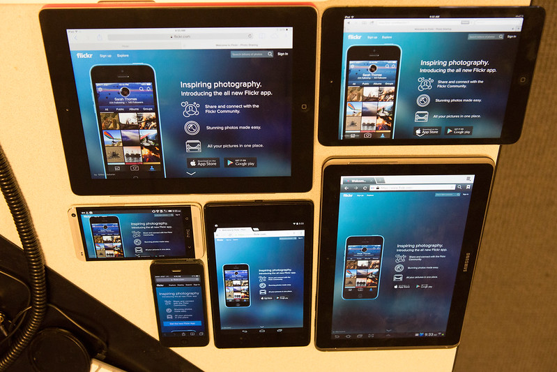
Smaller devices don’t have the bandwidth, CPU or GPU of their laptop and desktop counterparts. Additionally, they typically do not fire resize and scroll events with the same rapid interval because they are optimized for touch and inertia-based scrolling. Therefore, it is best to avoid “scroll hijacking” entirely; instead, allow users to swipe or otherwise scroll through the page as they normally would.
Given the points about video support and auto-play not being allowed, the benefits offered by controlled scrolling are largely moot on smaller devices. Users who tap on videos will find that they do play where supported, in line with their experience on other web sites. The iPad with iOS 7 and some Samsung tablets, for example, are capable of playing inline video, but the iPhone will go to a full-screen view and then return to the web page when “done” is tapped.
Without controlled scrolling and regular scroll events being fired, the parallax, blur and zoom effects are also not appropriate to use on smaller screens. Even if scroll events were fired or a timer were used to force regular updates at a similar interval, the effects would be too heavy for most devices to draw at any reasonable frame rate. The images for these effects are also fairly large, contributing to page weight.
Rendering Performance
Much of what helped for this page was covered in the 2013 article, but is worth a re-tread.
-
Do as little DOM “I/O” as possible.
-
Cache DOM attributes that are expensive (cause layout) to read. Possible candidates include
offsetWidth,offsetHeight,scrollTop,innerWidth,innerHeightetc. -
Throttle your function calls, particularly layout-causing work, for listeners attached to window scroll and resize events as appropriate.
-
Use
translate3d()for moving elements (i.e., fast parallax), and for promoting selected elements to layers for GPU-accelerated rendering.
It’s helpful to look at measured performance in Chrome’s DevTools “Timeline” / frames view, and the performance pane of IE 11’s “F12 Developer Tools” during development to see if there are any hotspots in your CSS or JS in particular. It can also be helpful to have a quick way to disable JS, to see if there are any expensive bits present just when scrolling natively and without regular events firing. JS aside, browsers still have to do layout, decode, resize and compositing of images for display, for example.
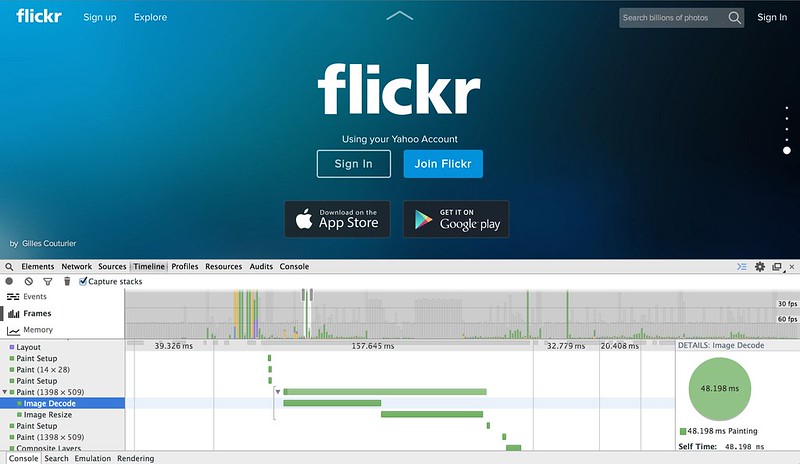
Chrome DevTools: Initial page load, and scroll-through. There are a few expensive image decode and resize operations, but overall the performance is quite smooth.
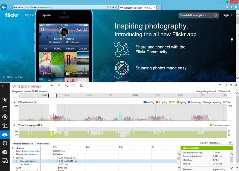
IE 11 + Windows 8.1, F12 Developer Tools: “UI Responsiveness” panel. Again, largely smooth with a few expensive frames here and there. The teal-coloured frames toward the middle are related to image decoding.
For the record, I found that Safari 7.0.3 on OS X (10.9.2) renders this page incredibly smoothly when scrolling, as seen in the demo videos. I suspect some of the overhead may stem from JS animating scrollTop. If I were to do this again, I might look at using a transition and applying something sneaky like translate3d() to move the whole page, effectively bypassing scrolling entirely. However, that would require eliminating the scrollbar altogether for usability.
What’s Next?
While a good number of Flickr users are on desktop or laptop browsers, tablets and mobile devices are here to stay. With a growing number of users on various forms of portable web browsers, designers and developers will have to work closely together to build pages that are increasingly fluid, responsive and performant across a variety of screens, platforms and device capabilities.
Did I mention we’re hiring? We have openings in our San Francisco office. Find out more at flickr.com/jobs.