Make it good.
As front-end engineers, our job is ultimately to produce and deliver the front-end “experience.” That is, in addition to the core service (eg., a photo sharing site) which you are providing, you are also responsible for replicating and maintaining the quality of the visual aesthetic, including attention to detail in your UI.
Making it really good.
It’s “the little things” – small layout changes, single-pixel margin tweaks and color fiddling done as part of this process – that can sometimes seem overly nit-picky and risk being overlooked or sacrificed in order to meet deadlines, but the result of this effort has value: It’s quite obvious when UI polish has been done, and it’s something everyone can appreciate – even if they don’t know it.
Getting the fine details down “just so” can take extra time and effort, but in my experience has always been justified – and whenever your work is under a microscope, attention to detail is a wonderful opportunity to make it shine.
An exercise in nit-picking
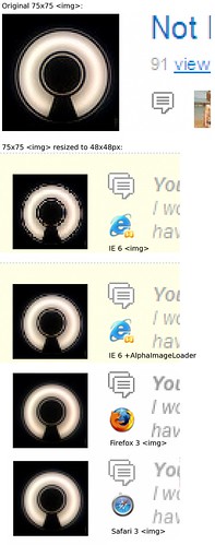
 With a recent home page redesign on Flickr, we found ourselves needing to show thumbnails for photos at a 48×48 pixel square size, smaller than the standard 75×75 square (currently the smallest available from the servers.) Interestingly (and not surprisingly), browsers differ in rendering images at non-native sizes, with some providing noticeably better results than others. Internet Explorer 6 in particular looked to be the least smooth when scaling images down, but some interesting workarounds are available.
Tweaking image resampling in IE
IE 7 supports high-quality bicubic image resampling, producing results akin to what you’d see in most image editing programs. It’s disabled by default, but you can enable it using -ms-interpolation-mode:bicubic;. It’s probably safest to apply this only to images you are explicitly showing at non-native sizes.
IE 6 is a riskier proposition, but can show improved image resizing when the AlphaImageLoader CSS filter is applied, the same filter commonly used for properly displaying PNGs with alpha transparency. For example, filter:progid:DXImageTransform.Microsoft.AlphaImageLoader (src='/path/to/image.jpg', sizingMethod='scale');. While there is no transparency to apply here, the resizing method applied gives a higher-quality result.
Further investigation
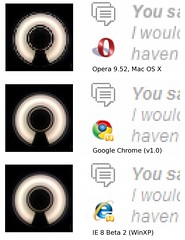
 After looking at IE 6 and 7, I was curious to see how other browsers handled image resizing. Opera is a little rough around the edges relative to others, but overall the quality of scaled images is pretty good.
Findings
UI quality is an ongoing process, the result of a shared interest between design and engineering groups in nit-picking, always trying to make things better. This particular image resizing example came out of a home page redesign, but was by no means the first use of it on the site. Despite the occasional limitations and peculiarities of the client-side, one of its upsides is its flexibility: You can often find creative solutions for just about any quirk.
