When creating a tool for the help team, one of the main things we wanted to do was find a good way to give them updates on new features and site issues. For any of you that have ever been on a help team you know that no matter how much your boss tells you it’s very important that you check your email or look at X web page for updates before each case, that’s probably not going to happen. When you are trying to get through help cases every click and keystroke counts.
So if you are supposed to check some page that only changes 1 out of 100 times you check it, it naturally falls into the list of things that you probably don’t 100% have to check. You don’t have time for that, you’ve got people to help and the queue keeps growing!
So how do you get people to look at those updates? Make it useful!
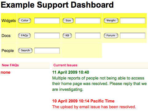
To make the page useful we tried to solve one of the other frustrations common to most help teams, the tools you need are all on different pages (maybe even managed by different teams). Go here to search for accounts, over there to search for a photo, another place to look up an ID, etc. Any search that might be needed to research a question we put all on one page. The actual tools may still reside somewhere else, but a search box is also included here so you can get to any tool you need, even the flickr.com searches for pictures and people.
Here is an example of what it looks like with a few parts and dates changed for security reasons.

Directly below the searches is “Current Issues” and new FAQs. Now that this is the page you will start at for every case, you’ll always see these updates.
But is that enough? At each stage we tried to think of our audience. If you are trying to get through cases, when you go to a page over and over you start to tune out what you don’t use. To combat that tunnel vision we rotate the color of the issue title and FAQs so it’s easier to notice that something changed. (I actually usually think of that T-Rex in Jurassic park that only sees you if you move. But don’t tell the help team that’s what I was thinking. They’re actually very nice.)
When we released it to the help team, everyone made it their homepage without the boss man having to go around and make them. Success!
