Archie Russell, Peter Norby, Saeideh Bakhshi
At Flickr our users really care about image quality. They also care a lot about how responsive our apps are. Addressing both of these concerns simultaneously is challenging; higher quality images have larger file sizes and are slower to transfer. Slow transfers are especially noticeable on mobile devices. Flickr had historically aimed for high quality at the expense of larger files, but in late 2014 we implemented a method to both maintain image quality and decrease the byte-size of the images we serve to users. As image appearance is very important to our users, we performed an extensive user test before rolling this change out. Here’s how we did it.
Background: JPEG Quality Settings
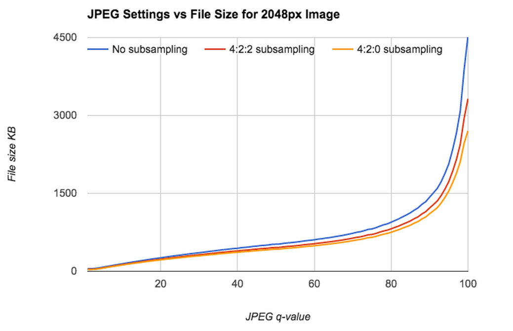
Fig 1. JPEG settings vs file size for a test image.
JPEG compression has several tuneable knobs. The q-value is the best known of these; it adjusts the level of spatial detail stored for fine details; a higher q-value typically keeps more detail. However, as q-value gets very close to 100, file size increases dramatically, usually without improving image appearance.
If file size and app performance isn’t an issue, dialing up q-value is an easy way to get really nice-looking images; this is what Flickr has done in the past. And if appearance isn’t very important, dialing down q-value is a viable option. But if you want both, you’re kind of stuck. Additionally, q-value isn’t one-size-fits-all, some images look great at q-value 80 while others don’t.
Another commonly adjusted setting is chroma-subsampling, which alters the amount of color information stored in a JPEG file. With a setting of 4:4:4, the two chroma (color) channels in a JPG have as much information as the luminance channel. In an image with a setting of 4:2:0, each chroma channel has only a quarter as much information as in an a 4:4:4 image.
 q=96, chroma=4:4:4 (125KB) q=96, chroma=4:4:4 (125KB) |
 q=70, chroma=4:4:4 (67KB) q=70, chroma=4:4:4 (67KB) |
 q=96, chroma=4:2:0 (62KB) q=96, chroma=4:2:0 (62KB) |
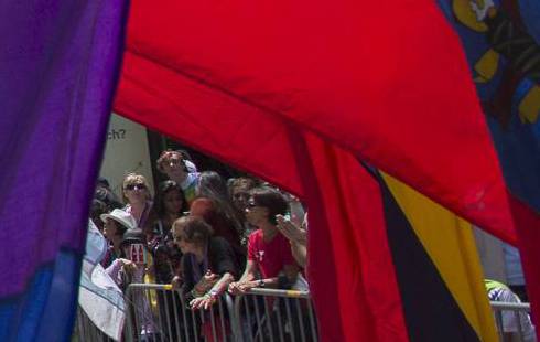 q=70, chroma=4:2:0 (62KB) q=70, chroma=4:2:0 (62KB) |
Table 1: JPEG stored at different quality and chroma levels. The upper left image is saved at high quality and chroma level; notice the color and detail in the folds of the red flag. The lower right image has the lowest quality; notice artifacts along the right edges of the red flag.
Perceptual JPEG Compression
Ideally we’d have an algorithm which automatically tuned all JPEG parameters to make a file smaller, but which would limit perceptible changes to the image. Technology exists that attempts to do this and can decrease image file size by 30-50%. This compression ratio is highly dependent on image content and dimensions.
 |
 |
| compressed: 112KB | non-compressed: 224KB |
Fig 2. Compressed cropped JPEG is 50% smaller than not-compressed cropped JPEG, above, with no obvious defects. Compression ratio is similar for a compressed 2048-pixel wide JPEG (475KB) of the entire scene and its corresponding not-compressed JPEG (897KB).
We were pleased with perceptually compressed images in non-structured examinations. The compressed images were smaller and nearly indistinguishable from their sources. But we wanted to really quantify how well the technology worked before considering incorporating it into Flickr. The standard computational tools for evaluating compression, such as SSIM, are fairly simplistic and don’t do a great job at modeling how a user sees things. To really evaluate this technology had to use a better measure of perceptibility: human minds.

To test whether our image compression would impact user perception of image quality, we put together a “taste test.” The taste test is constructed as a game with multiple rounds where users look at both compressed and uncompressed images. Users accumulate points the longer they play, and get more points for doing well at the game. We maintained a leaderboard to encourage participation and used only internal testers.The game’s test images came from a diverse collection of 250 images contributed by Flickr staff. The images came from a variety of cameras and included a number of subjects from photographers with varying skill levels.

Fig 3. A sampling of images used in our taste test.
In each round, our test code randomly select a test image, and present two variants of this image side by side. 50% of the time we present the user two identical images; the rest of the time we present one compressed image and one uncompressed image. We ask the tester if the two images look the same or different and we’d expect a user choosing randomly OR a user unable to distinguish the two cases would answer correctly about half the time. We randomly swap the location of the compressed images to compensate for user bias to the left or the right. If testers choose correctly, they are presented with a second question: “Which image did you prefer, and why?”
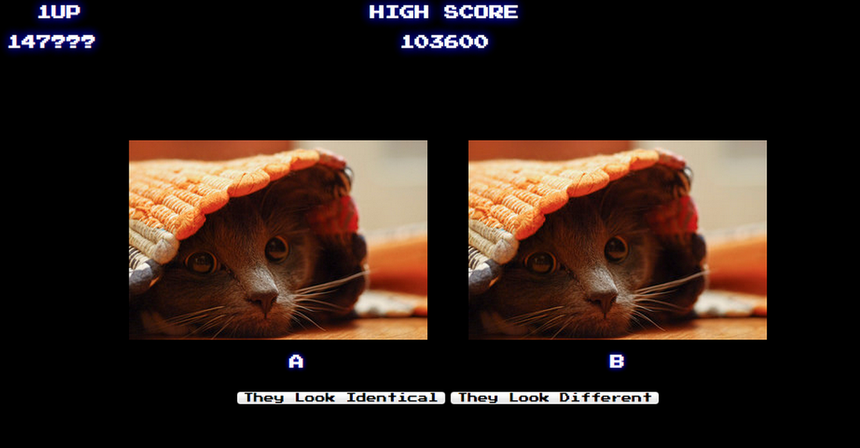
Fig 4. Screenshot of taste test.
Our test displays images simultaneously to prevent testers noticing a longer load time for the larger, non-compressed image. The images are presented with either 320, 640, or 1600 pixels on their longest side. The 320 & 640px images are shown for 12 seconds before being dimmed out. The intent behind this detail is to represent how real users interact with our images. The 1600px images stay on screen for 20 seconds, as we expect larger images to be viewed for longer periods of time by real users. We award 100 points per round, regardless of whether a tester chose correctly and also award a bonus of 400 points when a tester correctly identifies whether images were identical or different. We update the tester’s score every five tests so that the user perceives an increasing score without being rewarded immediately for any particular behavior.
Taste Test Outcome and Deployment
We ran our taste test for two weeks and analyzed our results. Although we let users play as long as they liked, we skipped the first result per user as a “warm-up” and considered only the subsequent ten results, this limited the potential for users training themselves to spot compression artifacts. We disregarded users that had fewer than eleven results.
| images | total results | # labeled “identical” by tester | % labeled “identical” by tester |
| two identical images | 368 | 253 | 68.8% |
| one compressed, one non-compressed | 352 | 238 | 67.6% |
Table 2. Taste test results. Testers select “identical” at nearly the same rate, whether the input is identical or not.
When our testers were presented with two identical images, they thought the images were identical only 68.8% of the time(!), and when presented with a compressed image next to a non-compressed image, our testers thought the images were identical slightly less often: 67.6% of the time. This difference was small enough for us, and our statisticians told us it was statistically insignificant. Our image pairs were so similar that multiple testers thought all images were identical and reported that the test system was buggy. We inspected the images most often labeled different, and found no significant artifacts in the compressed versions.
So even in this side-by-side test, perceptual image compression is just barely noticeable when images are presented side-by-side. As the Flickr website wouldn’t ever show compressed and uncompressed images at the same time, and the use of compression had large benefits in storage footprint and site performance, we elected to go forward.
At the beginning of 2014 we silently rolled out perceptual-based compression on our image thumbnails (we don’t alter the “original” images uploaded by our users). The slight changes to image appearance went unnoticed by users, but user interactions with Flickr became much faster, especially for users with slow connections, while our storage footprint became much smaller. This was a best-case scenario for us.
Evaluating perceptual compression was a considerable task, but it gave the confidence we needed to apply this compression in production to our users. This marked the first time Flickr had adjusted image settings in years, and, it was fun.
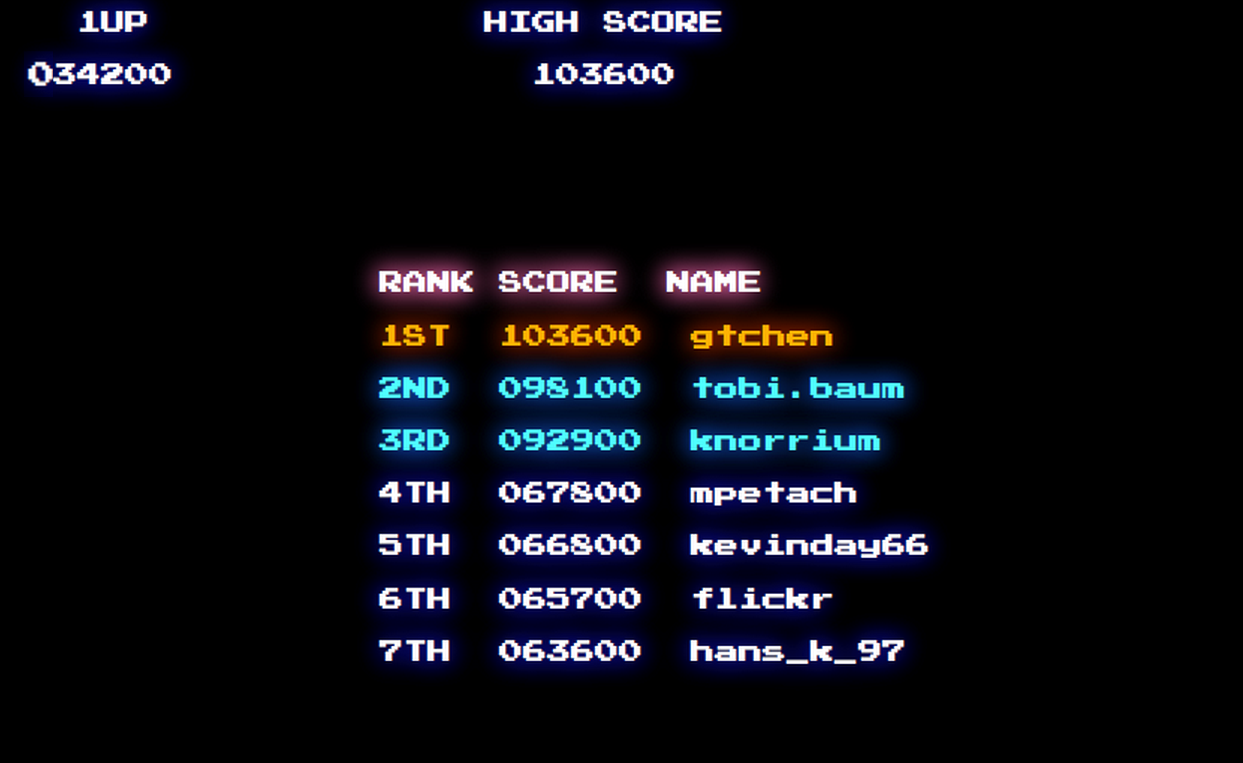
Fig 5. Taste test high score list
Epilogue
After eighteen months of perceptual compression at Flickr, we adjusted our settings slightly to shrink images an additional 15%. For our users on mobile devices, 15% fewer bytes per image makes for a much more responsive experience.We had run a taste test on this newer setting and users were were able to spot our compression slightly more often than with our original settings. When presented a pair of identical images, our testers declared these images identical 65.2% of the time, when presented with different images, of our testers declared the images identical 62% of the time. It wasn’t as imperceptible as our original approach, but, we decided it was close enough to roll out.
Boy were we wrong! A few very vocal users spotted the compression and didn’t like it at all. The Flickr Help Forum had a very lively thread which Petapixel picked up. We beat our heads against the wall considered our options and came up with a middle path between our initial and follow-on approaches, giving us smaller, faster-to-load files while still maintaining the appearance our users expect.
Through our use of perceptual compression, combined with our use of on-the-fly resize and COS, we’ve been able to decrease our storage footprint dramatically, while simultaneously improving user experience. It’s a win all around but we’re not done yet — we still have a few tricks up our sleeves.
