Introducing the New! Shiny! Photolist framework

Blue skies. Mostly.
Here at Flickr, we have photos. Lots of photos. Like, billions and billions of photos. So, it’s pretty important for us to be able to show you more than one at once.
We have used what we call the “justified algorithm” to lay out photos for a while now, but as we move more and more pages onto our new-ish isomorphic node.js stack, we determined it was time to revisit the algorithm and create an updated implementation.
A few of us here in Frontend-landia got together to figure out all the things this new shiny should be able to do. With a lot of projects in full swing and on the near horizon, we came up with a pretty significant list, including but not limited to:
– Easy for developers to use
– Fit into any kind of container
– Support pagination (in both directions!) and infinite scroll
– Jank-free, butter-silky-baby-smooth scrolling
– Support layouts other than justified, like square thumbnails and grid layout with native aspect ratio
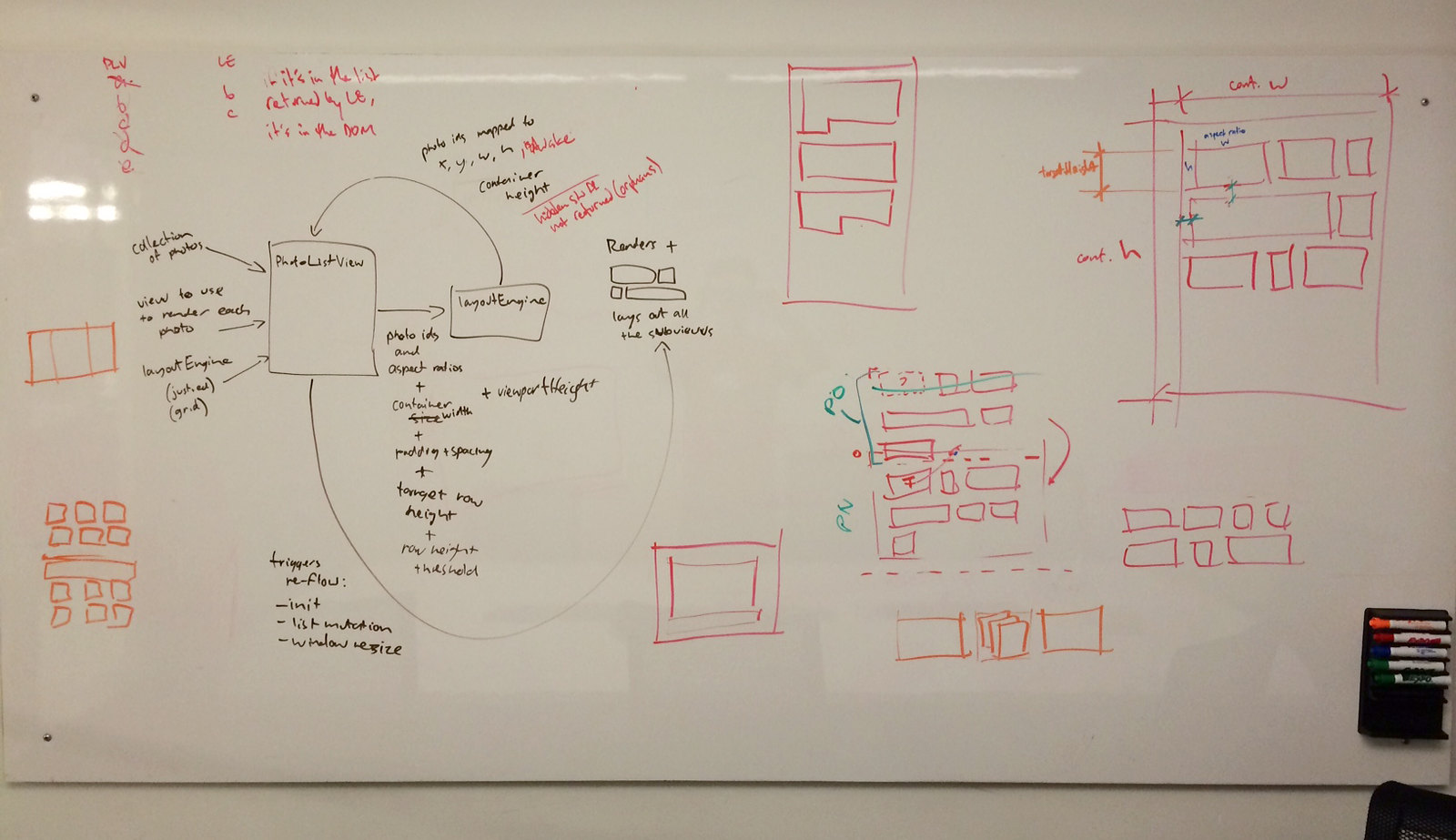
After some brainstorming, drawing of diagrams, and gummi bear consumption, we got to work building out the framework and the underlying algorithm.
Rejustification
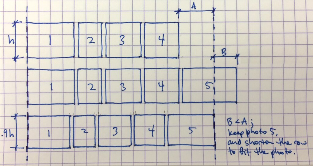
The basics of the justified algorithm aren’t too complex. The goal is for the layout module to accept a list of photo aspect ratios, and return a list of rectangles. A layout consists of a number of rows of items (photos), each with a target height and allowable height deviation above and below. This, along with the container width, gives us a minimum and maximum row aspect ratio.

Fig. 1: The justified algorithm: dimensions
We push each photo into a row; once the row is filled up, we move on to the next. It goes a little something like this:
- Iterate over each photo in the list to display
- Create a new row if there’s not currently an open row
- Attempt to add the photo to the current row at its native aspect ratio and at the target row height
- If the new row aspect ratio is less than the minimum row aspect ratio, continue adding photos until the aspect ratio is greater than the maximum aspect ratio
- Either keep or drop the last added photo, depending on which generates a row aspect ratio closer to the target row aspect ratio; adjust the row height as needed, and seal the row
- Repeat until all the photos have been laid out.

Fig. 2: The justified algorithm: row filling
It’s Never That Easy…
The justified algorithm described above is the primary responsibility of the layout module. In practice, however, there are a number of other things the layout must handle to get good results for all use cases, and to communicate the results to other parts of the framework.
Diffs
One key feature of the layout module is how it organizes its results. To minimize the amount of processing required to update photos as the layout changes, the layout module returns pre-sorted diffs, each with a specific purpose:
- new items, used to create new photos and put them in place
- layout-changed items, used to resize/reposition existing photos
- visibility-changed items, used to wake/sleep existing photos
- widows and orphans (leading and trailing items) (read on!)
The container view can process only the parts of the layout response that are necessary, given the current state of the whole framework, to keep processing time down and keep performance up.
Widows and orphans

Annie the Musical, by Eva Rinaldi
Some photolist pages on Flickr use infinite scrolling, and some display results one page at a time. Regardless of how a page shows its photos, it starts to feel messy when there is an incomplete row of photos hanging off the end of the page. If there is more content in the set, the last row should be full. However, since we fetch photos from the API in fixed batch sizes, things don’t always work out so nicely, leaving “leftovers” in the bottom row. Borrowing from typesetting terminology, we call these leftover photos orphans. (We can also paginate backwards; leftovers at the top are technically widows but we’ll just keep using the term orphans for simplicity.)
The layout notes these incomplete rows and hides them from the rest of the framework until the next page of content loads in. (This led to frequent and questionable metaphors about “orphan suppression” and “orphan rehydration.”) When orphans are to be hidden, the layout simply keeps them out of the diff. When the orphans are brought back in as the next page loads, the layout prepends them to the next diff. The container view is none the wiser.
This logic gets even more fun when you consider that it must perform in all of these use cases:
- fixed page size (book-style) pagination
- downward-scrolling infinite pagination
- upward-scrolling infinite pagination (enter into an “infinite” content set somewhere other than the beginning); this requires right-to-left layout!
There’s also the case of the end of an “infinite” content set (scrolling down to the end or up to the beginning); in these cases, we still want the row to appear complete, and still must maintain the native aspect ratio of the photo. Therefore, we allow the row height to grow as much as it needs in this case only.
Bonus Round!
You might have noticed that Flickr is kind of a big site with, like, lots of photos. And we display photos in lots of different ways, with lots of different use cases. The photolist framework bends over backwards to support all of those, including:
- forward and backward pagination
- infinite scroll and fixed page-size pagination
- specific aspect ratios (e.g. squares)
- fixed number of rows
- fast relayout (only a few milliseconds for thousands of photos)
Going into detail on each of those features is way beyond the scope of this blog post, but suffice it to say the framework is built to handle just about anything Flickr can throw at it. The one exception is the upcoming Camera Roll (coming soon to those of you who don’t yet have it!), which is Too Extreme for this framework, so we devised something special just for that page.
The whole enchilada
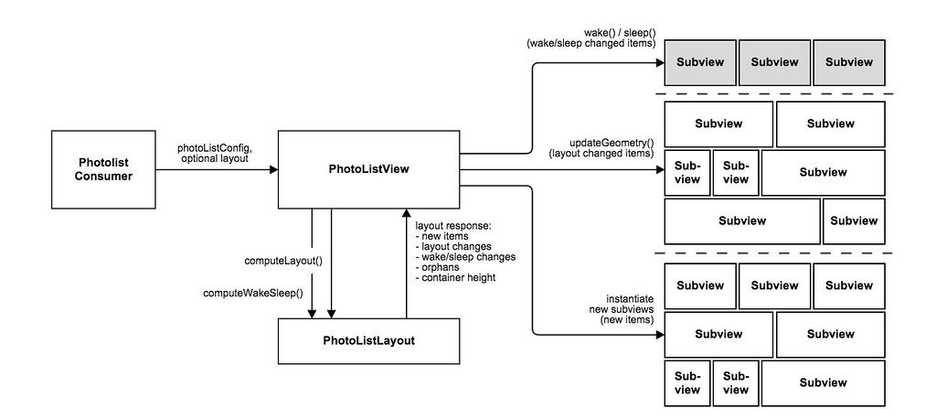
The layout is at the heart of the photolist framework, but wait — there’s more! The main components of the framework are the layout (dissected above), the container view / controller, and the subviews (usually containing photos).

Fig. 3: Relationship of view/controller, layout, and subviews, and changing subview states during downward scroll
The container view does a lot of fancy things, like:
- loading in photos as you scroll down or paginate
- triggering a relayout when the container size changes (i.e. when you resize your window)
- matching up server-rendered HTML with clientside JavaScript objects (see isomorphic JavaScript, and an upcoming blog post about the Hermes stack at Flickr).
Its primary job, though, is to act as the conduit between the layout module and the individual subviews.
Every time a layout is processed or changes, it returns a “layout response” to the container view. The layout response contains a list of rectangles and wake/sleep flags (actually, a list of lists; see Diffs above); the container view relays that new information on to each individual subview to determine position and visibility. The container view doesn’t even need to know about the layout details — each subview adjusts itself to its layout data all on its own.
The subviews each have a decent amount of intelligence of their own, performing such tasks as:
- choosing the most appropriate photo file size to fit the layout rectangle
- adding/removing itself to/from the DOM as instructed by the layout to maintain good scroll performance
- providing an annotation and interaction layer for titles, faves, comments, etc.
Coming soon to a webpage near you
The new photolist framework is certainly not a one-size-fits-all solution; it’s tailored for Flickr’s specific use cases. However, we tried to design and build it to be as broadly useful for Flickr as possible; as we continue to move parts of the site onto the new frontend stack and innovate new features, it’s critical to have solid components upon which we can build Flickr’s future. The layout algorithm is probably useful for many applications though, and we hope you gained some insight into how you might implement your own.
The photolist framework is already live in a number of places on the site, including the new Unified Search pages (currently in Beta), the Create / Wall art pages, the Group pool preview, and is coming soon to a number of other pages.
As always, if you’re interested in helping with that “and more” part, we’d love to have you! Stop by our jobs page and drop us a line.


