Web Ops Visualizations Group on Flickr

Like lots of operations people, we’re quite addicted to data pr0n here at Flickr. We’ve got graphs for pretty much everything, and add graphs all of the time. We’ve blogged about some of how and why we do it.

One thing we’re in the habit of is screenshotting these graphs when things go wrong, right, or indifferent, and adding them to a group on Flickr.

Xmas lights on Front Page

I’ve decided to make a public group for these sort of screenshots, for anyone to contribute to:

http://flickr.com/groups/webopsviz/

You should realize before posting anything here, that you might want to think about if you want everyone in the world to see what you’ve got. I’ve made a quick FAQ on the groups page, but I’ll repeat it here:

Q: What is this?
A: This group is for sharing visualizations of web operations metrics. For the most part, this means graphs of systems and application metrics, from software like ganglia, cacti, hyperic, etc.

Q:Who gets to see this?
A: This is a semi-public group, so don’t post anything you don’t want others to see.

For now, it’ll be for members-only to post and view. Ideally, I think it’d be great to share some of these things publicly.

Q: What’s interesting to post here?
A: Spikes, dips, patterns. Things with colors. Shiny things. Donuts. Ponies.

Q: My company will fire me if I show our metrics!
A: Don’t be dense, and post your pageview, revenue, or other super-secret stuff that you think would be sensitive. Your mileage may vary.

So: you’ve got something to brag about? How many requests per second can your awesome new solid-state-disk database do? You got spikes? Post them!

Machine Tag Hierarchies

Untitled Compass #1228516024

something:somethingelse=somethingspecific

With apologies to Jeremy Keith

If you’re not already familiar with machine tags the easiest way to think of them is being like a plain old tag but with a special syntax that allows users to define additional structured data about that tag. If you’d like to know more, the best place to start is the official announcement we made about machine tags in the Flickr API group.

If you want to know even more, still, take a look at:

Okay! Now that everyone is feeling warm and fuzzy about machine tags: We’ve added (4) new API methods for browsing the hierarchies of machine tags added to photos on the site. These are aggregate rollups of all the unique namespaces, predicates, values and pairs for public photos with machine tags.

For example, lots of people have added exif: related machine tags to their photos but there hasn’t been a way to know what kind of EXIF data has been added: exif:model? exif:focal_length? exif:tunablaster? Or what about all the planespotters who have been diligently adding machine tags to their photos using the aero namespace: What are the predicates that they’re tagging their photos with?

Those are the sorts of things these methods are designed to help you find. Sort of like wildcard URLs but for metadata instead of photos. Uh, sort of.

Untitled Future #1223665161

Anyway, the new methods are:

flickr.machinetags.getNamespaces

This returns a list of all the unique namespaces, optionally bracketed by a specific predicate. For example, these are all the namespaces that have an airport predicate:

# ?method=flickr.machinetags.getNamespaces&predicate=airport

<namespaces predicate="airport" page="1" total="2" perpage="500" pages="1">
	<namespace usage="1931" predicates="1">aero</namespace>
	<namespace usage="3" predicates="1">geo</namespace>
</namespaces>
		

flickr.machinetags.getPredicates

Like the getNamespaces method this returns a list of all the unique predicates, optionally bracketed by a specific namespace. For example, these are all the predicates that use the dopplr namespace:

			
# ?method=flickr.machinetags.getPredicates&predicate=dopplr

<predicates namespace="dopplr" page="1" total="4" perpage="500" pages="1">
	<predicate usage="4392" namespaces="1">tagged</predicate>
	<predicate usage="1" namespaces="1">traveller</predicate>
	<predicate usage="7780" namespaces="1">trip</predicate>
	<predicate usage="4269" namespaces="1">woeid</predicate>
</predicates>
		

flickr.machinetags.getValues

At this point, the pattern should be pretty straightforward. This method returns all the unique values for a specific namespace/predicate pair. For example, these are some of the values associated with the aero:tail machine tag (yes, really, airplane tail models!):

# ?method=flickr.machinetags.getValues&namespace=aero&predicate=tail
		
<values namespace="aero" predicate="tail" page="1" total="1159" 
	perpage="500" pages="3">
	<value usage="1">01-0041</value>
	<value usage="1">164993</value>
	<value usage="2">26000</value>
	<value usage="1">4k-az01</value>
	<value usage="1">4l-tgl</value>
	<value usage="1">4r-ade</value>
	<!-- and so on... -->
</values>
		

flickr.machinetags.getPairs

Finally, the getPairs method returns the list of unique namespace/predicate pairs optionally filtered by namespace or predicate.

Rather than including yet-another giant blob of XML, here’s a pretty picture of the metro stations in Munich instead:

ubahn

A few things to note

Certain namespace/predicate pairs have been special-cased to return a single value. As of this writing they are:

  • geo:lat (and variations)
  • geo:lon (and variations)
  • file:name
  • file:path
  • anything:md5

If people have particular reasons for needing or wanting these we’re open to the idea but otherwise the cost of storing all the variations and the dubious uses for returning them in the first place made us decide to exclude them.

Now what?

Some people take sandcastles pretty seriously...

photo by Daveybot

Well, that’s what we’re hoping you’ll tell us. Machine tags have been chugging away quietly since we announced them almost two years ago and despite being a bit nerd-tastic and awkward to explain we’ve been thrilled to see how people have been finding their own use for them.

And the list goes on.

The trick with machine tags has always been to make them both invisible (or at least barely visible) to those people who don’t care about them but also as easy as tags to pick up and use for those people who do or who wonder whether they might be the tool they were looking for. One thing we didn’t do very well, though, until the release of the machine tag hierarchy APIs was give people a way to learn about machine tags. The only way to find out which machine tags people were using was to hop-scotch your way around people’s photostreams or to be part of a larger community having a discussion about which tags to use. Oops.

Which is why it was extra-fantastic when a few short days after we announced the machine tag hierarchy methods on the API list, the ever prolific and awesome Paul Mison wrote back and said:

The obvious thing to build on top of these … is some sort of graphical machine tag browser, a bit like the Mac OS X / iPod column view browser. So I did.

http://husk.org/code/machine-tag-browser.html

This is entirely self-contained in one file (except for loading jQuery from Google and (cough) the pulser from Flickr). It uses JavaScript to get a full list of namespaces, giving you the option to drill down into predicates and the values available for that namespace/predicate pair.

We’re hoping that this provides a little more raw material to play with and maybe find some magic and that you’ll tell us what comes next.

Yay!

Oh yeah, the actual API methods

Enjoy!

In the coming weeks we’ll also try to gather most of the blog posts and other writings about machine tags and put them with the rest of the API documentation.

Lightweight Layout Management in Flash

Resizable apps are groovy. Users want content to fill the screen, and as the variance in screen resolutions has grown this has become more and more important. To make this happen you can either write manual positioning code to place and size items on window resize, or you can define a hierarchy, some properties on elements of the hierarchy and have a layout engine do the work for you. Up until a few years ago, there were no good pre-built solutions to do this in Flash so the only option was to roll your own framework. Nowadays there are several floating around, including this one from the flash platform team at Yahoo!, and of course there is the Flex/MXML route.

XML based UI markup seems to be all the rage these days, but what I found personally through my experience building the jumpcut tools is that this “responsible” approach has drawbacks. A hierarchy of HBoxes and VBoxes can be a lot of overhead for simple projects, and can become unwieldy and rigid when you are trying to develop something quickly. If you are doing anything weird in your UI (overlapping elements, changing things at runtime) it can also feel like trying to fit a square peg in a round hole.

The Best of Both Worlds

So is there any way to get at a sweet-spot, something quick and flexible, yet powerful? The first thing that probably comes to mind if you are a web developer is the CSS/HTML model. In fact, I think would be a rather good option if not for one missing piece, the unsung hero of the web: the HTML rendering engine. If anyone wants to implement Gecko or WebKit in ActionScript I think that would be a fun project, but because the web ecosystem evolved with the markup user and not the layout engine implementer in mind it’s rather complicated. There is also the fact that this model is based on the assumption of a page of fixed width but infinite height which doesn’t exactly suit our purposes.

What we can borrow though is the philosophy of good defaults and implicit rather than explicit layout specification. When you are building out a layout with HTML/CSS you can just drop stuff on the page and things more or less work and resize as you’d expect, then selectively you can move things around / add styling and padding and so on. To do something similar we can take advantage of one of the nice new features of Actionscript 3, the display hierarchy, which allows us to easily traverse, observe, and manage all the DisplayObjects at run time, without keeping track of them on our own as they are created. This way we can recurse through the tree, look for the appropriate properties, and apply positioning and sizing as necessary. If the properties don’t exist we’ll just leave things alone. When you start your project you can just write code to position stuff manually, then as things get more complex and start to solidify you can begin using layout management where it makes sense. I’m a bit of a commitment-phobe myself, so this really appeals to me; what’s especially nice is that you easily plug this in to any existing codebase.

Some Code

So, to get this working all we really need is a singleton that listens to the stage resize event, traverses the tree and places/sizes objects. Mine looks something like this:

  
/*..*/
stage.addEventListener(Event.RESIZE, this.onResize);
/*..*/
 
function onResize(e:Event){
	this.traverse(root);
}
 
function traverse(obj:DisplayObject){

	for (var i=0; i  < obj.numChildren; i++){

		var child = new LayoutWrapper(obj.getChildAt(i));
		if(child.no_layout)
			continue;
	   
		//layout code to determine how to place and size children
		//child.x = something
		//child.y = something


		child.setSize(W, H); // pre-order


		this.traverse(child);

		child.refresh(); // post-order
	   
	}
}


Two things of note here.
First is the LayoutWrapper which I use to set defaults for properties and functions that don’t necessarily exist on all objects, so sort of like slipping in a base class without having to alter any code. I use flash_proxy to make this easier, but you don’t have to do that. One thing you will want to do is store dummy values for width and height (something like _width and _height maybe as a throwback) so you can assign and keep track of the width and height of container elements without actually scaling the object. You’ll also want to decide how you want to handle turning on / off the layout management and what defaults make sense for you. In the above code I’m doing opt-out, using a no_layout variable to selectively turn off layout management where I don’t need it.
Second, I have two hooks for sizing, setSize on the way down, and refresh on the way up. This is useful in some cases because what you want to do at higher levels may depend on the size of children at lower levels which can change on the way down.
The layout code itself is outside the scope of this blog post, but I’ve found that a vertical stack container, a horizontal stack container, padding, and spacing is all I’ve needed to accomplish just about any UI. Of course, you can and should implement any layout tools that are useful to you; different projects may call for different layout containers and properties.

Some Fun

One thing that we are doing by using this approach is pushing the specification of the display tree into run-time. The analogy with HTML here is the part of the DOM that is generated by visible source vs the part of the DOM that is generated by JavaScript.
Going all cowboy like this does have its drawbacks. Specifically it can get a bit confusing as to what the tree looks like, or why this or that is not showing up, where is this Sprite attached, etc. Web developers have the Firebug inspect tool for a very similar problem, which I’ve found rather handy. We can get a poor-man’s version of something like this by writing some code that pretty prints the tree under an object on rollover or use the Flex debugger, but, depending on the size of your project, this can get unwieldy rather quickly.

As an excuse to play with the groovy new flare visualization library recently I tried pointing it at the display tree. The result is rather useful for debugging, especially if you have a lot of state changes / masking / weirdness (plus you look like you are using a debugging tool from the friggin future). Some nice things I’ve added: on roll over the object gets highlighted, I can see an edit some basic properties and see them update live. There’s quite a bit of room here to do something Firebug like, with drag and drop reparenting and the like (but be careful, not too interesting or you’d wind up reimplementing the Flash IDE).

If you’d like to try this yourself, this is the code to populate the flare data structure with the display tree:

public function populateData(){
	// create data and set defaults
	this.graph = new Tree();
	var n = this.graph.addRoot();
	n.data.label = String(root);
	this.populateDataHelper(n, root);
}

 
public function populateDataHelper(n, s){

	try{ // need this in case of TextFields
		var num_children = s.numChildren;
	}
	catch(e:Error){
		return;
	}
	
	//limit in case you have extremely long lists 
	//which can dominate the display
	num_children = num_children < 20 ? num_children : 20; 

	for(var i=0; i  < num_children; i++){
		var child = s.getChildAt(i);

		if(
		child != this //don't show the layout visualizer itself!
		&& child.visible //don't show items that are not visible
		){
			var c = this.graph.addChild(n);
			c.data.sprite = child;
			c.data.label = String(child);
			this.populateDataHelper(c, child)
		}
	}
  
}

Then just apply a visualization to this tree; I've been simply using the demo examples which has been sufficient for my uses, but obviously you can write your own as well.

Here it is in action on the flickr slideshow:

Boundaries, a tool to explore Flickr’s shapefiles

A few weeks ago we released our shapefiles via the API, and while most people were excited, some folks were a bit confused about what it all meant. Which is why Tom Taylor’s beautiful Boundaries application is so exciting. It helps you visualize the Flickr community’s twisty changing complex understanding of place.

You throw in a place name and it’ll attempt to find that place’s neighbours, using Yahoo GeoPlanet. For each of those neighbours, it uses the WOE ID to fetch and render the polygon from shapefile that Flickr returns.Tom Taylor: Flickr boundaries, now free to play with

Boundaries

5 Questions for Gustavo

Following our second interview Kellan snuck in 5 Questions for Paul Mison before I managed to tap Jim’s suggestion of Gustavo.

I think Drift Words sums Gustavo up nicely with “Although he’s far too clever, he makes up for it by using his polymath powers for good.” … and charts and stunning graphs. It’s always a pleasure to see what Gustavo comes up with.

And on that note …

1. What are you currently building that integrates with Flickr, or a past favorite that you think is cool, neat, popular and worth telling folks about? Or both.

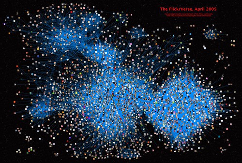
Gustavo: First of all I must say: I’m not really a flickr tool developer. The only real tools I created are the quite minimalistic FlickRandom and Contact Crossing (very kindly hosted by Jim Bumgardner). Rather, I use flickr’s API to mine flickr’s database for interesting information, usually leading to some visualizations or at the very least a bunch of graphs.

The FlickrVerse, April 2005 poster: flickr's social network

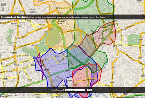
One such visualization led to a browser for exploring related groups. Not a full-fledged tool since it explores static and outdated data.

In other words, what I do with flickr’s API is not tool development but analyses, trying to figure out the structure and dynamics of flickr’s social network, group content and participation, etc. The most recent analysis I performed attempted to understand how exposure to photo content flows through the contact network. Starting from a basic pattern combining three types of network relations, I quantified the importance of a user’s social network in determining his or her exposure to content of interest.

2. What are the best tricks or tips you’ve learned working with the Flickr API?

Gustavo: Cache, cache, cache. Depending on what you want to do, you might find yourself retrieving certain bits repeatedly, and you’ll definitely want to build a good local cache. Be careful though, as it’s all too easy to underestimate the size and complexity of the data. Your cache might unexpectedly morph from a speed asset to a sluggish monster.

Another potential problem from underestimating the size and complexity of the data is that you might suddenly discover that your code issued many more API calls than you expected. Remember to play nice, and keep an eye on your API key usage graphs.

Expect unexpected responses: It’s always good to make the code smart enough to realize the server’s response is not exactly what was expected, be it in completeness, format, special characters in free text, etc.

Finally, still on the theme of unexpected responses: Grow a thick skin, as there will always be someone who will misinterpret your motives for developing a tool that “uses” their information.

3. As a Flickr developer what would you like to see Flickr do more of and why?

Gustavo: Let me suggest two: one very simple, the other very complex.
The simple one is a “no special perms” authentication level. For some purposes, as a developer I’d like to have the user authenticate for the sole purpose of knowing who they are – I might want to give certain results for their eyes only, or someone else might want to allow certain actions to happen just once per user, etc. At the moment, the minimal level of authentication requires that the user entrust the developer with access to private data. Many users will rightfully decline giving such access, and as a developer I’d rather not have to even request and disclaim, when I don’t need it.

The more complex one requires a bit of background. Almost four years ago, there were various discussion threads on the topic of finding interesting content. Back then I took a stab at using network information to discover interesting photos – first looking for people who post similar stuff, then looking for people who share faved photos (which striatic called neighbors) and finally, actual photo suggestions.

neighbors

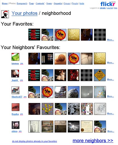
As an aside, the algorithm worked quite well even for people with a hundred or so favorites (I had just 21 faves!); people today have many thousand favorites – a very rich data set to start from. I went on to produce suggestion lists for many people, but that was always me, manually running scripts. Since then, other developers created interesting tools for content-driven content discovery, including Flickr Cross-Recommendations, inSuggest and flexplore.

flexplore 2.1 beta

The reason I never tried to create a stand-alone tool for this is that I quickly realized that to make it work reasonably fast, I essentially needed to replicate flickr’s database. If you take all my favorites, then list all the people that faved those photos, and finally enumerate all their favorites… and you then repeat this exercise for whoever requests it, you either need to use many thousand API calls per visitor (and wait!), or you need to create a huge cache, covering unpredictably disparate segments of flickr’s database. A massive cache that would grow stale very quickly unless people used the tool continuously. If you try to include extra information into the scoring scheme (say tags, color data, group membership…) the network use and storage requirements grow even worse. In other words, this project appears to be completely unsuitable for a developer without direct access to flickr’s database… and flickr’s content suggestion system (Explore) doesn’t provide any personalization tools: we all see the same.

The only effective solution I can suggest (beyond flickr developing a personalized Explore, or flickr sandboxing third party developers) is the creation of high level API calls, embodying some method of complex querying into the database. For example: A higher level API call could accept a list of users as query, and return a list of photos sorted by the number of people (from the query list) who faved them. With the current API, one has to retrieve the full favorites list for each person, collate the results, and discard the vast majority of the information that was transferred. A higher level API method could make such intermediary results invisible and save much bandwidth, latency and data replication.

Hey, you asked. ;)

4. What excites you about Flick and hacking? What do you think you’ll build next or would like someone else to build so you don’t have to?

Gustavo: There’s a number of things that attract me to flickr hacking. There’s of course the vast and ever-growing amounts of data, and the fact that it’s not “more of the same”: The diversity of data types (photos, users, metadata, groups, etc) and relations make this complex system fascinating to study. There is also the human side: People really care about their stuff. People get excited, for example, when they recognize their user icon in a visualization of the social network, and immediately want to explore around. Last but not least, I really appreciate the openness of the flickr API. I’m amazed that such wealth of information is shared so freely!

Free association, first page

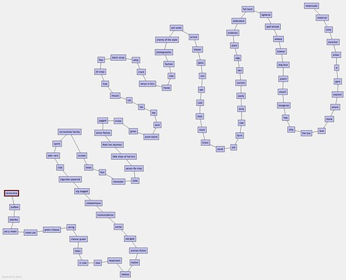
As for “what next”, I have a couple of ideas. I’ll only hint that the word association analysis was a fun first step. :)

5. Besides your own, what Flickr projects and hacks do you use on a regular basis? Who should we interview next?

Gustavo: dopiaza as Utata‘s architect.

Dan: Thank you, Gustavo. Next up (unless Kellan gets in first!) dopiaza.

Images from GustavoG,
striatic and malanalars.

On UI Quality (The Little Things): Client-side Image Resizing

Make it good.

As front-end engineers, our job is ultimately to produce and deliver the front-end “experience.” That is, in addition to the core service (eg., a photo sharing site) which you are providing, you are also responsible for replicating and maintaining the quality of the visual aesthetic, including attention to detail in your UI.

Making it really good.

It’s “the little things” – small layout changes, single-pixel margin tweaks and color fiddling done as part of this process – that can sometimes seem overly nit-picky and risk being overlooked or sacrificed in order to meet deadlines, but the result of this effort has value: It’s quite obvious when UI polish has been done, and it’s something everyone can appreciate – even if they don’t know it.

Getting the fine details down “just so” can take extra time and effort, but in my experience has always been justified – and whenever your work is under a microscope, attention to detail is a wonderful opportunity to make it shine.

An exercise in nit-picking

Resized images between different browsersWith a recent home page redesign on Flickr, we found ourselves needing to show thumbnails for photos at a 48×48 pixel square size, smaller than the standard 75×75 square (currently the smallest available from the servers.) Interestingly (and not surprisingly), browsers differ in rendering images at non-native sizes, with some providing noticeably better results than others. Internet Explorer 6 in particular looked to be the least smooth when scaling images down, but some interesting workarounds are available.

Tweaking image resampling in IE

IE 7 supports high-quality bicubic image resampling, producing results akin to what you’d see in most image editing programs. It’s disabled by default, but you can enable it using -ms-interpolation-mode:bicubic;. It’s probably safest to apply this only to images you are explicitly showing at non-native sizes.

IE 6 is a riskier proposition, but can show improved image resizing when the AlphaImageLoader CSS filter is applied, the same filter commonly used for properly displaying PNGs with alpha transparency. For example, filter:progid:DXImageTransform.Microsoft.AlphaImageLoader (src='/path/to/image.jpg', sizingMethod='scale');. While there is no transparency to apply here, the resizing method applied gives a higher-quality result.

Further investigation

Resized images between different browsersAfter looking at IE 6 and 7, I was curious to see how other browsers handled image resizing. Opera is a little rough around the edges relative to others, but overall the quality of scaled images is pretty good.

Findings

UI quality is an ongoing process, the result of a shared interest between design and engineering groups in nit-picking, always trying to make things better. This particular image resizing example came out of a home page redesign, but was by no means the first use of it on the site. Despite the occasional limitations and peculiarities of the client-side, one of its upsides is its flexibility: You can often find creative solutions for just about any quirk.

EXIF, Machine Tags, Groupr, and more Paul Mison

After we published Paul’s interview last week, he wrote in to let us know Groupr had been dusted off and was alive and well again. And followed it up with a post on machine tags, and automated EXIF extraction, two of our favorite topics here at Code.Flickr:

Why bother with such a thing? Flickr will extract EXIF metadata, but it won’t allow you to do any aggregate queries on it. By extracting all the data from my photos into machine tags (and a local SQLite database), it becomes possible to point people at all the photos taken at the wide end of my widest lens, or those taken with a particular make of camera (and to do more complex queries locally).Flickr, EXIF, Machine Tags

5 Questions for Paul Mison

One of the key goals for this blog when we launched it 9 months ago was to be a channel for the voice of the Flickr development community. Most importantly all the amazing developers building on our APIs. Which is by way of introducing our third developer interview here at code.flickr, our first was with Neil Berkman of Photopholow, while our 2nd, and first in the 5 questions format was with Jim Bumgardner a few weeks ago.

We’ll be posting an interview from GustavoG (as tapped by Jim) soon, but in the mean time I want to post an interview from Paul Mison aka blech. Paul is an active participant in the Flickr API group, and I’ve personally been using and loving his new project SnapTrip. And he likes rainbows, which makes him good by us.

A Trip Underground

1. What are you currently building that integrates with Flickr, or a
past favorite that you think is cool, neat, popular and worth telling
folks about? Or both.

Paul: My current main project is snaptrip, which works with Dopplr, a website for sharing personal travel information, as well as with Flickr. It helps you to find photos associated with a trip listed in Dopplr, to label them so that Dopplr can find them easily later on, and also lets you geotag them (if you haven’t already). I’ve also written a Greasemonkey user script so that you can see when other people’s photos were taken during a Dopplr trip.

Flickr photos in snaptrip

In the past I’ve mainly written command line tools; I used a script to migrate images out of my previous home-brewed image hosting to Flickr, and I have another that applies machine tags for EXIF properties (since tags make it easy to find photos; here’s all my photos with a focal length of 50mm). My great lost project was a web application called groupr that would let you see all the photos in groups you’re a member of, but unfortunately the platform I built it on was withdrawn, and I should rebuild it elsewhere (possibly on Google’s App Engine, like snaptrip; possibly not).

2. What are the best tricks or tips you’ve learned working with the
Flickr API?

Paul: The API Explorer is wonderfully useful, and it should be everyone’s first port of call when developing an application. Beyond that, I’d advise picking an API framework that does the tricky things (notably, user authentication – I’ve handcoded it myself, and it can be fiddly), but otherwise gets out of your way.

snaptrip uses Beej’s Python Flickr API, and I’ve previously used flickraw (for Ruby) and Flickr::API (for Perl). All three are nice and minimal, so that when new API methods are added, you don’t have to update your library. flickraw uses JSON internally, too, which is very nice if (like me) you lean towards dynamic, rather than static, languages.

For Greasemonkey scripts, this post from mortimer? about using API calls in GM scripts is great.

3. As a Flickr developer what would you like to see Flickr do more of
and why?

Paul: Well, a relatively minor request would be for JSON in the API Explorer. More seriously, there’s an entire class of methods I wish existed for groups. For example, the only way to track conversations at the moment is the group RSS feed, which isn’t segregated by thread. There’s no way to find out a group’s administrators or moderators. A final example is that the queue of photos awaiting approval isn’t exposed to the API. While I’m not sure I’d have used all of these in groupr, some of them would have been very handy.

Another small request would be for more extras, especially a few method-specific ones. In particular, I’d love to see ‘favedate’ on flickr.favorites.getPublicList.

4. What excites you about Flickr and hacking? What do you think you’ll
build next or would like someone else to build so you don’t have to?

Paul: For all that my answer to the last question was a demand for more methods, Flickr is exciting both because of the wealth of photography there, and the richness of the methods of getting at it. The geographical data, and access to it, that has emerged over the last year is really interesting, and I’d love to do something with it (and intend to, somehow, in snaptrip). However, for a complete new project, I’ve been poking for a year or so at making your Flickr favourites look a bit nicer, and maybe within another year I’ll actually have something out publicly. (I really need a simple job queue; anyone?)

5. Besides your own, what Flickr projects and hacks do you use on a
regular basis? Who should we interview next?

Paul: Well, as a Mac user, I’m a fan of Fraser Speirs Flickr Export for getting my images onto the site in the first place, and if I upgrade to an iPhone I look forward to playing more with Exposure. On the web, Dario Taraborelli’s Group Trackr is very nice, and I use fd’s Flickr Scout every now and again to see if anything’s hit Explore.

However, I think the most impressive recent project I’ve seen is a desktop app written using Adobe’s Air, called Destroy Flickr, by Jonnie Hallman. There were a lot of subtle UI techniques to hide the latency inherent in talking to a network service, so I think he’d be a great choice for an interview.

Kellan: Thanks Paul! And y’all be looking out for an interview with Jonnie and his oddly named project.

KrazyDad » Sunrise, Sunset

KrazyDad who kicked off our developer 5 questions series the other week, has a post up looking at animated visualizations of sunset and sunrise.

If you pay close attention to the differences between the two photos, particularly Florida and the Great Lakes, you’ll see that people prefer to photograph the sun sinking (or rising) behind a body of water. Hence eastern-facing coastlines tend to accumulate more sunrise photos, and western-facing coastlines tend to accumulate sunset photos.KrazyDad » Sunrise, Sunset

Counting & Timing

Here at Flickr, we’re pretty nerdy. We like to measure stuff. We love measuring stuff. The more stuff we can measure, the better our understanding of how different parts of the website work with each other gets. There are two types of measurement we especially like to do – counting and timing. These exciting activities help us to know what is happening when things break – if a page is taking a long time to load, where is that time being spent and what task have we started to do more of.

Counting

Our best friend, when it comes to stats collection and display is RRDTool, the Round-Robin Database. RRD is a magical database that uses a fixed amount of space for storing stats over time. It does this by storing data in decreasingly lower resolution as time goes by, keeping high resolution per-minute data for the last few hours, a lower per-day resolution data for times last year (the resolution is actually configurable). Since you generally care less about detailed data in the past, this works really well. RRD typically works in two modes – you feed it a number every so often and that number can either be a gauge (such as the current temperature) or a counter (such as the number of packets sent through a switch port). Gauges are easy, but RRD is clever enough to know how counters change over time. It then lets you graph these data points in interesting ways.

Counter - Basic RRD

The problem with RRD is that you often want to count some kind of event that doesn’t have a natural counter associated with it. For instance, we might want to count how many times we connect to a certain cache server from a particular piece of code, so that we can graph it. We know when we connect to it in the code, but there’s no global number tracking that count. We need some central counter which we increment each time we connect, which we can then periodically feed into RRD. This tends to get quickly further complicated by having multiple machines on which the code runs – every one of Flickr’s web servers will run this code, but we care about how many times they connect to the cache server in total.

The easiest way to do this is to use a database. When we connect to the cache server, connect to the database and increment a counter. Some other job can then periodically connect to the database, read the counter and store it in RRD. Simple! However, the operation of connecting to the database and performing the write does not have zero cost. It takes some amount of time which may appear trivial at first, but doing that several hundred times a second (lots of the operations we want to track happen very often), multiplied by hundreds of different things we want to track quickly adds up. It’s a little bit quantum theory-ish – the act of observing changes the observed reality. When we’re counting very fast operations, we can’t spend much time on the counting.

There’s luckily an operation which we can perform that’s cheap enough to do very often while allowing us to easily collect data from multiple servers at once: UDP. The User Datagram Protocol is TCP’s ugly kid brother. Unlike TCP, UDP does not guarantee delivery of packets, nor the order in which they’ll be received. In return, they’re a lot faster to send and use less bandwidth. When counting frequent stats, losing the odd packet doesn’t really hurt us, especially when we can also graph when we’ve been dropping packets (under Linux, try netstat -su and look for “packet receive errors”). Changing the UDP buffer size (kernel variable net.core.rmem_max) allows you to queue more packets before processing them, if you find you can’t keep up.

In our client code, this is very easy to do. Every language has a different approach (of course!), but they’re all straight forward.

Perl

	my $sock = new IO::Socket::INET(
			PeerAddr	=> $server,
			PeerPort	=> $port,
			Proto		=> 'udp',
		) or die('Could not connect: $!');

	print $sock "$valuen";

	close $sock;

PHP

	$fp = fsockopen("udp://$server", $port, $errno, $errstr);
	if ($fp){
		fwrite($fp, "$valuen");
		fclose($fp);
	}

The trickier part is the server component. We need something that will receive packets, increment counters and periodically save the counter to RRD files. At Flickr we developed a small Perl daemon to do this, using an alarm to save the counters to RRD. The UDP packet simply contains the name of the counter to increment. We can then start to track interesting operations over time:

Counter - Simple

The next stage was to change our simple counters into ones which recorded state. We’re performing a certain operation 300 times a second, but how often is it failing? RRD allows you to store multiple counters in a single file and then graph them together in a variety of ways, so all we needed was a little modification to our collection daemon.

Counter - Failures

The red area on the left shows some failures. Some tasks have very few relative failures, but which are still important to see. That’s easy enough, but just producing two graphs with different Y-axis scales (something that RRD does auto-magically for us).

Counter - Small Failures

Timing

Counting the number of times we perform a certain task can tell us a lot, but often we’ll want to know how long that task took. The simplest way to do this is to perform a task periodically and graph the result. This is pretty simple and something that we use Ganglia for to good effect.

Timings - Simple

The problem with this is that it just tells us the time it took to perform our single test task. This is useful for looking at macro problems, but is useless against tasks that can take a variable amount of time. If a database server is processing one in ten tasks slowly, then that will appear on this graph as a spike (roughly) every ten samples – it’s impossible for us to tell the different between a server that processes 10% of requests slowly and a sever that has periodic slow periods. We could take an average time (but storing an accumulator along with the counter, and dividing at the end of each period) and this gets us closer to useful data.

What we really need to know, however, is something like our standard deviation – both what our average is and where the bulk of our samples lie. This allows us to distinguish between a request that always takes 20ms and one that takes 10ms half of the time and 30ms half of the time. To achieve this, we changed our collection daemon to keep a list of timings. At the end of each sampling period (somewhere between 10s and 60s, depending on the thing we’re monitoring), we then sort these times, find the mean and the first and third quartiles. By storing each of these values (along with a min and max) into RRD every period, we can show the average timing along with the tolerance.

Timings - Quartiles

So our task takes 250ms on average, with 75% finishing within ~340ms and 25% finishing within ~190ms. The light green shaded area shows the lowest 25%. We don’t shade the upmost 25%, since random spikes can cause the Y-axis to become to large that it makes the graph difficult to read. We don’t have this problem with the lowest quartile, since nothing can be faster than zero (and we always show zero on the Y-axis to avoid scale bias).

Bringing it all together

The next step is to tie together the counting with the timing, to allow us to see how the rate of an operation effected the time which it took to perform. By simply lining up graphs below each other, we can easily see relationships between these different measures:

Timings - Correlate Simple

Of course, we like to go a little measurement-crazy, so we tend to sample as many things as we can to look for patterns. This graph from our Offline Task System shows how often we run a particular task, how long it took to execute but also how long it was queued before we ran it.

Timings - Correlate

The code for out timing daemon is available in the Flickr Code repository and through our trac install, so you can have a play with it yourself. It just requires RRDTool and some patience. Get graphing!