Building an HTML5 Photo Editor

Introducing guest blogger, Ari Fuchs. He is a Lead API Engineer and Developer Evangelist at Aviary. He has spent the last 3 years building out Aviary’s internal and external facing APIs, and is now working with partners to bring Aviary’s tools to the masses. He also did a lot of work to bring the Aviary editor to Flickr. Follow him on Twitter and send him a nice message to make him feel better about his stolen bike. Now, on to his post…

At Aviary, we’ve been passionate about photos since day one. It’s been five years since we released our first creative tool, Phoenix, a powerful, free Flash-based photo editor. Phoenix offered functionality on par with Adobe Photoshop 5 and a price point that opened its usage to anyone with an internet connection. As amateur photographers worldwide began trying their hand at editing, we watched our product join the ranks of a small number of companies working to democratize the process of photo editing for the first time.

Around two years ago we began rethinking the future of our tool set. While our original tools offered incredible functionality, they did have a learning curve which meant that the average person couldn’t just sit down and begin editing without investing time to become familiar with the tools. We wanted to build a powerful editor that anyone could use.

Because we were rebuilding the editor from the ground up, we took the opportunity to switch from a Flash based solution to one built using HTML5 technologies. We saw this as an opportunity to build on a growing standard, and to support the most platforms.

In fall of 2010 we released our HTML5 photo editor which has evolved into the product we’re proud to share with you today.

Widget Encapsulation

During our initial foray into the online editor space, we took a straightforward approach by having API users launch our editor in a new page or window. This simplified integrations and allowed us to own the editing experience.

When we rebuilt our editor in JavaScript, we took the opportunity to re-architect our API as well. Our first big change was making the editor embeddable. This meant that third party developers could load the editor on their own sites, maintaining user engagement while controlling their experience. We built out customization options that allowed the site owner to decide which tools appeared in the editor. A real estate site, for example, might not want its users adding mustache stickers to appliances in photos.

Our editor, unlike many rich HTML widgets, does not require an iframe and is truly embedded into a hosting webpage. This posed many challenges during development, but the result is a more seamless, lightweight integration.
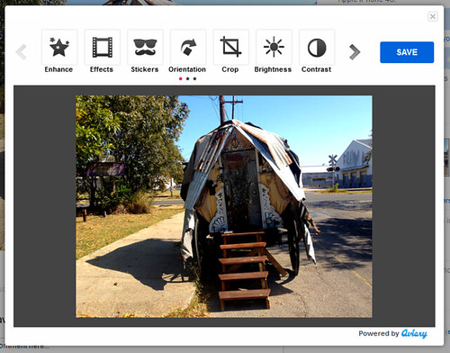
Aviary embeded in Flickr

Constructor API

When we rebuilt our API, we took a leap by assuming that web developers integrating our editor would have experience with other JavaScript libraries and plugins. We built our API to use a Constructor method that accepts a configuration object to allow for the aforementioned tool customization. The configuration object is also used to configure callbacks, image URLs, language settings, etc., and allows us to continue building out our API without losing backwards compatibility.

Simplifying the Save Process

Saving image data is always a challenge in the browser, and can require various cross-browser workarounds. An obvious method would be to initiate a form post to the server and include the base64 image data in a hidden field. This breaks in Safari, where form fields have an undocumented value length limit. We worked around this by switching to an ajax post with the appropriate CORS headers to get around cross domain issues. In browsers that don’t support CORS, we fall back to the form post method.

To hide this complexity from the developer, we’ve abstracted the save process completely. When a user saves an edited image, we temporarily save the image data to our own servers and return a public URL so the host application can download the image to their own.

High Resolution Photos

One of the coolest features of our editor is the high resolution image support — that being said, it certainly has a number of challenges. There’s the practical issue of limited real estate in the browser (keep an eye out for updates addressing this in the near future), as well as performance issues that are harder to quantify. Even in Flash based tools, the size of the image you can edit in the browser is limited by a number of gating factors: hardware specs, number of running processes, etc. To get around these client limitations, we’ve set a configurable maxSize on the editor and added a configuration field for an original-resolution version of the image to be edited: hiresUrl.

When a hiresUrl is supplied, every user edit action is logged. On save, the aptly named “actionlist” is sent to our server along with the hiresUrl. When it hits our render farm, the actionlist is replayed on the high resolution image, and the final results are returned to the host site via a new hiresUrl.

{
    "metadata": {
        "imageorigsize": [
            800,
            530
        ]
    },
    "actionlist": [
        {
            "action": "setfeathereditsize",
            "width": 800,
            "height": 530
        },
        {
            "action": "flatten"
        },
        {
            "action": "redeye",
            "radius": 5,
            "pointlist": [
                [545, 183], [546,183], [547,182], [548,181], [548,179], [548,177], [547,177], [545,177], [544,177], [543,177], [542,177], [541,179], [541,181], [541,183], [542,184]
            ]
        },
        {
            "action": "redeye",
            "radius": 5,
            "pointlist": [
                [481, 191], [481,193], [481,195], [482,196], [483,197], [484,198], [485,197], [485,196], [485,193], [485,190], [485,189], [485,188], [484,188], [482,188], [480,189], [480,190], [480, 191]
            ]
        },
        {
            "action": "sharpen",
            "value": 21.69312,
            "flatten": true
        }
    ]
}

As a side note, we maintain feature parity across all of our platforms (mobile included) by prototyping new tools and filters in the JavaScript first, and then porting them to C for our render farm and Android, and then to Objective-C for our iPhone SDK. By maintaining feature parity and synchronizing output across platforms, we’re able to ensure that users get the edits they expect on their high resolution photos, and we keep the door open for future server-side support for our mobile SDKs where the original photo might not be stored on the device.

Tools and Libraries

We use some pretty awesome tools to help us maintain cross-browser compatibility.

LESS CSS

We moved a lot of the cross-browser concerns to build-time with LESS and a library of mix-ins inspired initially by Twitter Bootstrap, though the final result is wholly our own. LESS’s color math and variables let us achieve a textured and rounded look and feel while minimizing complexity during development.

/* LESS */
.avpw_inset_button_group {
#gradient > .vertical(lighten(@conveyorBelt, 4%), darken(@conveyorBelt, 1%));
.box-shadow(inset 0 0 4px darken(@conveyorBelt, 20%));
.border-radius(8px);
}

/* EXPANDED */
.avpw_inset_button_group {
  background-color: #2a2a2a;
  background-repeat: repeat-x;
  background-image: -khtml-gradient(linear, left top, left bottom, from(#383838), to(#2a2a2a));
  background-image: -moz-linear-gradient(top, #383838, #2a2a2a);
  background-image: -ms-linear-gradient(top, #383838, #2a2a2a);
  background-image: -webkit-gradient(linear, left top, left bottom, color-stop(0%, #383838), color-stop(100%, #2a2a2a));
  background-image: -webkit-linear-gradient(top, #383838, #2a2a2a);
  background-image: -o-linear-gradient(top, #383838, #2a2a2a);
  background-image: linear-gradient(top, #383838, #2a2a2a);
  filter: progid:DXImageTransform.Microsoft.gradient(startColorstr='#383838', endColorstr='#2a2a2a', GradientType=0);
  -webkit-box-shadow: inset 0 0 4px #000000;
  -moz-box-shadow: inset 0 0 4px #000000;
  box-shadow: inset 0 0 4px #000000;
  -webkit-border-radius: 8px;
  -moz-border-radius: 8px;
  border-radius: 8px;
}

CSS3

With CSS3, we’ve just about managed a complete break from the DHTML effects of the past. The new UI uses CSS3 transitions and transforms wherever possible to remain future-proof.

Flash

Yes, our editor does indeed have a Flash fallback for browsers that lack certain HTML5 features (namely canvas). We initially built the editor as a move away from Flash, but because of the legacy IE7 and IE8 userbases on our larger partner sites, we had to go back and rebuild certain components in Flash to support those browsers.

We’ve architected the editor so that Flash is only being used where necessary. Some tools, such as draw, have been completely rebuilt in Flash; for others, like effects, the bitmap data is being exported and manipulated in JavaScript (using a reverse implementation of pibeca). This allows for code reuse, and enables us to build new features faster with more backwards compatibility.

Future

While the feedback for our editor has been overwhelmingly fantastic, we’re continuing to work hard building out new tools and features, and performance enhancements to our existing set.


YUI Blog: Improving The Flickr Upload Exprience With YUI Uploader

water pipe

Visual analogy of simultaneous file uploading. Also, internet/pipe joke goes here.

As a site which has many nifty JavaScript-driven features, Flickr makes good use of the Yahoo! User Interface library for much of its JavaScript DOM, Event handling and Ajax functionality.

One of the fancier widgets we’ve implemented is a flashy browser-based Web Uploadr which uses the YUI Uploader component (a combination of JavaScript and Flash) which allows for faster batch uploads, progress reporting, a nicer UI and overall improved user experience.

Head over to the YUI Blog and check out how Flickr uses YUI Uploader to provide a faster, shinier upload experience.

Lightweight Layout Management in Flash

Resizable apps are groovy. Users want content to fill the screen, and as the variance in screen resolutions has grown this has become more and more important. To make this happen you can either write manual positioning code to place and size items on window resize, or you can define a hierarchy, some properties on elements of the hierarchy and have a layout engine do the work for you. Up until a few years ago, there were no good pre-built solutions to do this in Flash so the only option was to roll your own framework. Nowadays there are several floating around, including this one from the flash platform team at Yahoo!, and of course there is the Flex/MXML route.

XML based UI markup seems to be all the rage these days, but what I found personally through my experience building the jumpcut tools is that this “responsible” approach has drawbacks. A hierarchy of HBoxes and VBoxes can be a lot of overhead for simple projects, and can become unwieldy and rigid when you are trying to develop something quickly. If you are doing anything weird in your UI (overlapping elements, changing things at runtime) it can also feel like trying to fit a square peg in a round hole.

The Best of Both Worlds

So is there any way to get at a sweet-spot, something quick and flexible, yet powerful? The first thing that probably comes to mind if you are a web developer is the CSS/HTML model. In fact, I think would be a rather good option if not for one missing piece, the unsung hero of the web: the HTML rendering engine. If anyone wants to implement Gecko or WebKit in ActionScript I think that would be a fun project, but because the web ecosystem evolved with the markup user and not the layout engine implementer in mind it’s rather complicated. There is also the fact that this model is based on the assumption of a page of fixed width but infinite height which doesn’t exactly suit our purposes.

What we can borrow though is the philosophy of good defaults and implicit rather than explicit layout specification. When you are building out a layout with HTML/CSS you can just drop stuff on the page and things more or less work and resize as you’d expect, then selectively you can move things around / add styling and padding and so on. To do something similar we can take advantage of one of the nice new features of Actionscript 3, the display hierarchy, which allows us to easily traverse, observe, and manage all the DisplayObjects at run time, without keeping track of them on our own as they are created. This way we can recurse through the tree, look for the appropriate properties, and apply positioning and sizing as necessary. If the properties don’t exist we’ll just leave things alone. When you start your project you can just write code to position stuff manually, then as things get more complex and start to solidify you can begin using layout management where it makes sense. I’m a bit of a commitment-phobe myself, so this really appeals to me; what’s especially nice is that you easily plug this in to any existing codebase.

Some Code

So, to get this working all we really need is a singleton that listens to the stage resize event, traverses the tree and places/sizes objects. Mine looks something like this:

  
/*..*/
stage.addEventListener(Event.RESIZE, this.onResize);
/*..*/
 
function onResize(e:Event){
	this.traverse(root);
}
 
function traverse(obj:DisplayObject){

	for (var i=0; i  < obj.numChildren; i++){

		var child = new LayoutWrapper(obj.getChildAt(i));
		if(child.no_layout)
			continue;
	   
		//layout code to determine how to place and size children
		//child.x = something
		//child.y = something


		child.setSize(W, H); // pre-order


		this.traverse(child);

		child.refresh(); // post-order
	   
	}
}


Two things of note here.
First is the LayoutWrapper which I use to set defaults for properties and functions that don’t necessarily exist on all objects, so sort of like slipping in a base class without having to alter any code. I use flash_proxy to make this easier, but you don’t have to do that. One thing you will want to do is store dummy values for width and height (something like _width and _height maybe as a throwback) so you can assign and keep track of the width and height of container elements without actually scaling the object. You’ll also want to decide how you want to handle turning on / off the layout management and what defaults make sense for you. In the above code I’m doing opt-out, using a no_layout variable to selectively turn off layout management where I don’t need it.
Second, I have two hooks for sizing, setSize on the way down, and refresh on the way up. This is useful in some cases because what you want to do at higher levels may depend on the size of children at lower levels which can change on the way down.
The layout code itself is outside the scope of this blog post, but I’ve found that a vertical stack container, a horizontal stack container, padding, and spacing is all I’ve needed to accomplish just about any UI. Of course, you can and should implement any layout tools that are useful to you; different projects may call for different layout containers and properties.

Some Fun

One thing that we are doing by using this approach is pushing the specification of the display tree into run-time. The analogy with HTML here is the part of the DOM that is generated by visible source vs the part of the DOM that is generated by JavaScript.
Going all cowboy like this does have its drawbacks. Specifically it can get a bit confusing as to what the tree looks like, or why this or that is not showing up, where is this Sprite attached, etc. Web developers have the Firebug inspect tool for a very similar problem, which I’ve found rather handy. We can get a poor-man’s version of something like this by writing some code that pretty prints the tree under an object on rollover or use the Flex debugger, but, depending on the size of your project, this can get unwieldy rather quickly.

As an excuse to play with the groovy new flare visualization library recently I tried pointing it at the display tree. The result is rather useful for debugging, especially if you have a lot of state changes / masking / weirdness (plus you look like you are using a debugging tool from the friggin future). Some nice things I’ve added: on roll over the object gets highlighted, I can see an edit some basic properties and see them update live. There’s quite a bit of room here to do something Firebug like, with drag and drop reparenting and the like (but be careful, not too interesting or you’d wind up reimplementing the Flash IDE).

If you’d like to try this yourself, this is the code to populate the flare data structure with the display tree:

public function populateData(){
	// create data and set defaults
	this.graph = new Tree();
	var n = this.graph.addRoot();
	n.data.label = String(root);
	this.populateDataHelper(n, root);
}

 
public function populateDataHelper(n, s){

	try{ // need this in case of TextFields
		var num_children = s.numChildren;
	}
	catch(e:Error){
		return;
	}
	
	//limit in case you have extremely long lists 
	//which can dominate the display
	num_children = num_children < 20 ? num_children : 20; 

	for(var i=0; i  < num_children; i++){
		var child = s.getChildAt(i);

		if(
		child != this //don't show the layout visualizer itself!
		&& child.visible //don't show items that are not visible
		){
			var c = this.graph.addChild(n);
			c.data.sprite = child;
			c.data.label = String(child);
			this.populateDataHelper(c, child)
		}
	}
  
}

Then just apply a visualization to this tree; I've been simply using the demo examples which has been sufficient for my uses, but obviously you can write your own as well.

Here it is in action on the flickr slideshow:

Making a better Flickr Web Uploadr (Or, “Web Browsers Aren’t Good At Uploading Files By Themselves”)

Sometimes when browsers won’t do what you want by themselves, you have to get creative.

A Brief History Of Web Uploading

As any developer who’s suffered through form-based uploading will understand, browsers have very limited native support for selecting and uploading files. While useable, Flickr’s form-based upload needed a refresh that would allow for batch selection and other improvements. After some consideration, Flash’s file-handling capabilities combined with the usual HTML/CSS/JS looked to be the winning solution.

In the past, ActiveX controls and Firefox extensions provided enhanced web-based upload experiences on Yahoo! Photos, supporting batch uploads, per-file progress , error reporting and so on; however, the initial browser-specific download/install requirement was “just another thing in the way” of a successful experience, not to mention one limited to Firefox and Internet Explorer. With Flickr’s new web Uploadr, my personal goals were to minimize or eliminate an install/set-up process altogether whenever possible, while at the same time keeping the approach browser-agnostic. Because of Flash’s distribution amongst Flickr users, it was safe to have as a requirement for the new experience. (In the non-flash/unsupported cases, browsers fall through to the old form-based Uploadr.)

And Now, For Something Completely Different

By using Flash to push files to Flickr, a number of advantages were clear over the old form-based method:

  • Batch file selection
  • File details (size, date etc.) for UI, business logic
  • Improved upload speed (faster than native browser form-based upload)
  • “Per-file”, asynchronous upload (as opposed to posting all data at once)
  • Upload progress reporting (per-file and overall)

Flash is able to do batch selection through standard operating system dialogs, report file names and size information, POST file data and read responses. Flickr’s new web Uploadr uses these features to provide a much-needed improvement over the old form-based Uploadr. The Flash component was developed by Allen Rabinovich on the Yahoo! Flash Platform Team. http://developer.yahoo.com/flash/

This Flash-based upload method did come with a few technical quirks, but ultimately we were still able to make signed calls to the Flickr API and upload files.

Now You Can, Too!

The Flash and client-side code which underlies the Flickr Web Uploadr is part of the Yahoo User Interface Library, available as the YUI Uploadr component.

It’s The Little Things That Count: UI Feedback

Given that Flash reports both file size and bytes uploaded, it made sense to show progress in the UI. In addition to per-file and overall progress in-page, the page’s title as shown in a browser window or tab also updates to reflect overall progress during upload – for example, “(42% complete) Flickr: Upload Photos”

Under Firefox, an .GIF-based “favicon” replaces the static Flickr icon, showing animation in the browser address bar while uploading is active. This combined with the title change is a nice indication of activity and status while the page is “working”, a handy way of checking progress without requiring the user to work to bring the window or tab back into focus.

In showing attention to detail in the UI and finding creative solutions to common browser drawbacks, a much nicer web upload experience is most certainly possible.

Scott Schiller is a front-end engineer and self-professed “DHTML + web standards evangelist / resident DJ and record crate digger” who works on Flickr. He enjoys making browsers do nifty things with client-side code, and making designers happy in bringing their work to life with close attention to detail. His personal site is a collection of random client-side experiments. http://flickr.com/photos/schill/