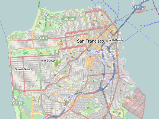
With the recent change to our map system, we introduced a new map style for our OSM tiles. Since 2008, we’ve used the default OSM styles, which produces map tiles like this:

This style is extremely good at putting a lot of information in front of you. OSM doesn’t know your intended purpose for the maps (navigation, orientation, exploration, city planning, disaster response, etc.), so they err on the side of lots of information. This is good, but with the introduction of TileMill, non-professional cartographers (like myself) can now easily change map styles to better suit our needs. Using TileMill, we decided to take a crack at designing a map that is better suited to Flickr.
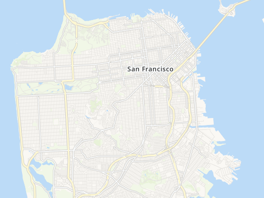
On Flickr, we use maps for a very specific purpose: to provide context for a photo. This means there are a lot of map features that we can leave out entirely. We can choose to hide features that are primarily used for navigation (ferry and train routes, bus stops) or for demarcation (city and county boundaries). Roads are useful as orientation tools, but certain road features (like exit numbers on highways) aren’t needed. In the end, we can reduce the data that the map shows to much smaller and more useful subset:

This is the style provided by MapBox’s excellent OSM Bright. As a starting point, this gets us a long way towards our goal of an unobtrusive yet still useful map. We made a few changes to OSM Bright and released them on GitHub as our Pandonia map style. Here are a few examples of the changes we made:
- Toned down the road, land, and water colors, to allow greater contrast with the pink and blue dots that we use as markers
- Reduced the density of road and highway names, as well as city, town and state names
- Removed underground tram and rail line
- Removed land use overlays for residential, commercial, and industrial zones, as well as parking lots
- Removed state park overlays that overlapped the water
This is how it looks:

We tried a lot of different color combinations on the road to this style. Here is an animation of the different styles we tried, starting with OSM Bright.

Here it is zoomed in a bit more:

Over the next couple of weeks, we’ll be rolling out this style to all of the places where we use OSM tiles.
These maps are still a work in progress. The world is a big place, and creating a unified style that works well for every single location is challenging. If you notice problems with our new map styles, please let us know!
