About Ross Harmes

I'm lucky enough to lead one of the best frontend teams in the business at Flickr. Want to join? We're hiring!

Pre-generating Justified Views

On May 20th, we introduced our Justified layout to the Photostream page. Ever since launch, we’ve been working hard to improve the performance of this page, and this week we’ve deployed a change that dramatically reduces the time it takes to display photos. The secret? Cookies.

At a high level, our Justified algorithm works like this:

  1. Take, as input, the browser viewport width and a list of photos
  2. Begin to lay those photos out in a row sequentially, using the maximum allowed height and scaling the width proportionately
  3. If a row becomes longer than the viewport width, reduce the height of that row and all the photos in it until the width is correct

Because we need the viewport width, we have to run this algorithm entirely in the browser. And because we won’t know which particular photo size to request until we’ve run the algorithm, we can’t start downloading the photos until very late in the process. This is why, up until Friday, when you loaded a photostream page, you saw the spinning blue and pink balls before the photos loaded.

Last week we were able to make one key change: we now pre-generate the layout on the server. This means that we know exactly which image sizes we need at the very top of the page, and can start downloading them immediately. It also means the spinning balls aren’t needed anymore. The end result is that the first photo on the page now loads seven times faster than on May 20th.

“Time to First Photo” on the Photostream page

One question remains: we need client viewport width in order to generate the layout, so how are we able to pre-generate it on the server? The first time you come to any Flickr page, we store the width of your browser window in a cookie. We can then read that cookie on the server on subsequent page loads. This means we aren’t able to pre-generate the photostream layout the very first time you come to the site. It also means that the layout will occasionally be incorrect, if you have resized the browser window since the last time you visited Flickr; we deal with this by always correcting the layout on the client, if a mismatch is detected.

This is one of many performance improvements we’re working on after our 5/20 release (we’ve also deployed some improvements to the homepage activity feed). Expect to see the performance continue to improve on the redesigned pages in the coming weeks and months.

Flickr at SF Web Performance

Wait! Did you say they all run Webkit?
Wait! Did you say they all run Webkit? by Schill

Thanks to everyone that came out to the SF Web Performance meet up last night! For those of you that missed it, JP and Aaron were kind enough to record the entire event on Ustream.

You can also view the slides and associated blog posts for each of the presentations:

  • Optimizing Touch Performance, by Stephen Woods: slides and blog post
  • Using Web Workers for fun and profit: Parsing Exif in the client, by Chris Berry: slides and blog post
  • The Grid: How we show 10,000 photos on a page without crashing your browser, by Scott Schiller: slides and blog post

Big thanks to JP and Aaron for setting it up and running the event so well!

Join the Flickr Frontend team tonight at the SF Web Performance meet up!

Team Tinfoil
Team Tinfoil by waferbaby

We will be hosting the SF Web Performance meet up tonight at 7pm at Citizen Space. Come join us for pizza, drinks, and these great talks:

Using Web Workers for fun and profit: Parsing Exif in the client, by Chris Berry

Exif, exchangeable image file format, describes various sets of metadata stored in a photo. Really interesting metadata, like image titles, descriptions, lens focal lengths, camera types, image orientation, even GPS data! I’ll go over the methods to extracting this data on the front-end, in real-time, using web workers.

The Grid: How we show 10,000 photos on a page without crashing your browser, by Scott Schiller

Flickr’s latest Web-based Uploadr interface uses HTML5 APIs to push bytes en masse. Its real power, however, is the UI which enables users to add and edit the metadata of hundreds of photos while they are uploading in the background.

Handling the selection, display and management of large numbers of photos in a browser UI meant that the Uploadr project needed to be designed for scalability from the ground up.

This talk will go into some of the details of the Uploadr “Grid” UI, technical notes and performance findings made during its development.

Optimizing Touch Performance, by Stephen Woods

Touch interfaces are amazing. Touch devices are amazingly slow. Stephen Woods will share hard-won advice for building responsive touch-based interfaces using HTML5, CSS, and JavaScript. He also reveals how Star Trek: The Next Generation predicted the need for instant user feedback in a touch-based UI and how Tivos slow UI was made bearable by a simple “bloop” sound.

See you there!

Designing an OSM Map Style

With the recent change to our map system, we introduced a new map style for our OSM tiles. Since 2008, we’ve used the default OSM styles, which produces map tiles like this:

This style is extremely good at putting a lot of information in front of you. OSM doesn’t know your intended purpose for the maps (navigation, orientation, exploration, city planning, disaster response, etc.), so they err on the side of lots of information. This is good, but with the introduction of TileMill, non-professional cartographers (like myself) can now easily change map styles to better suit our needs. Using TileMill, we decided to take a crack at designing a map that is better suited to Flickr.

On Flickr, we use maps for a very specific purpose: to provide context for a photo. This means there are a lot of map features that we can leave out entirely. We can choose to hide features that are primarily used for navigation (ferry and train routes, bus stops) or for demarcation (city and county boundaries). Roads are useful as orientation tools, but certain road features (like exit numbers on highways) aren’t needed. In the end, we can reduce the data that the map shows to much smaller and more useful subset:

This is the style provided by MapBox’s excellent OSM Bright. As a starting point, this gets us a long way towards our goal of an unobtrusive yet still useful map. We made a few changes to OSM Bright and released them on GitHub as our Pandonia map style. Here are a few examples of the changes we made:

  • Toned down the road, land, and water colors, to allow greater contrast with the pink and blue dots that we use as markers
  • Reduced the density of road and highway names, as well as city, town and state names
  • Removed underground tram and rail line
  • Removed land use overlays for residential, commercial, and industrial zones, as well as parking lots
  • Removed state park overlays that overlapped the water

This is how it looks:

We tried a lot of different color combinations on the road to this style. Here is an animation of the different styles we tried, starting with OSM Bright.

Here it is zoomed in a bit more:

Over the next couple of weeks, we’ll be rolling out this style to all of the places where we use OSM tiles.

These maps are still a work in progress. The world is a big place, and creating a unified style that works well for every single location is challenging. If you notice problems with our new map styles, please let us know!

Liquid Photo Page Layout

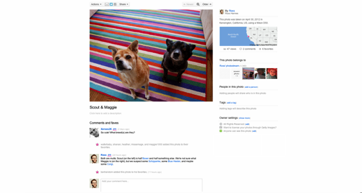
The Flickr photo page has gone through several revisions over the years. It was initially designed for 800×600 pixel displays, with a 500 pixel wide photo and a 250 pixel wide sidebar.


The 500×375 photo takes up 9.1% of the 1905×1079 pixels available in my viewport

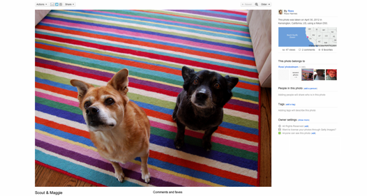
By 2010, display resolutions had increased significantly, and 1024×768 became the new standard for our smallest supported resolution. We launched a re-designed photo page, designed for a width of 960. It featured a 640 pixel wide photo and a sidebar of 300 pixels.


The 640×480 photo takes up 14.9% of the 1905×1079 pixels available in my viewport

Since then the number of different display resolutions has increased and larger sizes have become more popular, but the number of users still on 1024×768 displays have made it hard to increase the width of the page beyond 960. We realized that we would always have to support smaller monitors, but that there was no reason not to give bigger photos to those with larger monitors. The recent launch of the 800, 1600, and 2048 photo sizes gave us a lot of different options for showing big, beautiful photos to members, and we wanted to take advantage of that. Starting today, we will display the biggest photo that we can on the photo page for your monitor.


The 1213×910 photo takes up 53.7% of the 1905×1079 pixels available in my viewport

Algorithmic

As you use the new liquid photo page, you may notice that the page content doesn’t always fill the entire viewport. This is because we created an algorithm for taking the width and height into account that will display content at a width that will best showcase the most common photo ratio, the 4:3. Here are the goals of that algorithm:

  1. Show the biggest photo the window allows
  2. Ensure the title and the sidebar are visible
  3. Keep the width of the page consistent across all photo pages, regardless of the individual photo dimensions
  4. Whenever possible, prefer native dimensions of a photo size (i.e., resist downsampling and never upsample)

Going Big

Big photos are really compelling. We knew from using the Flickr Light Box that our members’ photos look amazing at full screen, and we wanted to give the same experience on the photo page. This part of the algorithm was easy; as soon as the page starts loading, we read the innerWidth and innerHeight of the viewport (or the browser’s equivalent), and then go through the photo sizes that the photo owner allows us to display to find the best fit. If the photo is a little too big for the space we have to work with, we scale it down in the browser.

Providing Context

As great as a giant photo is, a photo is more than just its pixels. The context and story around a photo is just as important. Imagine a photo of a tiger; it’s impressive in its own right, but throw in a map showing that the tiger is in a public park, and a title stating, “A Tiger Escaped From the Zoo!” and then you really have something.</>

We decided that the title and the sidebar are important enough to make it worth showing a slightly smaller photo on the page. We adjusted the algorithm to take into account the width of the sidebar and its gutter (335 pixels) and the height of the first line of the title (45 pixels) when calculating how much available space there is for a photo.

Site Consistency

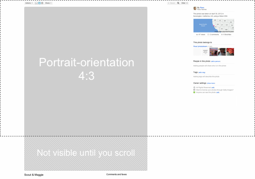
So far, so good. However, as we used the liquid photo page we noticed that it had one fatal flaw: Since the algorithm uses the dimensions of the photo that you are viewing to adjust the page width, it changes from photo to photo. This mean that if you’re browsing through some photos, the elements of the page are moving around from page to page. This is especially problematic with the header and the Next / Previous buttons; It’s incredibly difficult to navigate around if you always have to hunt around to find them first.

To fix this problem, we decided to make the algorithm ignore the dimensions of the currently displayed photo when calculating page width, and instead to always use the dimensions of an imaginary 4:3 photo. This means that the page width will always be the same for any given combination of viewport width and viewport height, and that the UI elements will be in the same places for each page. The downsides of this are that photos that aren’t 4:3 will have more whitespace around them and even potentially be cut off by the bottom of the page, forcing the viewer to scroll. Using a consistent width is definitely the lesser of the two evils, though. The current photo page has the same problem with photos that are taller than they are wide being below the fold, and we’ve been happily viewing them for years.

Going Native

These days, browsers do a pretty good job scaling a photo down. By default, most browsers err on the side of quality rather than speed, so the resulting photo should look good regardless of the size it is displayed. That being said, if we ever downsample a photo, then we are downloading more pixels than we need and throwing them away. This isn’t good for performance.

We adjusted the algorithm to favor native sizes, even if that means a slightly smaller photo is shown. We coded in detents, so that if a photo size is within 60 pixels of a native size, we will just use that size instead of downsampling a larger one. This means the page loads faster and that most common monitor resolutions will see photos at the native size, as this table illustrates (percentage use data from StatCounter):

Resolution Use % Page width Image size Image width Efficiency
1366 x 768 19.28% 975px Medium 640 640px 100.0%
1024 x 768 18.60% 975px Medium 640 640px 100.0%
1280 x 800 12.95% 1044px Medium 800 709px 88.6%
1280 x 1024 7.48% 1216px Large 1024 881px 86.0%
1440 x 900 6.60% 1135px Medium 800 800px 100.0%
1920 x 1080 5.09% 1359px Large 1024 1024px 100.0%
1600 x 900 3.83% 1135px Medium 800 800px 100.0%
1680 x 1050 3.63% 1359px Large 1024 1024px 100.0%
1360 x 768 2.32% 975px Medium 640 640px 100.0%

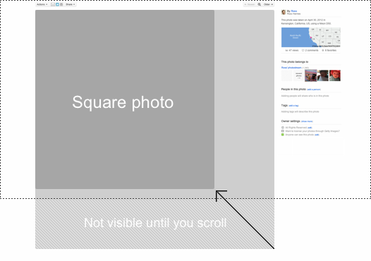
Titles Are for Squares, Man

Square photos are an interesting loophole in the way we size photos. Because we’re targeting an imaginary 4:3 photo, square photos will be displayed with more actual pixels than any other size, taking up the full width and height allotted. While browsing the site we noticed this, as well as the fact that the title is never visible. In order to bring the overall pixel count more in line with landscape and portrait photos, we reduce the size of square photos a bit more than the others. This helps ensure that the titles are always visible as well.

Making it Fast

Now that the algorithm is complete, we need to work on the performance. We noticed that reading the viewport dimensions and resizing the page every single time you go to a photo is unnecessary and distracting (since the page loads with a width of 960 and must be adjusted after the JavaScript loads on the page). To fix this, we cache the viewport dimensions in a cookie that can be read by the PHP code that generates the page. The first time you go to a liquid photo page, we have no choice but to adjust the page width on the fly. But every other photo page you visit will have the dimensions stored from the last page, and the page will be rendered with the correct width from the start.

More to Come

We have a lot more changes in store for this year. Stay tuned!

Scott Schiller on Web Audio

We recently had a Flickr Frontend Night at BayJax, the Bay Area JavaScript group. We’ll be posting the videos from those talks over the next couple of weeks.

First up! Frontend Engineer, DJ, and all-around nice guy Scott Schiller, with his great talk on Web Audio.

Scott used impress.js to make his awesome slides (using HTML and CSS Transitions). If you want to dig deeper into Scott’s talk, there is the HD version on YouTube, slides, the Wheels of Steel demo, and the HTML5 game he created, SURVIVOR.

Big thanks to Gonzalo Cordero for organizing the event, and to Ryan Grove and Allen Rabinovich for their great work filming it.

On a side note, if you’re in Austin for SxSW next week, be sure to check out talks by Flickr’s own Eric Gelinas (Geo Interfaces for Actual Humans) and Stephen Woods (Creating Responsive HTML5 Touch Interfaces).

Thanks to softdroid.net for creating a Ukrainian translation of this post.

How Photo Session Brings Photos Alive

This is a guest post by Teruhisa Haruguchi: Frontend Engineer in the Mobile & Presentation Service group. Main developer on the Flickr Photo Session project. Recent graduate from Cornell University with a concentration in Computer Graphics. Home country Japan.

Keeping everyone connected around photos

This post dives down into the inner working of Photo Session, which enables user to have a real time photo sharing experience on multiple platforms.

Connect 13/52

In order to synchronize the viewing experience on different browsers, we need to have a mechanism to pass the state of one browser to other browsers. There are emerging technologies that would allow messages to be passed to the browser by opening a connection (ex. WebSockets), but our goal was to enable this feature for multiple platforms. To support this requirement, we chose CometD as our server technology which enable browsers on multiple platform to handle push notification. CometD also allowed us to setup a server cluster to handle large number of requests.

Bayeux Protocol (a.k.a. Push Notification thingy)

Cometd Message Passing

The mechanism in which messages are passed around is as follows. As different browsers join a Photo Session, we connect them to one of our servers and leave that connection open. This is referred to as long polling. When Client X posts a message, it is first collected by the server it is connected to, Server A. Server B has a long polling connection open via Oort to listen for any message that comes through Server A. OortClient is simply a server-side client that enables message passing between servers. It employs the same mechanism to push message from server to client. Once Server B receives the message via Oort, it will then relay the message down to Client Y by using the same mechanism used by Oort.

This lightweight transport mechanism allows us to pass messages around with minimum latency. However, this comes with few limitations. One, it does not guarantee message ordering. Client Y would not know the message order which client X submitted the them. To hide this limitation, we simply pick the very last message that is received for any client. There would be cases where users will be temporarily be out of sync when multiple messages are passed around at once, but it will be correctly updated with subsequent messages. Another limitation is the lack of guarantee on message delivery. Since we do not check for ACK during message delivery, the client X does not know if the message has been received by client Y. Again, most of the message delivery limitation is masked by checking for the last message.

Realtime Photo Sharing: Flickr Photo Session

This is a guest post by Jason Gabriele. Jason is a developer from the Yahoo! Mobile Platform/CPG team, who has worked in the mobile space for years developing on devices ranging from a Motorola V3 flip phone to modern devices like the iPhone. Over the past few months, his focus has been on the Photo Session project working mostly on the frontend UI.

Photo Session started as a Hack Day project by Iain Huxley. The idea came from the desire to share and discuss photos live with friends, like being able to share photos from a recent vacation with his mother in Australia. He then created a demo which could provide realtime photo viewing synced across multiple users located anywhere in the world. At a Yahoo! Hack Day event, Photo Session was selected as a winner and Iain was awarded a Yahoo-branded beach towel. Later, the project evolved into a Flickr photo sharing project with chat provided by Yahoo! Messenger.

Photo Session

Photo Session allows you to share photos in realtime with your friends. You can slide through photos, draw on them, zoom in and out, and send messages with others present in the session using the built-in chat window. Users without Flickr accounts can still join as guests but can’t use certain features like the drawing tool or chat. Given the requirement to allow guest participants, we had to limit the photos to publicly-accessible photos only for the first release.

The Basics

  • Create a Photo Session by visiting a set or photo stream and clicking on “Start a Photo Session” under the share menu
  • Once in the photo session, advance through photos by clicking and dragging or using the arrow buttons (desktop only)
  • Start drawing mode by clicking the pencil icon (must be logged into Flickr) and begin drawing on the photo. Your drawing will be shared with others in the session but will be cleared as soon as drawing mode is disabled
  • Zoom in by using the +/- buttons or using the scroll wheel on the desktop, or by pinch-zooming on the iPhone and iPad
  • You can view details about the photo using the Information icon in the lower-left on desktop browsers, or by clicking the “i” icon in the lower-right on the iPhone
  • You can leave the group at any time and browse on your own using the “Browse on your own” button (not available on the iPhone). Return to the group session by simply clicking the button again
  • You can hide the Photo Session toolbars by doing a single click on the current photo. Click again to bring them back

Browser Support

Since the primary use of Photo Session is sharing photos, we wanted to make sure the experience felt fast and responsive. This meant we would need to use features like CSS transforms and other CSS3 properties only available in the latest browsers. We also needed the rendering to be fast enough to support users rapidly advancing through photos. We decided to support Chrome, Firefox, IE9, Safari and iOS for our first launch. This would also simplify the QA process. We plan on adding support for Android in the future.

Future

Photo Session is in preview mode, so we may change features in the future depending on how people use them. We already have plans for some new features, but we would still love to hear from you so please provide feedback in the Flickr forums. We hope Photo Session makes sharing photos with your family and friends a more social and interactive experience!

Join Us at the NYC Photo Hack Day!

Hacking audio on the iPad with @rharmes at Epicenter Cafe

Are you a developer with a great idea for a photo hack?

Are you going to be in New York on August 20th and 21st?

If so, join us at the Photo Hack Day! Our very own Paul Mison will be on hand to give a presentation on the Flickr API and to answer any questions you have while hacking. The winner will have their hack featured on the NASDAQ billboard in Times Square (among other prizes), and all participants will get a year of free Flickr Pro. Sign up to reserve your spot at the event, which will be held at General Assembly in Manhattan.

If you’re participating in the Hack Day, Flickr engineers will be available to help on IRC: #flickrapi on chat.us.freenode.net. You can also go to developer.flickr.com for more information on the API and developing with Flickr photos. We will be announcing some new and improved APIs in advance of the Hack Day, so watch this space!

The Flickr Developer Guide

We’re happy to announce today the launch of our Flickr API Developer Guide. Whether you’re just getting started or you have worked with our API for a long time, check it out for some tips on how to best (and respectfully) use the API. All feedback is welcome via the discussion board for the API Mailing List, and you can also check out the API Changelog for any updates, via @flickrAPI, the Flickr API Twitter feed.