Designing an OSM Map Style

With the recent change to our map system, we introduced a new map style for our OSM tiles. Since 2008, we’ve used the default OSM styles, which produces map tiles like this:

This style is extremely good at putting a lot of information in front of you. OSM doesn’t know your intended purpose for the maps (navigation, orientation, exploration, city planning, disaster response, etc.), so they err on the side of lots of information. This is good, but with the introduction of TileMill, non-professional cartographers (like myself) can now easily change map styles to better suit our needs. Using TileMill, we decided to take a crack at designing a map that is better suited to Flickr.

On Flickr, we use maps for a very specific purpose: to provide context for a photo. This means there are a lot of map features that we can leave out entirely. We can choose to hide features that are primarily used for navigation (ferry and train routes, bus stops) or for demarcation (city and county boundaries). Roads are useful as orientation tools, but certain road features (like exit numbers on highways) aren’t needed. In the end, we can reduce the data that the map shows to much smaller and more useful subset:

This is the style provided by MapBox’s excellent OSM Bright. As a starting point, this gets us a long way towards our goal of an unobtrusive yet still useful map. We made a few changes to OSM Bright and released them on GitHub as our Pandonia map style. Here are a few examples of the changes we made:

  • Toned down the road, land, and water colors, to allow greater contrast with the pink and blue dots that we use as markers
  • Reduced the density of road and highway names, as well as city, town and state names
  • Removed underground tram and rail line
  • Removed land use overlays for residential, commercial, and industrial zones, as well as parking lots
  • Removed state park overlays that overlapped the water

This is how it looks:

We tried a lot of different color combinations on the road to this style. Here is an animation of the different styles we tried, starting with OSM Bright.

Here it is zoomed in a bit more:

Over the next couple of weeks, we’ll be rolling out this style to all of the places where we use OSM tiles.

These maps are still a work in progress. The world is a big place, and creating a unified style that works well for every single location is challenging. If you notice problems with our new map styles, please let us know!

The great map update of 2012

Today we are announcing an update to the map tiles which we use site wide. A very high majority of the globe will be represented by Nokia’s clever looking tiles.

Nokia map tile

We are not stopping there. As some of you may know, Flickr has been using Open Street Maps (OSM) data to make map tiles for some places. We started with Beijing and the list has grown to twenty one additional places:

Mogadishu
Cairo
Algiers
Kiev
Tokyo
Tehran
Hanoi
Ho Chi Minh City
Manila
Davao
Cebu
Baghdad
Kabul
Accra
Hispaniola
Havana
Kinshasa
Harare
Nairobi
Buenos aires
Santiago

It has been a while since we last updated our OSM tiles. Since 2009, the OSM community has advanced quite a bit in the tools they provide and data quality. I went into a little detail about this in a talk I gave last year.

Introducing Pandonia

Nokia map tile

Today we are launching Buenos Aires and Santiago in a new style. We will be launching more cities in this new style in the near future. They are built from more recent OSM data and they will also have an entirely new style which we call Pandonia. Our new style was designed in TileMill from the osm-bright template, both created by the rad team at MapBox. TileMill changes the game when it comes to styling map tiles. The interface is developed to let you quickly iterate style changes to tiles and see the changes immediately. Ross Harmes will be writing a more detailed account of the work he did to create the Pandonia style. We appreciate the tips and guidance from Eric Gunderson, Tom MacWright, and the rest of the team at MapBox

We are looking forward to updating all of our OSM places with the Pandonia style in the near future and growing to more places after that… Antarctica? Null Island? The Moon? Stay tuned and see…

Changing our Javascript API

To host all of these new tiles we needed to find a flexible javascript api. Cloudmade’s Leaflet is a simple and open source tile serving javascript library. The events and methods map well to our previous JS API, which made upgrading simple for us. All of our existing map interfaces will stay the same with the addition of modern map tiles. They will also support touch screen devices better than ever. Leaflet’s layers mechanism will make it easier for us to blend different tile sources together seamlessly. We have a fork on GitHub which we plan to contribute to as time goes on. We’ll keep you posted.

horse=yes

a map Jason Bourne could eat cake on

Yes, I got a bit emotional at the third OpenStreetMap conference, held in the CCC, Amsterdam last weekend — mainly because this globe we are on is the only one we know — we really are mapping our universe, doing it our way. Creating the world we want to live in. I thought it worth while to say “Thanks” to some people. Being British, the feeling of being a bit foolish stopped me from being too effusive!

Tim Waters

A couple weeks ago I had the pleasure of attending, and the privilege of speaking at, the State of the Map conference in Amsterdam. I told the story of how we came to use Open Street Maps (OSM), how it works on the backend and talked a little bit about what we’d like to do next: Moving beyond “bags of tiles”, a better way to keep up to date with changes to the OSM database and, for good measure, a little bit of tree-hugging at the end.

Most of all, though, I wanted to take the opportunity to thank the OSM community. To thank them for making Flickr, the thing that we care about and work on all day, better. To thank them for proving the nay-sayers wrong.

To say that OSM started with an audacious plan (to map the entire world by “hand” one neighbourhood and one person at a time) would be an understatement. You would have been forgiven, at the time, for laughing.

And yet, in a few short years they are well on their way having nurtured both a community of users and an infrastructure of tools that makes it hard to ever imagine a world without Open Street Maps. In the U.K. alone, as Muki Haklay demonstrated, they have produced a free and open dataset whose coverage and fidelity rivals those created by the Ordinance Survey with its government funding and 250-year head start.

That is really exciting both because of the opportunities that such a rich and comprehensive dataset provide but also because it proves what is possible. The Internets are still a pretty great place that way.

mugs

photo by russelldavies

There were too many excellent talks to list them all, but here’s a short (ish) list that betrays some of my interests and biases:

  • Harry Wood’s talk on tagging in OSM. I actually missed this talk and after seeing the slides I am doubly disappointed. Open Street Map is not just the raw geographic data that people collect but also all the metadata that is used to describe it. OSM uses a simple tagging system for recording “map features” and Harry’s talk on managing the chaos, navigating the disputes and juggling the possibilities looked like it was really interesting.

    (The title of this post is, in fact, a gentle poke at the black sheep of the OSM tagging world. There really are map features tagged “horse=yes” which is mostly hilarious until you remember how much has been accomplished with a framework that allows for tags like that.)

  • The Sunday afternoon maps-and-history love-fest that included Frankie Roberto’s “Mapping History on Open Street Map“, Tim Water’s “Open Historical Maps” and the Dutch Nationaal Archief’s presenting “MapIt 1418“, a project to allow users to add suggested locations for their photos in the Flickr Commons!

    Tim’s been doing work for The New York Public Library, another Flickr Commons member, and MapWarper (the code that powers the NYPL’s historical map rectifier) is an open source project and available on GitHub.

  • Mikel Maron’s “Free and Open Palestine” (the slides are here but you should really watch the video) which is an amazing story of collecting map data in the West Bank and Gaza.

    Mikel was also instrumental in creating a scholarship program to pay the travel and lodging expenses for 15 members from the OSM community, from all over the world, to attend the conference. Because he’s kind of awesome, that way.

But that’s just me. I’d encourage you to spend some time poking around all the other presentations that are available online:

Despite the “bag of tiles” approach for using OSM on Flickr getting a bit old it still works so as of right here, right now:

We’ve also refreshed the tiles for Beijing and Tehran where, I’m told, the OSM community has added twice as much data since we first started showing (OSM) maps a month ago!

If it sometimes seems like we’re doing all of this in a bit of an ad hoc fashion that’s because we (mostly) are. How and when and where are all details we need to work out going forward but, in the meantime, we have map tiles where there were none before so it can’t be all bad.

Finally, because the actual decision to attend the conference was so last minute I did not get the memo to all presenters to include a funny picture of SteveC (one of the original founders of Open Street Maps) in their slides.

To make up for that omission, I leave you now with the one-and-only Steve Coast.

Steve *loves* Yahoo

photo by Andy Hume

The Only Question Left Is

photo by Shawn Allen

At the Emerging Technology conference this year Stamen Design’s Michal Migurski and Shawn Allen led an afternoon workshop called “Maps from Scratch: Online Maps from the Ground Up” where people made digital maps from, well… scratch.

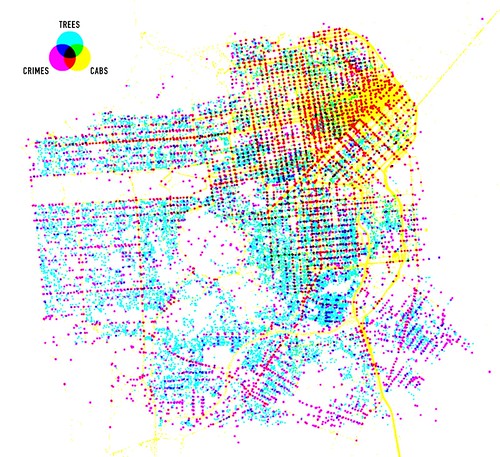
If you’ve never heard of Stamen they’ve been doing some of the most exciting work around the idea of “custom cartography” including: Cabspotting, Oakland Crimespotting and Old Oakland Maps, work for the London Olympics, and designing custom map tiles for CloudMade. (Stamen also built the recently launched Flickr Clock :-)

All of this is interesting in its own right; proof that there is still a lot of room in which to imagine maps beyond so-called red-dot fever. All of this is extra interesting in light of Apple’s recent announcement to allow developers to define their own map tiles in the next iPhone OS release. All of this super-duper interesting because it is work produced by a team of less than 10 people.

The tools, and increasingly the data, to build the maps we want are bubbling up and becoming easier and more accessible to more people every day. Easier, anyway.

“One of the things that made this tutorial especially interesting for us was our use of Amazon’s EC2 service, the “Elastic Compute Cloud” that provides billed-by-the-hour virtual servers with speedy internet connections and a wide variety of operating system and configuration options. Each participant received a login to a freshly-made EC2 instance (a single server) with code and lesson data already in-place. We walked through the five stages of the tutorial with the group coding along and making their own maps, starting from incomplete initial files and progressing through added layers of complexity.

“Probably the biggest hassle with open source geospatial software is getting the full stack installed and set up, so we’ve gone ahead and made the AMI (Amazon Machine Image, a template for a virtual server) available publicly for anyone to use, along with notes on the process we used to create it.”

Michal Migurski

The Maps From Scratch (MFS) AMI may not be a Leveraged Turn Key Synergistic Do-What-I-Mean Solutions Platform but, really, anything that dulls the hassle and cost of setting up specialized software is a great big step in the right direction. I mention all of this because Clustr, the command-line application we use to derive shapefiles from geotagged photos, has recently been added to the list of tools bundled with the MFS AMI.

Specifically: ami-4d769124.

We’re super excited about this because it means that Clustr is that much easier for people to use. We expressly chose to make Clustr an open-source project to share some of the tools we’ve developed with the community but it has also always had a relatively high barrier to entry. Building and configuring a Unix machine is often more that most people are interested in, let alone compiling big and complicated maths libraries from scratch. Clustr on EC2 is not a magic pony factory but hopefully it will make the application a little friendlier.

Shapes

Creating and configuring an EC2 account is too involved for this post but there are lots of good resources out there, starting with Amazon’s own documentation. When I’m stuck I usually refer back to Paul Stamatiou’s How To: Getting Started with Amazon EC2.

Assuming that you familiar using Unix command line tools, let’s also assume that you have gotten all your ducks in a row and are ready to fire up the MFS AMI:

your-computer> ec2-run-instances ami-4d769124 -k example-keypair

your-computer> ec2-describe-instances

At which point, you’ll see something like this:

INSTANCE i-xxxxxxxx ami-4d769124 ec2-xxxxx.amazonaws.com blah blah blah

i-xxxxxxxx is the unique identifier of your current EC2 session. You will need this to tell Amazon to shut down the server and stop billing you for its use.

ec2-xxxxx.amazonaws.com is the address of your EC2 server on the Internets.

Once you have that information, you can start using Clustr. First, log in and create a new folder where you’ll save your shapefile:

your-computer> ssh -i example-rsa-key root@ec2-xxxxx.amazonaws.com

ec2-xxxxx.amazonaws.com> mkdir /root/clustr-test

The MFS AMI comes complete with a series of sample “points” files to render. We’ll start with the list of all the geotagged photos uploaded to Flickr on March 24:

ec2-xxxxx.amazonaws.com> /usr/bin/clustr -v -a 0.001 
   /root/clustr/start/points-2009-03-24.txt 
   /root/clustr-test/clustr-test.shp

By default Clustr generates a series of files named clustr (dot shp, dot dbf and dot shx because shapefiles are funny that way) in the current working directory. You can specify an alternate name by passing a fully qualified path as the last argument to Clustr. When run in verbose mode (that’s the -v flag) you’ll see something like this:

Reading points from input.
Got 44410 points for tag '20090324'.
799 component(s) found for alpha value 0.001.
- 23 vertices, area: 86.7491, perimeter: 71.9647
- 32 vertices, area: 1171.51, perimeter: 41.3095
- 8 vertices, area: 18.5112, perimeter: 0.529504
- 12 vertices, area: 1484.81, perimeter: 10.8544
...
Writing 505 polygons to shapefile.

Yay!

ec2-xxxxx.amazonaws.com> ls -la /root/clustr-test
total 172
drwxr-xr-x 2 root root  4096 2009-04-07 03:14 .
drwxr-xr-x 5 root root  4096 2009-04-07 02:22 ..
-rw-r--r-- 1 root root 52208 2009-04-07 03:14 clustr-test.dbf
-rw-r--r-- 1 root root 97388 2009-04-07 03:14 clustr-test.shp
-rw-r--r-- 1 root root  4140 2009-04-07 03:14 clustr-test.shx

Now copy the shapefiles back to your computer and terminate your EC2 instance (or you might be surprised when you get your next billing statement from Amazon).

ec2-xxxxx.amazonaws.com> scp -r /root/clustr-test 
   you@your-computer:/path/to/your/desktop/

ec2-xxxxx.amazonaws.com> exit

your-computer> ec2-terminate-instances i-xxxxxxxxx

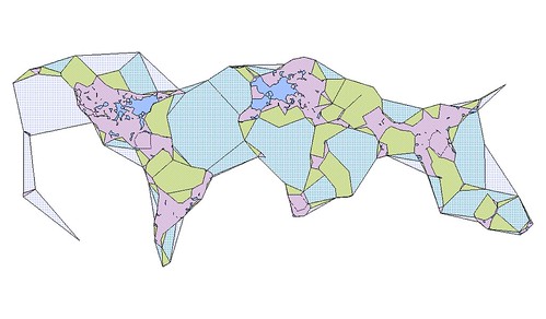
I created this image (using the open source QGIS application) for all those points by running Clustr multiple times with alpha numbers ranging from 0.05 to 603:

SHAPEZ (2009-03-24)

Here’s another version rendered using the nik2img application and a custom style sheet, both included with the MFS distribution:

clustr

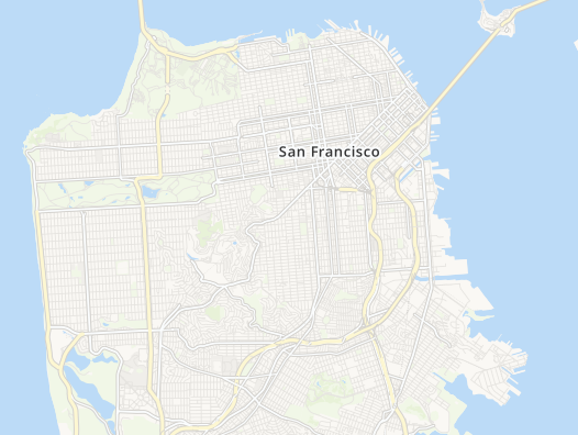
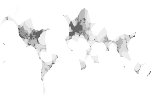
Here’s one of all the geotagged photos tagged “route66” (with alpha numbers ranging from 0.001 to 0.5):

tag=route66, alpha=(0.001 - 0.5)

Apologies and big sloppy kisses to Stamen’s own Mappr (first released in 2005).

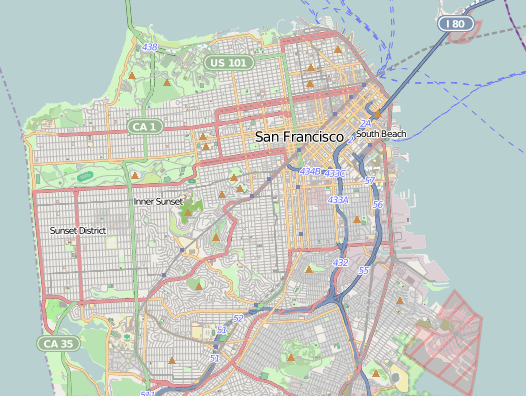
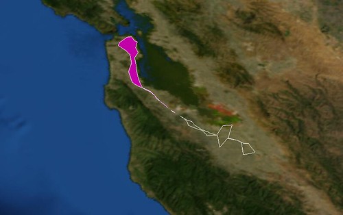
Or tagged “caltrain“, the commuter train that runs between San Francisco and San Jose:

tag=caltrain, alpha=0.001

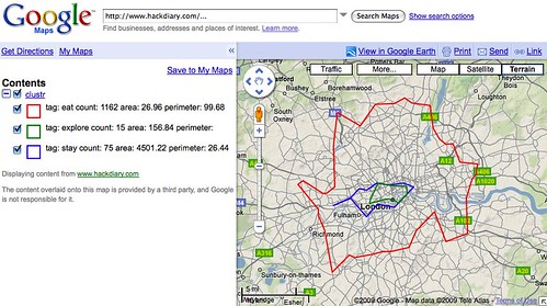
Meanwhile, Matt Biddulph at Dopplr has been generating a series of visualizations depicting the shape of where to eat, stay and explore for the cities in their Places database. This is what London looks like:

Or: “London dopplr places, filtered to only places my social network has been to, clustrd“.

One of the things I like the most about Clustr is that it will generate shape(file)s for any old list of geographic coordinates. Now that most of the hassle of setting up Clustr has been (mostly) removed, the only question left is: What do you want to render?

“They do not detail locations in space but histories of movement that constitute space.”

Rob Kitchin, Chris Perkins

If you’re like me you’re probably thinking something like “Wouldn’t it be nice if I could just POST a points file to a webservice running on the AMI and have it return a compressed shapefile?” It sure would so I wrote a quick and dirty version (not included in the MFS AMI; you’ll need to do that yourself) in PHP but if there are any Apache hackers in the house who want to make a zippy C version that would be even Moar Awesome ™.

If you don’t want to use the MFS AMI and would rather just install Clustr on your own machine instance, here are the steps I went through to get it work on a Debian 5.0 (Lenny) AMI; presumably the steps are basically the same for any Linux flavoured operating system:

$> apt-get update
$> apt-get install libcgal-dev
$> apt-get install libgdal1-dev
$> apt-get install subversion

$> svn co http://code.flickr.com/svn/trunk/clustr/
$> cd clustr
$> make
$> cp clustr /usr/bin/

$> clustr -h

clustr 0.2 - construct polygons from tagged points
written by Schuyler Erle

(c) 2007-2008 Yahoo!, Inc.

Usage: clustr [-a <n>] [-p] [-v] <input> <output>
   -h, -?      this help message
   -v          be verbose (default: off)
   -a <n>      set alpha value (default: use "optimal" value)
   -p          output points to shapefile, instead of polygons

If <input> is missing or given as "-", stdin is used.
If <output> is missing, output is written to clustr.shp.
Input file should be formatted as: <tag> <lon> <lat>n
Tags must not contain spaces.
        

Just like that!

photo by Timo Arnall

Defining the boundaries we are all within

Last week I made a blog post about what we call ‘corrections’ and because a picture is worth a thousand words, here’s where people have been fixing things in Europe …

… and over in the US …


… as expected most of the corrections to neighborhoods are taking place in major cities. Also seemingly most of the UK, presumably because the population is high and our current data is messy (or too abstract) there.

As we get more of this stuff back, the process of feeding it into the system will get underway (in some form or other).

I wonder that as that happens, we’ll see the corrections move away from already heavily corrected locations like cities, or if they’ll continue to be areas that appear to have highly contested borders.

Only time will tell I guess, we’ll keep tracking it.

Map extracts taken from this world map by Serguei.