Kay is a Community Manager for Flickr and passionate about extraordinary photography. As an editor on Flickr Blog he loves to showcase the beauty and diversity of Flickr in his posts. When he's not blogging or making Flickr more awesome (in front of and behind the scenes), you can find him taking pictures with his beloved Nikon and iPhone, listening to Hans Zimmer's music or playing board games. | On Flickr you can find him at https://flic.kr/quicksilver
At Flickr Engineering our favorite thing is rainbows. But fast stable websites come a pretty close second. So last week some of us drove down to San Jose to take part in the 2009 O’Reilly Velocity conference.
The conference consists of two tracks, performance and operations. The attendance was a great mix of people working on optimizing the whole web stack – everything from the download size of CSS to the PUE of data centers. There were talks on automated infrastructure, Javascript, MySQL, front-end performance recommendations and CDNs, but the most significant theme was the direct business benefits that companies like Google and Microsoft are seeing from microsecond speed improvements on their sites.
Some of the most interesting sessions for for us were:
Eric Schurman and Jake Brutlag’s joint presentation about performance benefits seen at Google and Bing (details , slides , video )
Andrew Shafer’s discussion of Agile Infrastructure (details )
Adam Jacobs and Ezra Zygmuntowicz’s talk about Cloud Infrastructure (details )
John and I also gave a talk on how Flickr’s engineering and operations team work together to allow us to iterate quickly without causing stability problems. The full video is available, and here’s the slides:
Use this to explore your neighborhood, or find the best places to photograph local landmarks from. Reload the page as you walk around a city, and see the things that have happened there in the past. You’ll see a place through the eyes of the flickrverse.
…without a trailing latitude and longitude, we’ll see if you have any one of a variety of browser plugins that can tell us your location. This is similar to the Find My Location button on the site maps, that Dan described back in April, but for nearby!
Like the iPhone’s Mobile Safari browser, the next version of Firefox (version 3.5, currently being tested as a release candidate) will also support automagic geolocation so you won’t even need to install any plugins or other widgets.
The other piece of nearby-related news is Tom Taylor’s fantastic FireEagle application for the Mac called Clarke.
Clarke is a toolbar app that sits quietly in the background and scans the available wireless networks using the Skyhook APIs to triangulate your position and updates FireEagle with your current location.
In addition to being an excellent FireEagle client, Clarke also supports Nearby-iness for a variety of services, including Flickr.
I’m writing this post from FlickrHQ, in downtown San Francisco, so when I choose Flickr from Clarke’s Nearby menu it loads the following page in my web browser:
Which is kind of awesome! It means that you can travel to a brand new place, open up your laptop and just like magic (read: once you’ve connected to a wireless network) see pictures nearby.
To the extent possible under law, Flickr has waived all copyright and related or neighboring rights to the “Flickr Shapefiles Public Dataset, Version 1.0”. This work is published from the United States. While you are under no obligation to do so, wherever possible it would be extra-super-duper-awesome if you would attribute flickr.com when using the dataset. Thanks!
We are doing this for a few reasons.
We want people (developers, researchers and anyone else who wants to play) to find new and interesting ways to use the shapefiles and we recognize that, in many cases, this means having access to the entire dataset.
We want people to feel both comfortable and confident using this data in their projects and so we opted for a public domain license so no one would have to spend their time wondering about the issue of licensing. We also think the work that the Creative Commons crew is doing is valuable and important and so we chose to release the shapefiles under the CC0 waiver as a show of support.
We want people to create their own shapefiles and to share them so that other people (including us!) can find interesting ways to use them. We’re pretty sure there’s something to this “shapefile stuff” even if we can’t always put our finger on it so if publishing the dataset will encourage others to do the same then we’re happy to do so.
The dataset itself is pretty straightforward. It is a single 549MB XML file uncompressed (84MB when zipped). The data model is a simple, pared-down version of what you can already get via the Flickr API with an emphasis on the shape data.
Everything lives under a single root places element. For example:
<place woe_id="26" place_id="BvYpo7abBw" place_type="locality" place_type_id="7" label="Arvida, Quebec, Canada">
	<shape created="1226804891" alpha="0.00015" points="45" edges="15" is_donuthole="0">
		<polylines bbox="48.399932861328,-71.214576721191,48.444801330566,-71.157333374023">
			<polyline>
				<!-- points go here-->
			</polyline>
		</polylines>
		<shapefile url="http://farm4.static.flickr.com/3203/shapefiles/26_20081116_082a565562.tar.gz" />
	</shape>

	<!-- and so on -->
</place>
Aside from the quirkiness of the shapes themselves, it is worth remembering that some of them may just be wrong. We work pretty hard to prevent Undue Wronginess ™ from occurring but we’ve seen it happen in the past and so it would be, well, wrong not to acknowledge the possibility. On the other hand we don’t think we would have gotten this far if it wasn’t mostly right but if you see something that looks weird, please let us know
The dataset is available for download, today, from:
They’ve also released the GeoPlanet Placemaker API. You feed it a big old chunk of free-form text and then “the service identifies places mentioned in text, disambiguates those places, and returns unique identifiers (WOEIDs) for each, as well as information about how many times the place was found in the text, and where in the text it was found.”
And a bit dorky. It’s true. The data, all by itself, won’t tell a story. It needs people and history to make that possible but as you poke around all this stuff don’t forget the value of having a big giant, and now open, database of unique identifiers and what is possible when you use them as a bridge between other things. Without WOE IDs we wouldn’t have been able to generate the shapefiles or do the Places project or provide a way to search for photos by place, rather than location.
Enjoy!
Oh, and those “unidentified” outliers, in New York City, that I mentioned in the last post about the donut hole shapefiles: The Bronx Zoo, Coney Island and Shea Stadium. Of course!
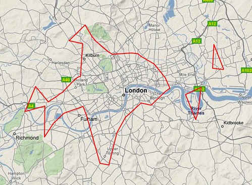
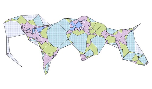
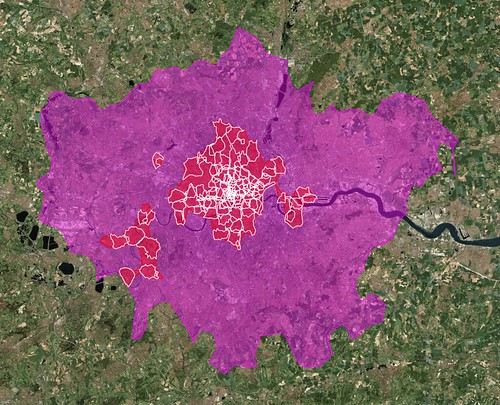
Back in January, I wrote a blog post about some experimental work that I’d been doing with the shapefile data we derive from geotagged photos. I was investigating the idea of generating shapefiles for a given location using not the photos associated with that place but, instead, from the photos associated with the children of that place. For example, London:
The larger pink shape is what we (Flickr) think of as the “city” of London. The smaller white shapes are its neighbourhoods. The red shapes represent an entirely new shapefile that we created by collecting all the points for those neighbourhoods and running them through Clustr, the tool we use to generate shapes.
For lack of any better name I called these shapes “donut holes” because, well, because that’s what they look like. The larger shape is a pretty accurate reflection of the greater metropolitain area of London, the place that has grown and evolved over the years out of the city center that most people would recognize in the smaller red shape. Our goal with the shapefiles has always been to use them to better reverse-geocode people’s geotagged photos so these sorts of variations on a theme can better help us understand where a place is.
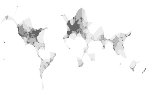
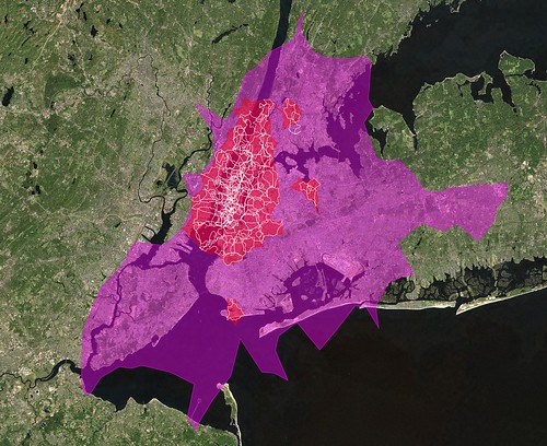
Like New York City. No one gets New York right including us try as we might (though, in fairness, it’s gotten better recently (no, really)) and even I am hard pressed to explain the giant pink blob, below, that is supposed to be New York City. On the other hand, the red donut hole shape even though (perhaps, because) it spills in to New Jersey a bit is actually a pretty good reflection of the way people move through the city as a whole.
It could play New York on TV, I think.
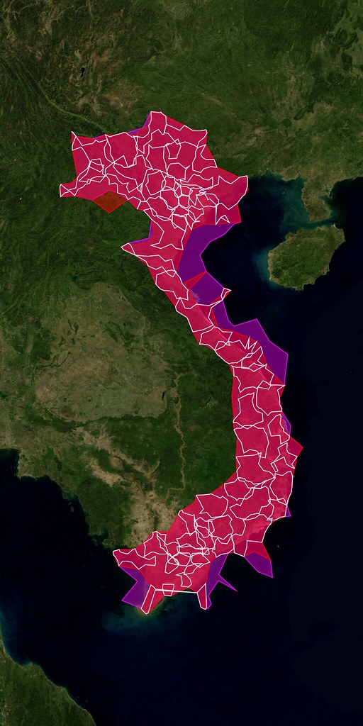
I’m not sure how to explain the outliers yet, either, other than to say the shapefiles for city-derived donut holes may contain up to 3 polygons (or “records” in proper Shapefile-speak) compared to a single polygon for plain-old city shapes so if nothing else it’s an indicator of where people are taking photos.
If the shapefiles themselves are uncharted territory, the donut holes are the fuzzy horizon even further off in the distance. We’re not really sure where this will take us but we’re pretty sure there’s something to it all so we’re eager to share it with people and see what they can make of it too.
(This is probably still my favourite shapefile ever.)
Starting today, the donut hole shapes are available for developers to use with their developer magic via the Flickr API.
At the moment we are only rendering donut hole shapefiles for cities and countries. I suppose it might make sense to do the same for continents but we probably won’t render states (or provinces) simply because there is too much empty unphotographed space between the cities to make it very interesting.
There are also relatively few donut holes compared to the corpus of all the available shapefiles so rather than create an entirely new API method we’ve included them in the flickr.places.getShapeHistory API method which returns all the shapefiles ever created for a place. Each shape element now contains an is_donuthole attribute. Here’s what it looks like for London:
<shapes total="6" woe_id="44418" place_id=".2P4je.dBZgMyQ"
	place_type="locality" place_type_id="7">

	<shape created="1241477118" alpha="9.765625E-05" count_points="275464"
		count_edges="333" is_donuthole="1">

		<!-- shape data goes here... -->

	</shape>

	<!-- and so on ->

</shapes>
Meanwhile, the places.getInfo API method has been updated to included a has_donuthole attribute, to help people decide whether it’s worth calling the getShapeHistory method or not. Again, using London as the example:
<place place_id=".2P4je.dBZgMyQ" woeid="44418" latitude="51.506"
       longitude="-0.127" place_url="/United+Kingdom/England/London"
       place_type="locality" place_type_id="7" timezone="Europe/London"
       name="London, England, United Kingdom" has_shapedata="1">

	<shapedata created="1239037710" alpha="0.00029296875" count_points="406594"
                   count_edges="231" has_donuthole="1" is_donuthole="0">

        <!-- and so on -->
</place>
Finally, here’s another picture by Shannon Rankin mostly just because I like her work so much. Enjoy!
One passage that I thought was worth calling out, and which I’ve copied verbatim below, is Shelley’s answer to the question “Why did you decide to build an API?”
First, practical… in the past we’d been asked to be a part of larger projects where institutions were trying to aggregate data across many collections (like d*hub). At the time, we couldn’t justify allocating the time to provide data sets which would become stale as fast as we could turn over the data. By developing the API, we can create this one thing that will work for many people so it no longer become a project every time we are asked to take part.
Second, community… the developer community is not one we’d worked with before. We’d recently had exposure to the indicommons community at the Flickr Commons and had seen developers like David Wilkinson do some great things with our data there. It’s been a very positive experience and one we wanted to carry forward (emphasis mine) into our Collection, not just the materials we are posting to The Commons.
Third, community+practical… I think we needed to recognize that ideas about our data can come from anywhere, and encourage outside partnerships. We should recognize that programmers from outside the organization will have skills and ideas that we don’t have internally and encourage everyone to use them with our data if they want to. When they do, we want to make sure we get them the credit they deserve by pointing our visitors to their sites so they get some exposure for their efforts.
I just added a button to the Explore Map and the pop-up map you see when geotagging your own photos from the photo page (organizer support v.soon).
Using my l33t Skitch skills I’ll attempt to highlight it …
… but WAIT! You maynot see it! It’s one of those “Power-User” type things…
To get the button to show up you’ll need some form of geo-locating built-in/plug-in type thing, or maybe you’re all smarty-pants and running a cutting edge beta version of a browser with location finding built in already. Perhaps you’ve already installed Google Gears, in which case we’ll use that.
Probably the easiest way of getting the button to appear is to pop over to the Loki site and click the “Try it Now” button, install the plug-in, then pop back to Flickr. Loki is from the SKYHOOK Wireless peeps, who all the cool kids seem to be using.
You can also click over to the Mozilla Labs and read more about their Geode project, about how location stuff will soon be built into browsers and everything and install their geode plug-in from there.
Either way, it’ll check all three “things” and show the button if it finds one, as more options come along I’ll add those too.
As an aside …
This is why you shouldn’t do graphical buttons and multi-language support at the same time.
Over on our sister photo arty blog you could easily imagine reading phrases like “One of the amazing things about working at Flickr is the vast amount of incredible photography it exposes you to“, or some such. Hah! Those arty types!
Over here, I’d like to post the flip side … about how one of the amazing things about working at Flickr, is the awesome people I get to work with.
Take for example …
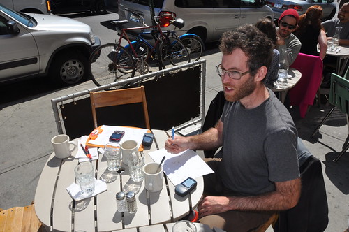
Ross Harmes
… people often think I’m joking when we’re sitting in a meeting, discussing how we should standardise our front-end coding conventions or some such and I say we should just “ask Ross”.
But! BUT!! but, Ross wrote a fricking book about JavaScript; Pro JavaScript Design Patterns and sits 3 desks away, it’s faster (and more amusing (to me)) to shout out a question than it is to flick through the index of the book. It’s like having the talking Kindle version, but with a much more natural voice!
If you want to join in, you can read more over on the official RevCanonical blog and get, fork or whatever it is people do with code on github. And I’m sure we’ll have more news about RevCanonical here soon :)
But not content with starting that wildfire, Kellan has also been does his bit to help OpenStreetMap, by walking around with a GPS unit and, I think this part is important, drinking beer …
… shown here featuring our good friend Mikel Maron, remember we use OpenSteetMap on Flickr when our own maps are a little sparse. More on maps later!
As well as smoldering he also gave a talk at the Web 2.0 Expo called Operational Efficiency Hacks the other week. If you’re into that type of thing and missed it, which you probably did, here are his slides …
… and his follow up post adds a little further reading. If you like this kinda of thing you should probably subscribe to his blog where he posts really interesting Flickr related stuff, and infuriatingly enough *not* here on this blog, /me sulk.
On the subject of Allspaw (and as we’ve already mentioned one book), I was pretty sure I’d mentioned his book before: The Art of Capacity Planning: Scaling Web Resources … if building big things on the web is your kinda thing, but apparently I haven’t, so …
According to a reviewer on Amazon “John’s examples are just like Charlie’s from the TV show Numb3rs”, having never watched Numb3rs I can only assume that’s a probably a bad thing (kinda like Scully from X-Files explaining science) but gave it 4 stars anyway :) on those grounds alone you should buy it …
Oh and don’t forget the WebOps Visualizations Pool on flickr, that John often posts to when things suddenly get much better or worse ;) if you enjoy graphs like this …
It’s an extensive and easy to use javascript thingy … wait, Scott says it better … “SoundManager 2 wraps and extends the Flash Sound API, and exposes it to Javascript. (The flash portion is hidden, transparent to both developers and end users.)” … which basically means that if you like JavaScript, messing with audio but hate, I mean, dislike working with Flash, it can save you a lot of pain. Here’s one of the demos Scott put together …
And if you think that all looks awesome, remember that Scott is one of our fantastic front-end guys, bringing all that good js magic to Flickr! Apart from the music part, well unless we one day decide to add music and customisable backgrounds to flickr [1].
Aaron Straup Cope
Aaron covered this only the other day: The Only Question Left Is, but has been doing an awful lot with generating shapefiles recently. I just wanted to add my take to it, because even I have trouble keeping up.
Basically what I want, is to be able to send something-somewhere a list of latitudes and longitudes and it return me the “shape” that those points make. This could be anything, the locations of geotagged Squirrels, or even something useful, well kinda like this from MattBiddulph (him wot of Dopplr) …
“London dopplr places, filtered to only places my social network has been to, clustrd“
… which maps out something of interest to him, where his “social network” go/eat etc. in London. Which may be different from mine, or could even have some overlap, thus answering the time old question; which pub should we all go to for lunch?
It’s not quite at the point where you can do it without having to put a little effort in, but I keep prodding Aaron because I want it now! But if you’re the type that does enjoy putting the effort in then you can again do the GitHub dance here: ws-clustr and py-wsclustr (Python bindings for spinning up and using an EC2 instance running ws-clustr).
Once more, more on maps later.
Daniel Bogan – Setup Man
Bogan is virtual, and only exists in the internets, as can be seen here …
… kind of like Max Headroom, but with worse resolution. Which I think makes Flickr the first interweb company you have a real AI working on the code, not that pretend AI stuff!
Last year he has a bash at helping to put a little context around us delicate flower developers, with a quick run-down of the setup we each used with Trickr, or Humanising the Developers (Part 1) & Trickr, or Humanising the Developers (Part 2). Based on an old project of his called “The Setup” where he used to interview various Internet Famous people (when there wasn’t so damn many of them) about their Setup.
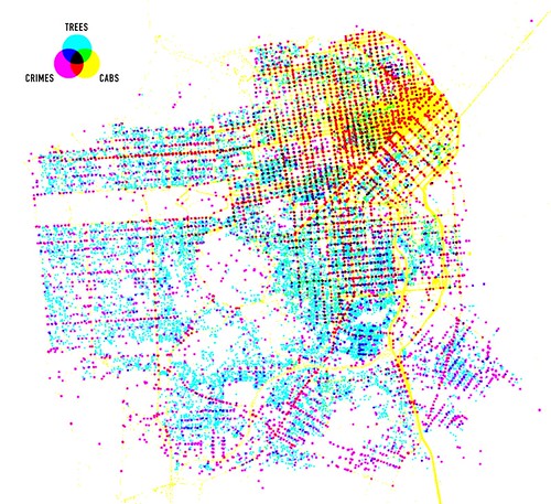
Meanwhile, if you’re reading this blog, you’ve probably already seen this, I’ve been trying my hand at using Processing to visualize 24 hours of geotagged photos on Flickr …
So that’s what some of us are up-to, and going back to the start, I’m amazed and all the stuff that goes on, brilliant minds and all that.
In my head, this is what ties it all together, hang on, here we go …
Kellan’s been walking around with a GPS unit (along with 1000s of others), adding to the OpenStreetMap (OSM) dataset, we (Flickr) sometimes use that dataset, but also … Matt Jones (also him wot of Dopplr) made this …
… using Cloudmade, who in turn use OSM data to allow people to easily style up and use maps. Now, I’m sure Mr Jones, wont mind me saying that he’s not a coder, infact here he is; Matt Jones – Design Husband …
Then using our wonderfully public Shape Files API (flickr.places.getShapeHistory which yes you can get in JSON format for using with Processing or JavaScript) overlay boundaries. Even, when it’s easier (for the non-programmer) plot outlines and shapes, based on the code Aaron is working on, onto those maps.
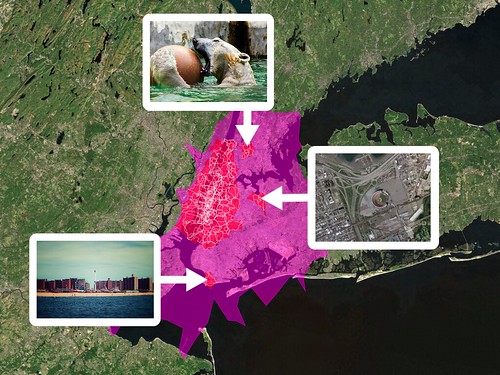
But where could you get such useful data for plotting or visualising, well obviously there’s our API, which is where the senseable team at MIT got the data for their Los ojos del mundo (the world’s eyes) project, again using Processing …
But also, let us recall “Stinky” Willison, one time employee of Flickr, who now works at The Gruadian. They have a geocoding project, that allows you, if you so wished to place their stories on a map … http://guardian.apimaps.org/search.html … which uses Mapping from Cloudmade, map data from OpenStreetMap, location search from our very own API, and stories from their own API. Which in turn allows you to plot their stories on your own maps, phew!
You can also read about their Data Store, which gives you access to a load of easy to use data just ripe for visualizing…
… be that with Processing, Flash or JavaScript (following the advice in Ross’s book), and even with photos from Flickr and Audio driven with Scott’s SoundManager2, in “Shapes” powered by Aaron, and preserved with short URLs that’ll stick around, thanks Kellan :) and you can scale it if you need to by following John’s insights.
And that’s just what we do when we’re not working on Flickr.
Straightforward, and thorough tutorial on working with the Flickr API and Rails. Takes you from installing the libraries, to coding, to designing your layout, to caching to speed up your site (and keep Flickr happy with you). Awesome.
All of this is interesting in its own right; proof that there is still a lot of room in which to imagine maps beyond so-called red-dot fever. All of this is extra interesting in light of Apple’s recent announcement to allow developers to define their own map tiles in the next iPhone OS release. All of this super-duper interesting because it is work produced by a team of less than 10 people.
The tools, and increasingly the data, to build the maps we want are bubbling up and becoming easier and more accessible to more people every day. Easier, anyway.
“One of the things that made this tutorial especially interesting for us was our use of Amazon’s EC2 service, the “Elastic Compute Cloud” that provides billed-by-the-hour virtual servers with speedy internet connections and a wide variety of operating system and configuration options. Each participant received a login to a freshly-made EC2 instance (a single server) with code and lesson data already in-place. We walked through the five stages of the tutorial with the group coding along and making their own maps, starting from incomplete initial files and progressing through added layers of complexity.
“Probably the biggest hassle with open source geospatial software is getting the full stack installed and set up, so we’ve gone ahead and made the AMI (Amazon Machine Image, a template for a virtual server) available publicly for anyone to use, along with notes on the process we used to create it.”
The Maps From Scratch (MFS) AMI may not be a Leveraged Turn Key Synergistic Do-What-I-Mean Solutions Platform but, really, anything that dulls the hassle and cost of setting up specialized software is a great big step in the right direction. I mention all of this because Clustr, the command-line application we use to derive shapefiles from geotagged photos, has recently been added to the list of tools bundled with the MFS AMI.
Specifically: ami-4d769124.
We’re super excited about this because it means that Clustr is that much easier for people to use. We expressly chose to make Clustr an open-source project to share some of the tools we’ve developed with the community but it has also always had a relatively high barrier to entry. Building and configuring a Unix machine is often more that most people are interested in, let alone compiling big and complicated maths libraries from scratch. Clustr on EC2 is not a magic pony factory but hopefully it will make the application a little friendlier.
Assuming that you familiar using Unix command line tools, let’s also assume that you have gotten all your ducks in a row and are ready to fire up the MFS AMI:
i-xxxxxxxx is the unique identifier of your current EC2 session. You will need this to tell Amazon to shut down the server and stop billing you for its use.
ec2-xxxxx.amazonaws.com is the address of your EC2 server on the Internets.
Once you have that information, you can start using Clustr. First, log in and create a new folder where you’ll save your shapefile:
ec2-xxxxx.amazonaws.com> /usr/bin/clustr -v -a 0.001
   /root/clustr/start/points-2009-03-24.txt
   /root/clustr-test/clustr-test.shp
By default Clustr generates a series of files named clustr (dot shp, dot dbf and dot shx because shapefiles are funny that way) in the current working directory. You can specify an alternate name by passing a fully qualified path as the last argument to Clustr. When run in verbose mode (that’s the -v flag) you’ll see something like this:
Reading points from input.
Got 44410 points for tag '20090324'.
799 component(s) found for alpha value 0.001.
- 23 vertices, area: 86.7491, perimeter: 71.9647
- 32 vertices, area: 1171.51, perimeter: 41.3095
- 8 vertices, area: 18.5112, perimeter: 0.529504
- 12 vertices, area: 1484.81, perimeter: 10.8544
...
Writing 505 polygons to shapefile.
Now copy the shapefiles back to your computer and terminate your EC2 instance (or you might be surprised when you get your next billing statement from Amazon).
I created this image (using the open source QGIS application) for all those points by running Clustr multiple times with alpha numbers ranging from 0.05 to 603:
Here’s another version rendered using the nik2img application and a custom style sheet, both included with the MFS distribution:
Here’s one of all the geotagged photos tagged “route66” (with alpha numbers ranging from 0.001 to 0.5):
Apologies and big sloppy kisses to Stamen’s own Mappr (first released in 2005).
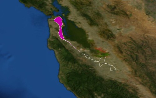
Or tagged “caltrain“, the commuter train that runs between San Francisco and San Jose:
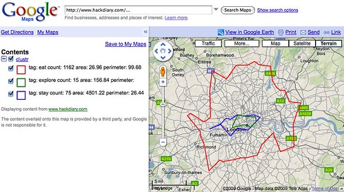
Meanwhile, Matt Biddulph at Dopplr has been generating a series of visualizations depicting the shape of where to eat, stay and explore for the cities in their Places database. This is what London looks like:
One of the things I like the most about Clustr is that it will generate shape(file)s for any old list of geographic coordinates. Now that most of the hassle of setting up Clustr has been (mostly) removed, the only question left is: What do you want to render?
“They do not detail locations in space but histories of movement that constitute space.”
If you’re like me you’re probably thinking something like “Wouldn’t it be nice if I could just POST a points file to a webservice running on the AMI and have it return a compressed shapefile?” It sure would so I wrote a quick and dirty version (not included in the MFS AMI; you’ll need to do that yourself) in PHP but if there are any Apache hackers in the house who want to make a zippy C version that would be even Moar Awesome ™.
If you don’t want to use the MFS AMI and would rather just install Clustr on your own machine instance, here are the steps I went through to get it work on a Debian 5.0 (Lenny) AMI; presumably the steps are basically the same for any Linux flavoured operating system:
$> apt-get update
$> apt-get install libcgal-dev
$> apt-get install libgdal1-dev
$> apt-get install subversion

$> svn co http://code.flickr.com/svn/trunk/clustr/
$> cd clustr
$> make
$> cp clustr /usr/bin/

$> clustr -h

clustr 0.2 - construct polygons from tagged points
written by Schuyler Erle

(c) 2007-2008 Yahoo!, Inc.

Usage: clustr [-a <n>] [-p] [-v] <input> <output>
   -h, -?      this help message
   -v          be verbose (default: off)
   -a <n>      set alpha value (default: use "optimal" value)
   -p          output points to shapefile, instead of polygons

If <input> is missing or given as "-", stdin is used.
If <output> is missing, output is written to clustr.shp.
Input file should be formatted as: <tag> <lon> <lat>n
Tags must not contain spaces.


![A [ Radiohead / JavaScript / Boids / Canvas / SM2 ] mashup by Jacob Seidelin](http://farm4.static.flickr.com/3305/3427837146_6ddf2b3870.jpg)