Every Step A Story

Many of you will have already read on the sister Flickr.com blog that we added “nearby” pages to the m.flickr.com site, last week, for phones that support the W3C Geolocation API (that means the iPhone, or Gears if you’ve got an Android phone).

Ross summed it up nicely, writing:

Use this to explore your neighborhood, or find the best places to photograph local landmarks from. Reload the page as you walk around a city, and see the things that have happened there in the past. You’ll see a place through the eyes of the flickrverse.

We’ve also updated the nearby pages on the main site so that when you go to…

www.flickr.com/nearby

…without a trailing latitude and longitude, we’ll see if you have any one of a variety of browser plugins that can tell us your location. This is similar to the Find My Location button on the site maps, that Dan described back in April, but for nearby!

Like the iPhone’s Mobile Safari browser, the next version of Firefox (version 3.5, currently being tested as a release candidate) will also support automagic geolocation so you won’t even need to install any plugins or other widgets.

Just point your browser to www.flickr.com/nearby/ and away you go.

The other piece of nearby-related news is Tom Taylor’s fantastic FireEagle application for the Mac called Clarke.

Clarke is a toolbar app that sits quietly in the background and scans the available wireless networks using the Skyhook APIs to triangulate your position and updates FireEagle with your current location.

In addition to being an excellent FireEagle client, Clarke also supports Nearby-iness for a variety of services, including Flickr.

I’m writing this post from FlickrHQ, in downtown San Francisco, so when I choose Flickr from Clarke’s Nearby menu it loads the following page in my web browser:

http://www.flickr.com/nearby/37.794116,-122.402776

Which is kind of awesome! It means that you can travel to a brand new place, open up your laptop and just like magic (read: once you’ve connected to a wireless network) see pictures nearby.

Woosh!

Videos in the Flickr API: Part Deux

We hope it’s obvious that long photos are taken extremely seriously here at FlickrHQ. To that end, it’s important that videos be first class citizens in our api. And with today’s launch of video for free users and the HD output, we have some important new api changes to share with you. So if you’re an uploader developer, a mobile application developer, or you make those things that are changing the way that people consume their tv and other media (nudge-nudge Boxee), take a look at these new additions to the api and make our long photos feel right at home in your apps.

With the addition of our HD output, all videos are now transcoded into 2 or 3 MP4s. Since these are in a widely-supported format, we thought it would be interesting to make them available to third-party developers. flickr.photos.getSizes will give you semi-permanent urls to the 700k site output, the mobile-optimized output, the 2mbps HD output (if available), and the original video (if the call is authenticated by the video owner and the owner is a pro member). For example:

<rsp stat="ok">
<sizes canblog="1" canprint="1" candownload="1">
<size label="Square" width="75" height="75" source="http://farm4.static.flickr.com/3436/3232057393_815b1c5d26_s.jpg" url="http://www.flickr.com/photos/mylesdgrant/3232057393/sizes/sq/" media="photo"/>
<size label="Thumbnail" width="100" height="56" source="http://farm4.static.flickr.com/3436/3232057393_815b1c5d26_t.jpg" url="http://www.flickr.com/photos/mylesdgrant/3232057393/sizes/t/" media="photo"/>
<size label="Small" width="240" height="135" source="http://farm4.static.flickr.com/3436/3232057393_815b1c5d26_m.jpg" url="http://www.flickr.com/photos/mylesdgrant/3232057393/sizes/s/" media="photo"/>
<size label="Medium" width="500" height="281" source="http://farm4.static.flickr.com/3436/3232057393_815b1c5d26.jpg" url="http://www.flickr.com/photos/mylesdgrant/3232057393/sizes/m/" media="photo"/>
<size label="Original" width="1280" height="720" source="http://farm4.static.flickr.com/3436/3232057393_204af3bcff_o.jpg" url="http://www.flickr.com/photos/mylesdgrant/3232057393/sizes/o/" media="photo"/>
<size label="Video Player" width="640" height="360" source="http://www.flickr.com/apps/video/stewart.swf?v=1233362721&photo_id=3232057393&photo_secret=815b1c5d26" url="http://www.flickr.com/photos/mylesdgrant/3232057393/" media="video"/>
<size label="Site MP4" width="640" height="360" source="http://www.flickr.com/photos/mylesdgrant/3232057393/play/site/815b1c5d26/" url="http://www.flickr.com/photos/mylesdgrant/3232057393/" media="video"/>
<size label="Mobile MP4" width="480" height="360" source="http://www.flickr.com/photos/mylesdgrant/3232057393/play/mobile/815b1c5d26/" url="http://www.flickr.com/photos/mylesdgrant/3232057393/" media="video"/>
<size label="HD MP4" width="1280" height="720" source="http://www.flickr.com/photos/mylesdgrant/3232057393/play/hd/815b1c5d26/" url="http://www.flickr.com/photos/mylesdgrant/3232057393/" media="video"/>
<size label="Video Original" width="1280" height="720" source="http://www.flickr.com/photos/mylesdgrant/3232057393/play/orig/123fakest/" url="http://www.flickr.com/photos/mylesdgrant/3232057393/" media="video"/>
</sizes>
</rsp>

Use this if you’re lazy. If you’re not lazy and want to be one of the cool kids, you can construct the urls to these outputs yourself, assuming you have the nsid or custom url of the owner, the video id, and the secret (or original secret). Requesting the HD output for a video that doesn’t have it (because it’s less than 720 pixels high, or the owner is a free member), will deliver a 404. An example url:

http://www.flickr.com/photos/{user-id|custom-url}/{photo-id}/play/{site|mobile|hd|orig}/{secret|originalsecret}/

If you’re developing uploading tools for free users, flickr.people.getUploadStatus has new attributes to determine whether a user is allowed to upload any more videos or not. If the user is a free user, the output of this method will now look something like this:

<rsp stat="ok">
<user id="88251462@N00" ispro="0">
<username>Dev Myles</username>
<bandwidth max="107373568" used="0" maxbytes="104857600" usedbytes="0" remainingbytes="104857600" maxkb="104857" usedkb="0" remainingkb="104857" unlimited="0"/>
<filesize max="10485760" maxbytes="10485760" maxkb="10240" maxmb="10"/>
<sets created="7" remaining="lots"/>
<videosize maxbytes="157286400" maxkb="153600" maxmb="150"/>
<videos uploaded="0" remaining="2"/>
</user>
</rsp>

Note the new <videos> element in the response, which will let you know how many more videos this user can upload this month.

And as always, if you feel like we’re missing something, please let us know.

Lessons Learned while Building an iPhone Site

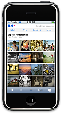
The Explore Page in the iPhone site

A few weeks ago we released a version of the Flickr site tailored specifically for the iPhone. Developing this site was very different from any other project I’ve worked on; there seems to be a new set of frontend rules for developing high-end mobile sites. A lot of the current best practices get thrown out the window in the quest for minimum page weight and fastest load times over slow cellular connections.

Here are a few of the lessons we learned (sometimes painfully) while developing this site.

1. Don’t Use a JavaScript Library or CSS Framework

This was one of the hardest things for me to come to terms with. I’m a huge fan of libraries, especially YUI, mostly because they allow me to spend my time creating new stuff instead of working around crazy browser quirks. But these libraries walk a fine line; by definition, they must work across a wide array of browsers and offer enough features to make them worth using. This means they potentially contain a lot of code that you don’t care about and won’t use. This code is dead weight to your site.

With such a high percentage of normal web users on broadband connections, we’ve gotten cavalier about what we can include in our pages. 250 KB of JavaScript or more isn’t uncommon for a large site these days. But for sites that are meant to be viewed over slow cellular connections like EDGE, 250 KB is an impossible amount of data. The only way to get the size of your JavaScript down is to selectively pull code out of libraries, and include only what you use. This means you can rip out code meant only for browsers that you won’t support (modular libraries like the new YUI 3.0 allow you to only include the code you use, preventing this problem somewhat).

The same goes for CSS. Frameworks make development faster and your final product more robust, but they, like the JavaScript libraries, include code for situations you won’t have to deal with. Every line in your CSS must be custom; each property must be scrutinized to ensure it’s needed.

2. Load Page Fragments Instead of Full Pages
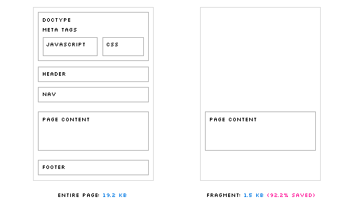
Loading fragments saves 92.2% of the page size

When navigating through a site, most of what changes from page to page is the actual content; the JavaScript, CSS, header and footer stay mostly the same. We can use this to our advantage by only loading the part of each page that changes. We did this by hijacking all links of the page: when a link is clicked, we intercept the event, fetch the page fragment using Ajax, and insert the HTML into a new div. This has several benefits:

  • Since you control the entire life cycle of the page fetch, you can display loading indicators or a wireframe version of the page while new pages load
  • All pages that have been fetched will exist within the DOM; clicking the back button (or clicking on a link for a page that has already been fetched) results in an instantaneous page load
  • The page fragments are extremely small; ours are about 800 bytes (gzipped) on average

Using this system complicates your code a bit. You need JavaScript to handle the hijacking, the page fragment insertion, and the address bar hash changes (which allow the back and forward buttons to work normally). You also need your backend to recognize requests made with Ajax, and to only send the page content instead of the full HTML document. And lastly, if you want normal URLs to work, and each of your pages to be bookmarkable, you will need even more JavaScript.

Despite these downsides, the benefits can’t be ignored. The extra JavaScript code is a one-time cost, but the extra page content that we would have downloaded is saved for every page load. We found it was worth the complication and additional JS in order to dramatically reduce the time it took to load each page.

3. Don’t Build for Just One Device

It’s really tempting to build the site for just the iPhone: you can use modern CSS (including things like CSS3 selectors and transformations), you don’t have to hack around annoying browser quirks, and testing is extremely easy. But any single device, even one as ubiquitous as the iPhone, has a limited share of the mobile market, especially internationally. Rarely can you justify the cost of creating a one-off site for a very small number of your users.

Luckily the current generation of high-end mobile browsers is excellent in terms of support for modern features. Many phones use a WebKit derivative, including the iPhone, and Symbian and Android phones. Other phones either come with or can use Opera Mobile or the new mobile version of Firefox (called Fennec). For the most part, very few changes are needed in order to support these browsers.

Most of the differences lie in layout. It’s important to structure your pages around a grid that can expand as a percentage of the page width. This allows your layouts to work on many different screen sizes and orientations. The iPhone, for example, allows both landscape and portrait viewing styles, which have vastly different layout requirements. By using percentages, you can have the content fill the screen regardless of orientation. Another option is to detect viewport width and height, and use JavaScript to dynamically adjust classes based on those measurements (but we found this was overkill; CSS can handle most situations on its own).

4. Optimize Everything

The browsers on mobile devices operate under much stricter constraints than their desktop cousins. Slower CPUs, smaller amounts of memory, and smaller hard drives mean that less data can be cached. On the iPhone, for instance, only files smaller than 25 KB are cached. This puts very specific limits of the size of your files. For a large site like Flickr, 25 KB worth of JavaScript and CSS barely scratches the surface. To put our files under the limit, we ran everything through the YUI Compressor using the most aggressive settings. We ran all images through compression tools as well (we like pngout and Smushit), reducing each image file by an average of 40%. We also made heavy use of sprites, where possible.

In the end, we were able to go from 90+ second load times over EDGE to less than 7 for an empty cache experience. Using page fragments, we are able to load and display new pages in under a second (though the images in those pages take longer to load). These are not trivial gains, and make the difference between a good mobile experience and a one that is so awful the user gives up halfway through the page load.

5. Tell the User What is Happening

Once we hijacked all clicks actions in order to load page fragments, it wasn’t always clear to the user if anything was happening when they clicked on a link. This is especially true on touch devices, where it is difficult to know if the device even detected your action. To combat this problem, we added loading indicators to every link. These tell the user that something is happening, and reassures them that their action was detected. It also makes the pages seem to load much faster, since something is happening right away; if the indicators weren’t there, it would seem like nothing was happening for a few seconds, and then the page would load suddenly. In our testing, these indicators were the difference between a UI that seems snappy and responsive, and one that seemed slow and inconsistent.

Loading indicators

One Easy Option

The iUI framework implements a lot of these practices for you, and might be a good place to start in developing any mobile site (though keep in mind it was developed specifically for the iPhone). We found it especially useful in the early stages of development, though eventually we pulled it out and wrote custom code to run the site.

FireDopplGängEaglr

First, there was filtr but that’s another story entirely. The point being that I gave up carrying around a capital-C camera a few years ago choosing instead to make do with cameraphones and the availability of cheap, unlimited data-plans in the U.S.

I am mostly lazy and can’t really be bothered to shuttle photos around from one device to another only to move them again to the giant device in the sky called Flickr. Before filtr I relied on the upload by email feature to snag a photo and quickly share it with the future-past but the desire to touch up — or filter — the photos before upload meant that I needed to write my own service to accept, process and then upload pictures to Flickr using the API.

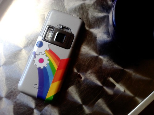
ph:camera=n82

Which is what I want to talk about. Sort of.

Read the rest of “FireDopplGängEaglr” for thoughts on FireEagle, Dopplr, place, and the DWIM engine.